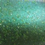
I went home and compared the 2 and discovered that I did not have the HTF version of that color. After much picture taking from every angle in daylight, shade and flash I gave up. To cheer myself up, I decided to compare two holographic polishes from two lines: Ginger & Liz (whom I have so much love for) and Color Club.
I spent so much time *staring* at the The-Brand-That-Shall-Not-Be-Mentioned that I literally went cross-eyed (more so than usual!) and said I needed some real holographic stuff to show me what I seem to have been forgetting. As a side note, I’ve decided to re-swatch all the colors I have from the old China Glaze collections of Kaleidoscope, 2BKewl and 2BHot. So keep an eye out for that. 🙂
In the meantime, here are the colors!
Ooops. Some notes:
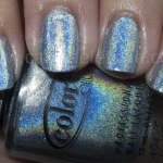
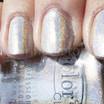
Ginger & Liz’s Trance: Beautiful high gloss shine. Fast drying, too!
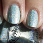
Color Club’s Revvvolution: A little slower on the drying time than G&L, but a good shine.
Both colors are three coats because I wanted to make sure I got it right!
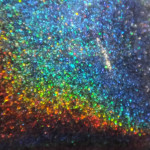
 The holographic isn’t really all that forthcoming in this shot – neither of the two colors wanted to shine in the shade/indoors. I had it under light, but I think I had the wrong kind of light to try and bring it out.

Early morning sunlight isn’t as strong as it could be to bring out the flash and shimmer of the holographic. Sadly, my swatching of holographics this week has been cut short thanks to the rain. BOOO.
I’ve decided that if I can for this week, it will be supcaliholographicexpialidocious! Wish me luck. I can’t believe spring is around the corner and it’s due to piss down rain…grrr.
The holographics in both of these polishes are not really mega strong, but I think the combination of my camera and weak sunlight make them look very tepid and weaker than what they are. They really are a lot stronger in person, if a bit more subdued than I had hoped for.
At any rate, purchasing either one of these colors (or both!) is definitely worth it. I love having them in my collection.
Was this post interesting? Come read more!