Monthly Archives

February 2010

Nubar's Cleopatra Collection – Part II

Sunday, 28 February, 2010

This is the shimmers and glitter part of the collection.

The glitter in this very pretty purple isn’t as obnoxious as say…your regular glitter type of polish. It’s still a pita to remove, though! But it’s nothing like OPI’s Absolutely Alice or anything like that. Thank God! It’s a bit of a reddish purple that some may find very appealing

I look at this color and think…disco roller derby night. Those scary satin shorts. Tube tops. I don’t know why those images flash into my head. Yet, they have and they remain there…Hm…the shimmer in here is so strong it makes it almost like a metallic, doesn’t it? This color reminds me more of a raspberry than a purple, to be honest. Well, at least it looks that way on my skin! 🙂

Good googalamoogala! The shimmer in this bad ass baby saved it from being a flat out boring purple creme. Well, to be honest, I think it would’ve been a gorgeous purple creme on its own, but the subtle shimmer in it makes it so purty!

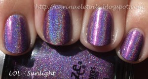
Oh. My. Stars. Oh. My. Goodness. While this color reminds me of Yoga-Ta Get This Blue (it’s that micro shimmer/glitter thing going on in the polish), it’s the darker more seductive cousin of the two. I’ve always been a sucka for dark nail polish and this truly made my heart sing! A beautiful indigo that has some gorgeous reddish/purple shimmer/glitter thrown in…OMG – *swoons*  You’ve got to see the full technicolor blown up pic of this – click the thumbnail for the sunlight version. It will take you to another page with the same image. Click on the image and the pic will be HUGE and you can see the absolute detail on this gorgeous, fantabulous, kick a** color. I’m serious! It’s that freaking gorgeous to me.

Nubar's Cleopatra Collection – Part I

Saturday, 27 February, 2010

I’m not a huge fan of purples. I never really have been…but what Nubar’s done is put together this collection that really made me look at purples differently. I’ve started with the cremes.

Application on this stuff was FLAWLESS.  I think Nubar is my new favorite brand of nail polish. Every single polish I’ve used by them makes me think all the other polishes I have been using are cheap things…Nubar is worth every penny I’ve shelled out.

This is a super pretty raspberry purple with a tinge of purple in it that makes it very flattering for my skin tone. It’s gorgeous, isn’t it?

A very pretty shade of pink with faint undertones of purple that keep it from hitting the lavender point.

This…is my most favorite color out of the entire collection. It’s got some grey in there…and it’s purple…it’s just such a pretty color that it hits high on my Top 10 list of all time favorites.

Not quite a royal purple but also not quite a lavender, it’s a cool mix of both and one that I really enjoyed seeing on me.

OPI Holiday Collection 2009 – Holiday Wishes – Part II

Friday, 26 February, 2010


Found these on clearance…woo hoo! 🙂 Snagged ’em for a mere $1.25. Scha-weet!

I actually wore this color for a bit…it reminds me Chop-Sticking To My Story. I’ll put them next to each other and see. I do like this color and it actually didn’t look too bad on me, either.
I thought I’d like this color, but not so much. It’s all right, but I won’t go out of my way to find a reason to wear it. It’s a bit too much of a warm tone for my skin.
China Glaze Holographic kaleidoscope collection

China Glaze – Holgraphics – Mix of OMG and Kaleidoscope Collection

Thursday, 25 February, 2010

I love holographic and duo chrome nail polish…so I was particularly bummed when I discovered that China Glaze has discontinued their Kaleidoscope and OMG line.

I went to my least favorite nail place in Mesa, AZ, a few weeks ago and on whim I checked to see if the guy carried any of the OMG/Kaleidoscope line – imagine my surprise when I found Octa Gone Wild – one of the more difficult of the Kaleidoscope colors to find. Well, it’s been difficult for *me* to find. I bit the bullet and paid his price of *weeps* $6 – there went my lunch money.

I found the biggest difference between the Kaleidoscope and OMG line is that the OMG line’s holographic nature is far more prevalent than in Kaleidoscope. K is more subtle. OMG is all bling blang in your face LOOK AT ME! kind of thing. Application was a bit difficult at first because Nubar’s  Reclaim had me mega spoiled in terms of coverage and flow. CG’s formula is one that dries super quick so you have to know what you’re doing or hope you can make up for it in the 2nd coat. Hope I am making sense.

Anyway, here is Octa Gone Wild and some others of the OMG line I was able to procure.

A lovely lilac…absolutely gorgeous!
This was a fun one, too. However, I think it was a bit too warm toned for my skin.
It was hard to capture this one. I tried different angles and it was hard catching the prism effect…you can almost see it on my middle finger. Out of the 10 shots in direct sunlight, this one was the best for the holographic to shine through.
Ok, I loved this. Someone said LOL was too ugly a purple…I completely disagree! It’s freaking GORGEOUS!!! Look at this! I didn’t even have to try to find the right angle to take the pic. It just totally jumped out from whatever angle I had the camera at.
china glaze nail polish swatches Fall 2008 Rodeo Diva

China Glaze – Fall 2008 – Rodeo Diva Collection

Wednesday, 24 February, 2010

I remember seeing this back in 2008, before leaving for India. I was so tempted to buy it, but didn’t. I really didn’t want to buy it, then try to lug it to India or worse yet, leave it behind. So I didn’t buy it.

The nail polish guy I go to here in AZ had these puppies on CLEARANCE for a mere dollar. HOLLA!!! I grabbed as many as I could, but sadly, not all colors are here. I’m not about to go and buy from an e-tailer because the colors I’m missing aren’t ones I think I really I want, anyway.

This was definitely one where I went, “I don’t like this color in the bottle, but boy do I love it on me!” It’s a super rich raspberry tone that’s broke up with a lovely frost.

I love green nail polish and this is no exception. I didn’t understand the fuss, now I do. Definitely one that I am happy to have in my collection!

Now this…this really stole my heart – can you see why? I swear it reminds me of my favorite colors from my junior high days. This color was flattering on my skin tone – definitely a keeper, too!

So the girl who loves dark nail polish (that’s me!) loved this, too…despite the faint shimmer running through this. This was such a deep dark eggplant kind of purple that I ended up liking the faint shimmer. It brought a kind of depth that I didn’t know I’d truly appreciate until I saw it on me.

A lovely ocean blue nail polish with a shimmer and and some subtle micro glitter thrown in for good measure…and what a difference that makes!

This is another eggplant-y shade that they had…but they threw in some warm gold micro glitter that really…really made this color seem slightly bronze-y and just a beautiful shade to have on your nails.

Ok, now this…this is the total surprise for me of the collection. Not quite a black nail polish, but the base was so dark a green it appeared black. Then they had put some shimmer to it that was gold. The result? A gorgeously mysterious dark green nail polish with some beautiful gold/bronze shimmer. A real gem!

china glaze nail polish swatches

MAC Cosmetics, Fall 2009 – Beyond Jealous nail polish swatch

Tuesday, 23 February, 2010

Yea, this was lovely. Indoors I was having a flashback to OPI’s Here Today…Aragon Tomorrow but I was wrong.

This polish is really, really pretty. Added bonus? It’s a creme! No shimmer, no glitter…just a pure, gorgeous green creme with wonderful application.

I thought that OPI had nailed a great dark green with HT…AT, but this…wow. This moved that right out of my way. I love how in the sun it looks almost like a grey-green thanks to a tiny dose of blue.

bahama blues collection

China Glaze – Bahama Blues Collection – Fall 2008

Monday, 22 February, 2010

Lots of hits here! I liked this collection save for the very dark colors…when did that happen?! Who knew that my dark loving nail polish self would actually not be cool with dark blues.

You’ll see why below…

Bermuda Breakaway
Shade (Top), Sunlight (Bottom)
This color wasn’t bad, actually. It was very pretty. A nice royal blue creme. Fabulous!


Calypso Blue
Not one of my favorite colors, to be honest. It was just so dark and the creme was a bit streaky. I thought it would be worth it, but it really wasn’t. I’d say skip this.

Bahamian Escape
Super pretty and not quite robin’s egg blue,  but it’s a gorgeous shade that was surprisingly pretty on me. It’s cool toned enough to actually look quite nice.

Blue Island Iced Tea
Yet another gorgeous color from the collection. It’s a nice light, almost sky blue that has some serious silver micro glitter thrown in…making this totally sparkly, shiny and yet somehow incredibly refined and tasteful. Definitely one that I’d enjoy wearing again…despite the glitter.

Blue Paradise
This color seriously surprised me…why? Because I thought the blue frost in the shade was so unappealing and utterly forgetful. Then I put this sucka under some sunlight then BLAM! this was such a gorgeous color that I had to just admire it for an hour before I removed it from my nails.
Caribbean Blue
Normally I would have hated this right off the bat…because of the glitter. I hate glitter in nail polish. I hate glitter polish. It’s only recently that I’ve been able to barely tolerate shimmers. I’m a creme kind of girl…shimmer and sparkle is for my face, ok? 😉 Anyway, this color is an awesome close to turquoise blue with some glitter thrown in, but it’s not an in your face kind of glitter. It’s very subtle and I think that’s why I liked it. It’s also got a hint of shimmer in it, too, so I think that really downplayed the glitter factor.

Orly Metal Chic – Fall 2009/Spring 2010

Sunday, 21 February, 2010

Orly released a matte line of 3 colors called Metal Chic.

I’m not usually a fan of matte nail polish, but I found this collection cool, even if it’s not for me. I did two things on them – I took them as they were originally meant to be worn – as a matte. Then I slapped on a super shiny top coat because I was curious how it would look. Both were pretty and I really preferred the shiny version.

Removing the colors were a PAIN thanks to the glitter…but anyway, please excuse the dry cuticles. Acetone and a strict, “DO NOT USE ANY LOTIONS WITH THIS MATTE NAIL POLISH” makes for a very ooglay cuticle display.

Admittedly this wasn’t the best color for my skin tone…either matte or not, it just didn’t look right. But if I had to choose, I’d say the matte version is much better on me than the one with top coat.
With or without topcoat, this color is freaking gorgeous…
I prefer this with top coat. Can you blame me?