I really enjoyed the Zoya colors I purchased…I find that of the two, Midori was my favorite.


I really enjoyed the Zoya colors I purchased…I find that of the two, Midori was my favorite.
I FELL IN LOVE!!!
Big time. Fell hard.
I now present Nubar’s limited edition Going Green collection…


Conserve


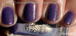
Greener
Shade (Top), Sunlight (Bottom)
Move over China Glaze’s Emerald Sparkle, I’ve found your prettier, younger sister. Less streaky and less frustrating to work with, this girl takes the cake. Plus, she’s not jelly based…she’s actually got some substance to her formula.Take that, Emerald Sparkle!
**** Now here is where Nubar totally makes me die ****


Reclaim
Shade (Top), Sunlight (Bottom)
I die. Seriously. I. die. A freaking GREEN HOLOGRAPHIC? Even China Glaze didn’t have a green like this in their Kaleidoscope and OMG Collections. The closest they had was L8R G8R and that was more like a lemon quartz in color – freaking beautiful. However, there is no green holographic like this. *swoons*
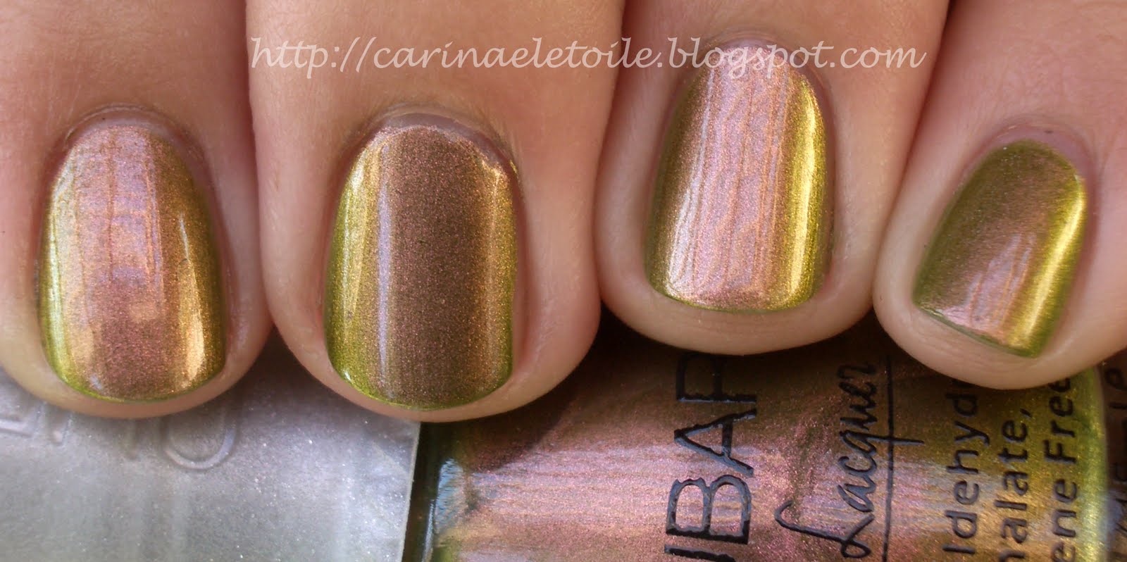

Wildlife
Shade (Top), Sunlight (Bottom)
I died with the last color, but Nubar seriously shut it down with this. It’s billed as a duochrome…and it sure is. It’s got some gorgeous pink-gold thang going on and then a pretty mossy green. It even looks good on my skintone, too! I just didn’t know what to say. I’m wearing it right now. I’m in love.
I loved the formula for all the polishes – it’s by far, the best formula I’ve ever used…Nubar is a total winner in my book and I’m a fan.
I made the decision to buy when I saw the swatches on Scrangie’s blog…and I’ve got to say, I’m not impressed by the colors. Well, there are two that I like. There were 9 colors, but I only bought the 7 that enticed me the most…and if I could do it all over again, I’d probably only get 5.
Just a note – these pictures were taken with a mixture of sunlight and indoors. Normally I do my swatching during the day, but the sun set and I decided to finally try the light box set up hubby used for my jewelry. I used my same lil old camera and maybe it’s time for me to graduate to the big kids stuff…but anyway, this is my first time using the light box so please don’t be so harsh on me.


Let me first start out by saying that there hits and misses for me in this collection. There are some bright colors in here and that’s what I’ll be showing first. They hurt my eyes…big time. I definitely enjoyed the rest of the collection, too. Very pretty and very not what I expected. I had seen it on some other people, but on me…I fell in love. For once, there was no black nail polish involved. 😀
The formula itself was pretty good, too…I normally have issues with cremes because I am little miss heavy handed in application. You’ll see it here and there throughout the pics but overall no problems. Please excuse the messiness of the manicures. I’m normally a lot more careful in application, but all the colors and the excitement got to me. Haha. Sad, but true.
As always, click to make the pics bigger!


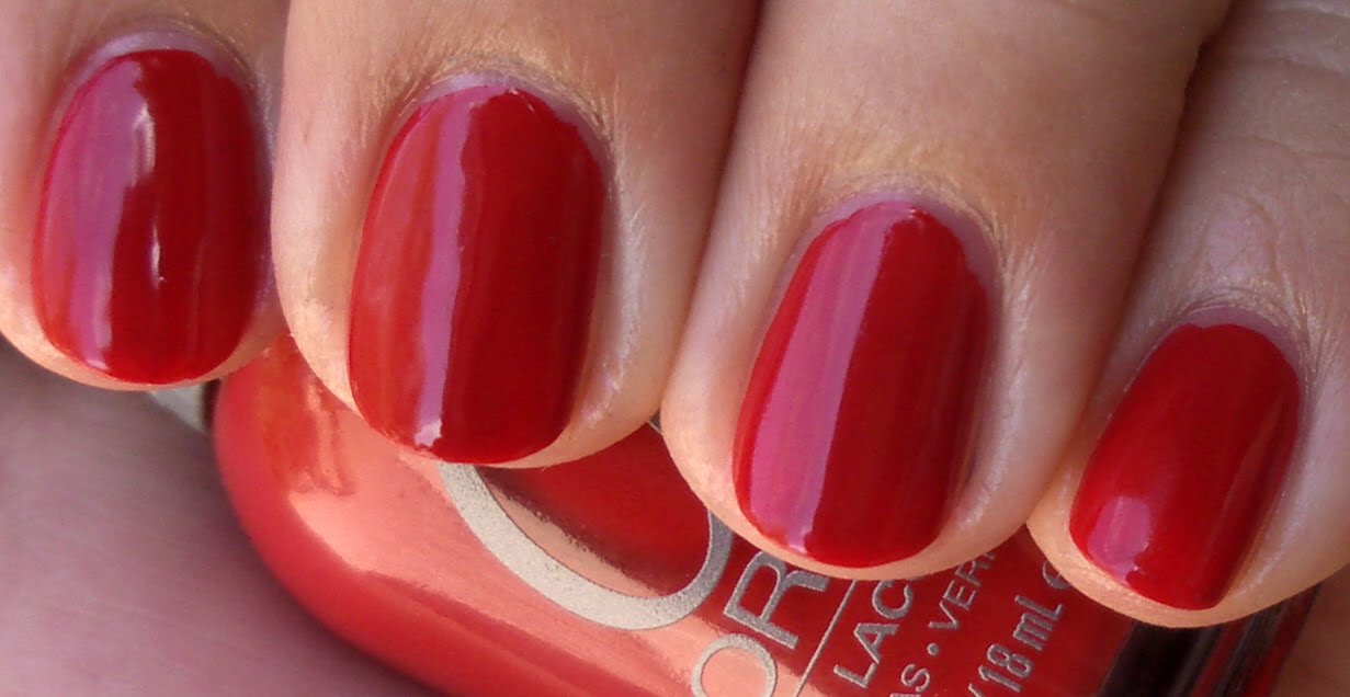
Shade (L) and Sunlight (R)
It’s not quite tomato and not maraschino cherry…It didn’t look bad on me, but it didn’t look good either.


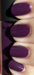
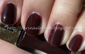
MAC Cosmetics, Spring 2010 – Imperial Splendour
What a gorgeous deep purple creme. I hate sparkles and shimmers in my nail polish and this was just…beyond gorgeousness. This makes CG’s Grape Pop and RBL’s Mismas look so…sad and lonely.
Formula was a little on the too thin/runny side, but if I laid it on a little thicker than usual and let it completely dry between coats, I got no bubbling. It was completely dry in 30 mins. I got a little fidgety at the 15 marker,b ut it was worth the results!


Orly decided to drop a collection on us called Once Upon A Time, basing colors on fairy tale stories from either their lines or just a vague reference to all stories.
Overall I liked the collection…save for one color, which you will see.
I liked the formula on this – I had no problems or complaints…not even a tiny one!
As always, click to enlarge the thumbnails.
Now, off with her red…oops. That’s OPI’s Alice in Wonderland thang…wrong place to put it – sort of. 🙂


So this is YSL’s Vernis Laque Pur line, 73521 number 29. You can see from the pics at the bottom.
Overall it was very hard to work with, thin and temperamental…but hey, it’s a teenager!


