Monthly Archives

December 2010

Femme Couture

Femme Couture – Ruby Slippers

Friday, 31 December, 2010

Happy New Year! 🙂 May 2011 be less stressful and more awesome than last year. If you make resolutions, I hope you stick to them.

That said…on to the color!

Every time I looked at this color, I kept saying, “Ruby Pumps, it’s Ruby Pumps!” It’s not. Ruby Pumps is a unique thing and this one tried to be similar to it, but it didn’t do so great.

Don’t get me wrong, it’s a pretty color, but in my heart Ruby Pumps will always be #1 for a glittery red.

However, as I’ve said it’s no RP, but it’s definitely a good Ruby Slippers…see below!

Notes on the formula – a bit on the runny side, but was easy to work with. Dried quickly.

Ginger & Liz Goin’ Back to Cali

Thursday, 30 December, 2010

I am truly the biggest fangirl of Ginger & Liz. I know I don’t feature them that much in my blog, but in my heart this is my number one brand. If they had a huge collection, I’d be snapping up every color I could. As it stands, I tend to purchase G&L few and far between, but when I do I purchase it, it’s in a frenzy – usually 4+ bottles.

I’ve had my eye on their new colors for some time, but when I purchase I want to make sure it’s hefty, meaning I don’t want to go back time and again. I like doing things in one go, unless they’re Limited Editions. I didn’t get their LEs this time around, but I got 4 colors that moved me. This is just one of them…

I’m not a fan of neon anything. I think it’s to do with my bad 80s moment where I thought I was the shiz when I had my neon outfits. I cringe looking back at those photos and they’re buried deep in my huge embarrassment pile.

I got Goin’ Back To Cali for 2 reasons: 1) it came from one of my favorite 80s movie soundtrack – Less Than Zero and 2) It’s an LL Cool J song. I love LL Cool J. I fully admit to watching NCIS:LA because he’s eye candy…and he can act.

Anyway, Goin’ Back to Cali is a color that flashes a not so neon (but make no mistake, it’s still bright) pink in some light, while in others it appears orange. It threw my camera for a loop! You’ll see the difference in the shade and sunlight shots.

I wasn’t sure if GBTC was meant to have a wax finish, but it sure dried that way.

The formula was a dream and dried in record time.

Ginger & Liz Goin' Back to Cali

It’s looking a little pinky/orange in here…I like that it changes colors in different settings. I put a fast drying topcoat on the middle and ring ringer, leaving the pointer and pinkie bare. Not sure if you can see what I mean by the wax finish on the pointer and pinkie fingers – it looks a bit shiny, but not like the other 2 that have the high gloss top coat.

Ginger & Liz Goin' Back to Cali

Definitely looking more orange here.

Zoya Crystal

Wednesday, 29 December, 2010
Zoya Crystal

My pictures do not do this color justice. This is the smoother, sleeker version of OPI’s Absolutely Alice.

I am going to re-swatch this color again now that I’m more familiar with my camera and processing pictures in RAW mode.

For now, enjoy the pretty blue gold goodness that is Zoya Crystal. It is a beautiful metallic blue with flecks of gold glitter thrown in. Application was easy and smooth. This is right up there with Zoya’s Ivanka, in my opinion. Two coats and dried quickly.

I think that Zoya Crystal is one that you need to have in your collection. For some reason, when I look at this, I’m reminded of a globe from my old days in school. It’s like land masses surrounded by all the water. It’s just super gorgeous! Can you imagine if they did a green version of this?! *swoons*

Zoya Crystal.

Zoya Crystal

Two different shade shots of Zoya Crystal to show you the gold flecks and the shimmery metallic goodness of blue.

Zoya Crystal

Sunlight washed out this shot, making it appear dull and lifeless. That is not the case, it really is a gorgeous color

Now that you’ve seen Zoya Crystal, do you think you want/need this in your collection? I think it’s a must! Do you?

Uncategorized

Dior – Purple Revolution

Tuesday, 28 December, 2010

I’ve been eyeballing Dior polishes for some time now. I just never really had the urge to buy them because the colors don’t really appeal to me. This one reached out enough for me to be tempted into buying.

The formula was lush and just all around luxurious. It’s what I expect in a bottle of nail polish I’m forking out some serious money for. It dried fairly fast and was opaque in two coats.

It’s almost vampy…

…and it remains totally dark and gorgeous in the sun. While not a traditional purple I was expecting, it was a yummy plummy color.

If other Diors are like this, I’ll gladly keep buying this brand.

Illamasqua – Jo’mina

Monday, 27 December, 2010

Tagged by Illamasqua itself as an electric lilac, I was a bit skeptical. What does that mean, I wondered.

Then I put it on my nails…and wore it for a few days. I did the swatching on an overcast day and the colors confused me. They were somewhat different in shade and the overcast shots. Then the sun peeked through a few days later when I happened to still be wearing Jo’mina. It was honestly so different in different lighting that I felt I never captured the true beauty of this color.

It would have to rank as one my top 10 favorite colors because it’s so unique. I don’t have many lavender colors because they are such an odd color on me. Jo’mina, however, looks wonderful on me and I love it.

Gorgeous. Almost muted. So pretty!

Totally bright…It looks even better in direct sunlight.

Femme Couture

Femme Couture’s Red Caviar

Friday, 24 December, 2010

In the bottle, I honestly thought this would be another sister to OPI’s Tease-y Does It or Nubar’s Raspberry Truffle.

Color me 85 shades of wrong…but I don’t mind. How did I discover I was wrong? Why, I did a cray cray comparison, of course! See below for my insanity.

Formula was good – it dried quickly and was opaque in 2 coats despite my heavy handed tendencies.


So I left out OPI on the picture, but it’s there. FYI: Middle Finger = Nubar’s Raspberry Truffle, Ring Finger = OPI’s Tease-y Does It and Pointer and Pinkie finger = Femme Couture’s Red Caviar. RC has a very pretty subtle shimmer you can’t really see and it barely hints at a shimmer on my pointer finger.

Ah, now you can see the shimmer in the pointer finger, but it’s still incredibly subtle, isn’t it? RT and TDI are practically dupes! Just a reminder: Middle Finger = Nubar’s Raspberry Truffle, Ring Finger = OPI’s Tease-y Does It and Pointer and Pinkie finger = Femme Couture’s Red Caviar.

This Friday Red post is a lot more subdued than the others I’ve done, that’s for sure.

Chanel – Black Pearl and Pearl Drop

Thursday, 23 December, 2010

Part of Chanel’s 2011 Spring Collection, Collection Les Perles De Chanel, Black Pearl and Pearl Drop, are the 2 colors that made me go, “Hmm…it will either fail or sink.”

To be honest, after the epic gorgeousness that was Fall’s Paradoxal, I was severely let down by Riva. It felt so common. I had honestly seen it before – both with and without shimmer. I could wax bitterly lyrical about how disappointed I was by Riva, by not only by the color but the application as well. Rather than rehash, check out the post.

I’m in the middle of road for Black Pearl and Pearl drop. While both had fairly good application with the formula being a bit on the thin side, I once again felt that this was something I had already seen.

What Chanel tried to do was make a cute little tips and toes set – I was told that Pearl Drop was meant for your fingers and Black Pearl was meant for your toes. Wear it at a resort, blah blah blah. You get the idea. Anyway, picture spam below!

Last note: I wanted to compare the nail polish against the real thing – a black pearl. Obligatory shot included.

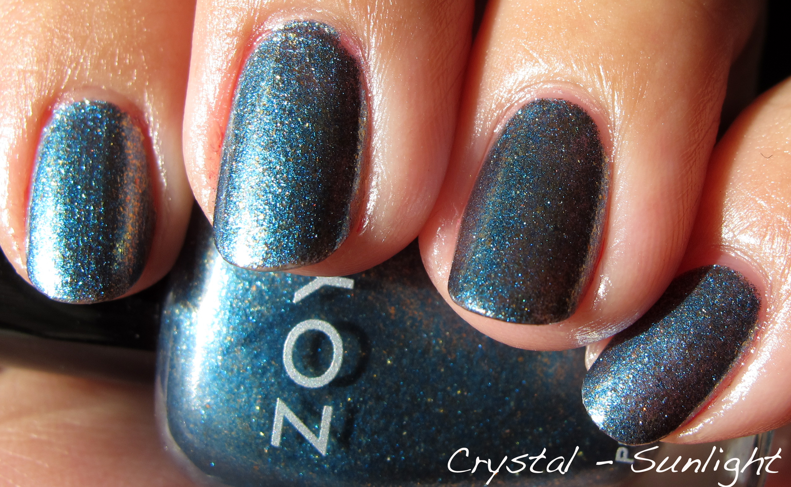
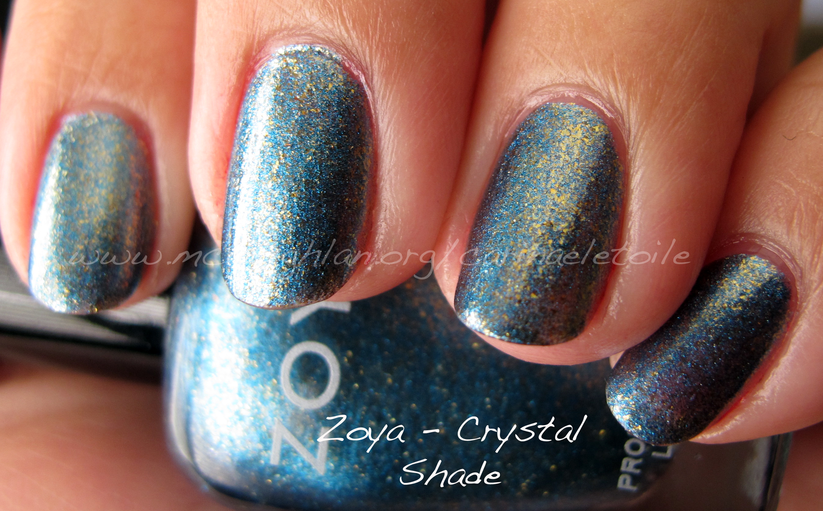
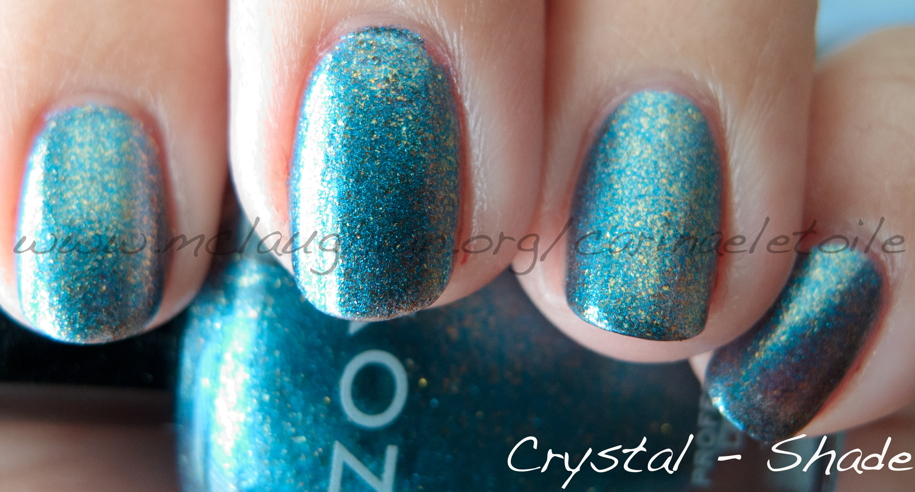
What Chanel did here was capture the iridescence you would find in a black pearl. It’s a hard sheen to capture because it has so many colors – green, grey, gold and a multitude of other colors depending on the lustre of the pearl and the type/kind. Don’t worry, there won’t be much jewelry or gemstone chatter from me in this post…I think.

When I saw this in sunlight, it really reminded me of my mother’s Tahitian Black Pearls that she has. She busts out with them once every NEVER because she can’t be bothered with getting them out of the bank. I saw them ONCE when I graduated from college, but that was it. I remember I was struck by the sheer size of the pearls as well as the lustre and the color. When I say size, you have to understand that the average pearls you see in the store are small – roughly 7 to 7.7 mm. Her Tahitian Black Pearls are a crazy 13-15mm in size. Practically double the average size of a pearl. Ok, I’m done. Sort of. I swear I’m done with jewelry chatter.

I didn’t lie – I had to provide picture of Chanel’s Black Pearl nail polish vs the color of a real black pearl. 😀

There is a faint gold shimmer that only comes out in person. It barely registers here. What Chanel tried to do was mimic the peachy golden glow of white pearls. They did a pretty good job. While this color wasn’t bad, not sure if I’d wear it faithfully.

You can see the shimmer better here.

Overall not a bad collection, but just not enough to wow me. Sorry, Chanel. If I had to give this a grade, I’d say this is a C for colors and an A for the formula.