WordPress does things a little differently than Blogger for images – you have to click the thumbnail here, it takes you to another page and you’ll have to click that image again to be able to see the original size.

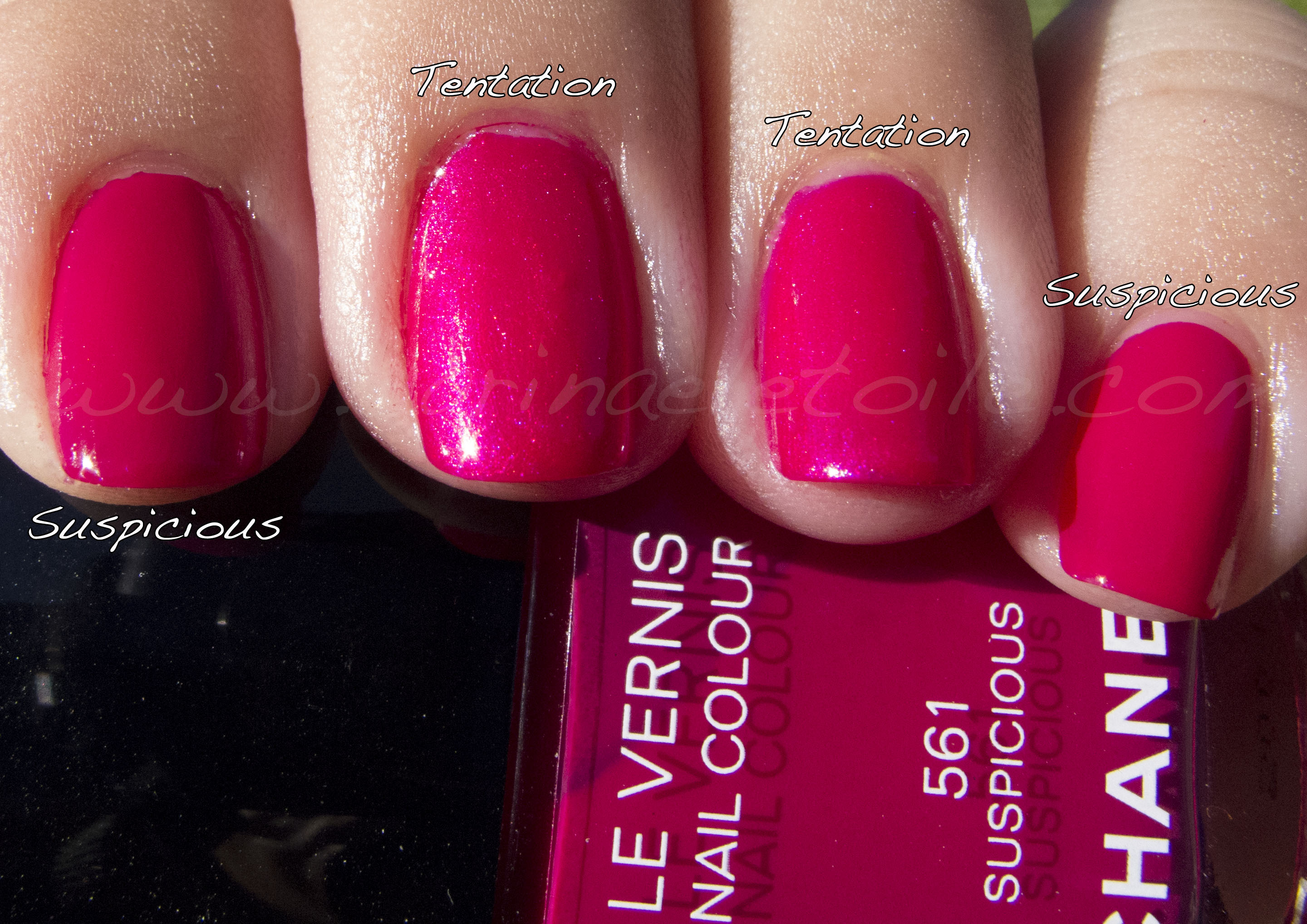
 Out of these two, I really love Shelter Island the best. I wear it whenever I can. However, you can’t really see the very subtle difference between the two here.


You can see the slight difference in the shade pic, but it’s the sunlight shot that really shows the difference between the two. However, it’s such a close call you can really get away with it. One is slightly deeper, the other…not so much. As I said, it’s subtle, but for me I definitely prefer the deeper shade, but they are both gorgeous, n’est-ce pas?
Was this post interesting? Come read more!
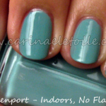 Essie – North Fork Collection, Summer 2009
 OPI – Black Shatter, Teenage Dream, Last Friday Night and Not Like the Movies
 OPI – Yodel Me On My Cell
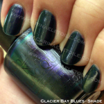 Monday Morning Blue – OPI's Glacier Bay Blues
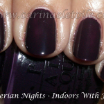 OPI – Russian Collection
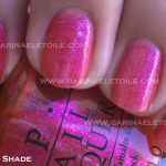 OPI Flutter Collection (Part I)- Wing It! and Catch Me In Your Net / Zoya – Charla – Summer 2010