All Posts By

carinaeletoile

Zoya nail polish swatches Zoya swatches

Happy St. Patrick's Day!

Wednesday, 17 March, 2010

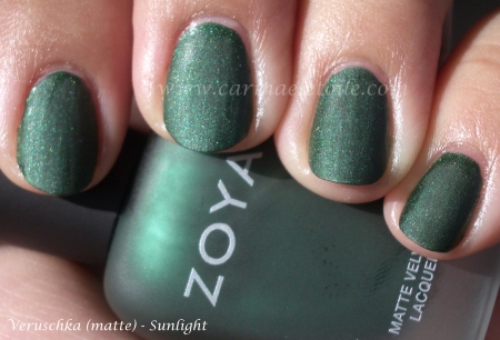
Obligatory green!

Such prettiness. I think Zoya was able to do what OPI couldn’t – make a pretty matte that didn’t seem so dull and lifeless. Go on with your bad self, Zoya!

Now, something NOT green. 🙂

I spoke about Ginger & Liz, my new nail polish crush…and here is Trance.

I think it was supposed to be a holographic, but it’s not showing up here. In person…it is some serious wow factor. Definitely one of my faves! I have a few more bottles from Ginger & Liz and I’ve a feeling I’m going to be loving every single one of them.

Ginger & Liz

Tuesday, 16 March, 2010

I’ve been waiting for a shipment of nail polish to come in from a new company called Ginger & Liz – and it’s finally arrived…pity a bottle (Tough Luxe) got broken in transit and it spilled everywhere, but the colors that did make it are fabulous! Tough Luxe sure looked pretty enough all over the inside of the packaging and on the other bottles. I was finally able to clean off the broken bottle’s contents off the remaining shipment…and what a treasure, indeed.

I was so excited I had to share. So much for putting up a green nail polish in honor of St. Patrick’s Day. Guess that’ll happen tomorrow because for now it’s all about Ginger & Liz, my new nail polish crush.

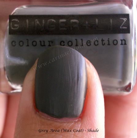
I’m going gray, baby!

Ginger & Liz – remember those names because the colors and application will rock your world. I love the wax coat finish on Gray Area and I’ve got to bust out with Royal Flush now. The finish is awesome – it’s not super shiny and it’s not like other mattes out there – this is a wonderful compromise that reminds me of candle wax. It’s a nice dull shine! I only needed 2 thin applications of the prettiness.

Check it out below. 🙂

Zoya Polish

Monday, 15 March, 2010

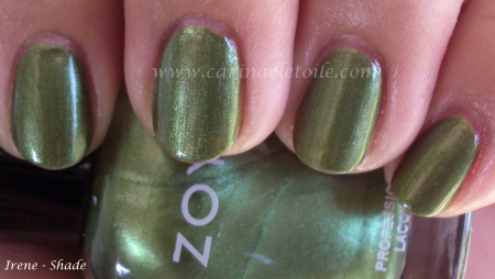
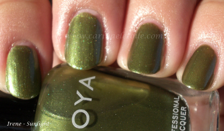
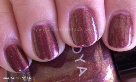
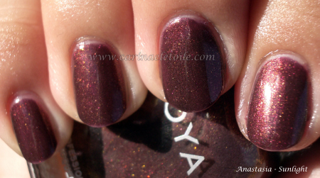
I keep looking at this color and thinking, it’s the sister to Midori! I’m going to have to do a comparison swatch…it’s darker, edgier with a lovely golden shimmer. It warms it up enough but doesn’t detract from the coolness of the color – if it had been too warm it would look like green pewp on me.

And no it’s not like Midori – my bad! Midori is lighter and more golden…but still gorgeous. 🙂

I was having China  Glaze flashbacks when I put this on. This is suspiciously close (at least in color and shimmer) to CG’s Lasso My HeartOops, compared swatches and I’m wrong. This is richer, fuller…much prettier. I definitely prefer Zoya’s take on this.

Note on the formula – these were 3 coaters for me. 2 looked ok, but 3 really showed the true beauty of these babies…and look ma — NO BUBBLES! It dried fast and smooth.

Will be doing more Zoya colors during the week because I ordered quite a few when we got our tax return. 😉

Essie – Angora Cardi swatches

Sunday, 14 March, 2010

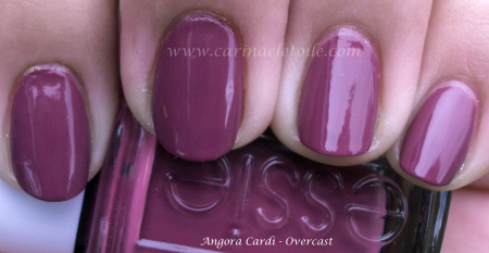
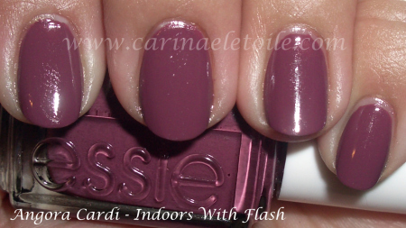
So much for me keeping Cashmere Cardigan on for the weekend. I got all distracted by Essie’s Angora Cardi. It was a winner for the weekend. 🙂 It’s not quite a rose color and it’s close to Butter’s Tramp Stamp.

Very pretty! 🙂

Orly – Cashmere Cardigan

Friday, 12 March, 2010
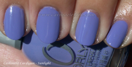
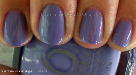
Orly Cashmere Cardigan

Ok, I’m wearing this right now…and am loving it. Hopefully I can keep it on for the weekend unless I get distracted by another color in my collection! Essie’s Shelter Island and OPI’s No Room For the Blues still keep calling me.

How pretty is this? LOVE IT!!! 🙂

Now I must wear Essie’s Angora Cardi on Monday…or tomorrow. 😉

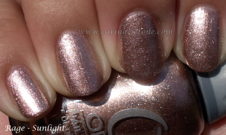
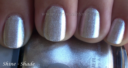
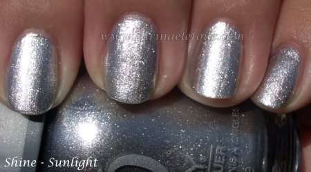
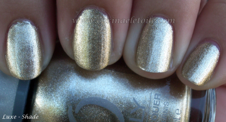
Orly – Foil FX

Thursday, 11 March, 2010
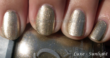
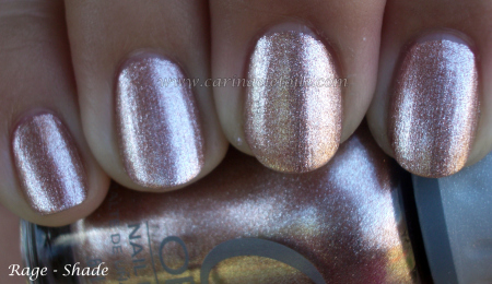
Orly Luxe

Things that make me go SQUEEEEE…and when I saw this on my nails, I sure did that. 🙂

I’m currently wearing this on my nails – loving this shiny foil like effect!

Out of all the 3 Foil Fxes, this one flattered me the most and I loved it. I looked at it on me and the only thought that ran through my head was, “This reminds me of rose gold!”

It looked super futuristic on me, but I did like this…it reminded me of an old school Urban Decay I had about 15 years ago.

Not one my favorites…only because it’s too close to gold and I look awful in gold. Rose gold (I love it makes things have an antique-y feel to it!) is a bit cooler in tone so I find I tend to favor it than straight up yellow gold. When I looked at this color from a distance on me it really wasn’t very flattering for me.

Some stuff to check out if you like RBL or Zoya

Wednesday, 10 March, 2010

From Barielle

As a special thank you to all our customers and online followers, we would like to
give you an 8oz Zoya Remove+ (award winning 3-in1 remover) FREE with any
online purchase of $10 or more at www.zoya.com, www.qtica.com or www.artofbeauty.com

Use code: BF5 at check out. Offer expires Monday 2/15/2010. Not valid with any other
coupons or offers. Limit one per order.

*************************************************

From Rescue Beauty Lounge

Pre-order their spring Line – 3 surfer themed colors: Bangin’, Diddy Mow, 360

comparison

Comparison

Wednesday, 10 March, 2010

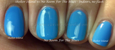
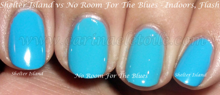
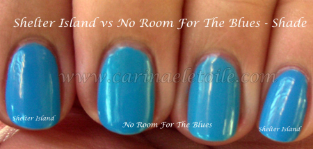
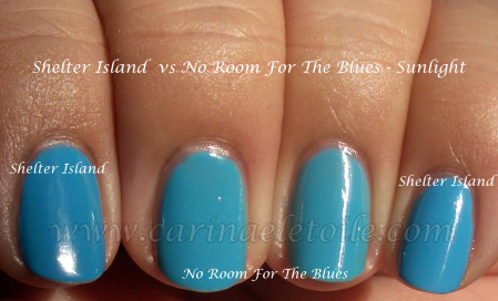
Comparison swatches of Essie’s Shelter Island and OPI’s No Room For The Blues in different lighting.

WordPress does things a little differently than Blogger for images – you have to click the thumbnail here, it takes you to another page and you’ll have to click that image again to be able to see the original size.

Out of these two, I really love Shelter Island the best. I wear it whenever I can. However, you can’t really see the very subtle difference between the two here.

You can see the slight difference in the shade pic, but it’s the sunlight shot that really shows the difference between the two. However, it’s such a close call you can really get away with it. One is slightly deeper, the other…not so much. As I said, it’s subtle, but for me I definitely prefer the deeper shade, but they are both gorgeous, n’est-ce pas?