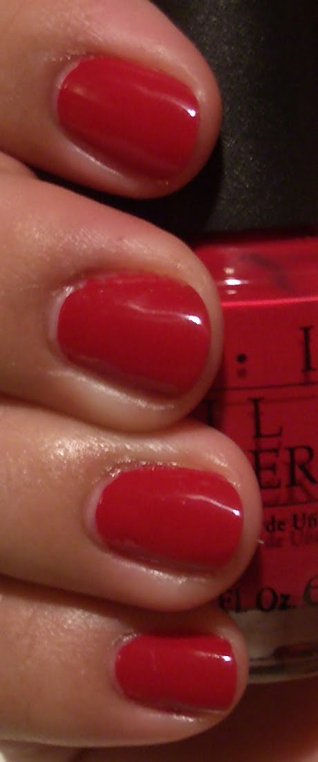
Festive Fuchsia – Indoors with Flash
Ok, I’ve swatched it and was so uninspired by the color I just snapped a pic with the flash then took it off my nails. doh doh It was eh. So uninspiring that I merely just took the picture with a flash and called it a day. Couldn’t even be arsed with going outside and taking a pic in the sun – how sad is that?
Ok, I’ve swatched it and was so uninspired by the color I just snapped a pic with the flash then took it off my nails. doh doh It was eh. So uninspiring that I merely just took the picture with a flash and called it a day. Couldn’t even be arsed with going outside and taking a pic in the sun – how sad is that?


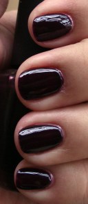
All A-Bordeaux The Sled!
shade (L); direct sunlight (R)
Ok, this…this…where do I even begin? I must wax lyrical! First coat impression: “I’ve seen this before. I loved it. I know…Chanel’s original Vamp.†I’m not talking about that crap Vamp that’s out now. I’m talking old school, circa 1994/1995 Vamp. The good stuff. I loved that color so much that I wore it till the bottle ran out…and bought another one…and used that up, too! I almost cried when I threw out the bottles, but I have here my new, much more affordable version — even though I only have one bottle. Oh dear.
Ok, this…this…where do I even begin? I must wax lyrical! First coat impression: “I’ve seen this before. I loved it. I know…Chanel’s original Vamp.†I’m not talking about that crap Vamp that’s out now. I’m talking old school, circa 1994/1995 Vamp. The good stuff. I loved that color so much that I wore it till the bottle ran out…and bought another one…and used that up, too! I almost cried when I threw out the bottles, but I have here my new, much more affordable version — even though I only have one bottle. Oh dear.

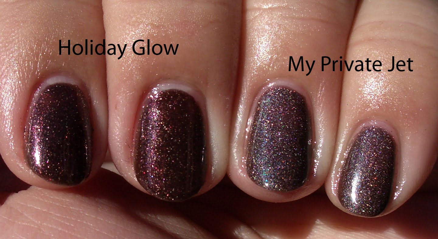
Holiday Glow and My Private Jet
Shade (Top) Direct sunlight (Bottom)
Ok, so I totally messed up. I did my index and middle finger with Holiday Glow and I got a phone call. I had a bottle of My Private Jet (which is NOT part of the OPI Holiday 2009 collection) sitting next to Holiday Glow and thought I was finishing putting on Holiday Glow. I noticed on the 2nd coat. I didn’t want to waste anything so I just kept them side by side. I have to say, they were easy to apply. I like both of them. They’re very pretty.
Ok, so I totally messed up. I did my index and middle finger with Holiday Glow and I got a phone call. I had a bottle of My Private Jet (which is NOT part of the OPI Holiday 2009 collection) sitting next to Holiday Glow and thought I was finishing putting on Holiday Glow. I noticed on the 2nd coat. I didn’t want to waste anything so I just kept them side by side. I have to say, they were easy to apply. I like both of them. They’re very pretty.


Sapphire in the Snow
Indoors, no flash; luminescent lighting (L); outdoors, pretty Arizona sunshine (R)
I said that I was never a fan of purple nail polish, but this is such a deep dark royal purple that I fell for it. Hard. When in light, you can see the purple shine through. Absolutely beautiful, even if the formula is a bit temperamental. I found that to be true of the Spanish Collection as well. Those colors would’ve benefited from a three coat application and the same applies for the 2009 Holiday colors. In direct sunlight…there is that gorgeous, dark royal purple coming into play. How can you not fall for a pretty purple?!
I said that I was never a fan of purple nail polish, but this is such a deep dark royal purple that I fell for it. Hard. When in light, you can see the purple shine through. Absolutely beautiful, even if the formula is a bit temperamental. I found that to be true of the Spanish Collection as well. Those colors would’ve benefited from a three coat application and the same applies for the 2009 Holiday colors. In direct sunlight…there is that gorgeous, dark royal purple coming into play. How can you not fall for a pretty purple?!