Monthly Archives

March 2010

Difficult Formulas I've Used – Rescue Beauty Lounge and Sally Hansen

Sunday, 21 March, 2010

These were colors that people said were so cute – you must try them! and I did…much to my horror and chagrin. I actually did 4 coats of each of the polishes below before I called it a day.

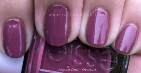
Both were a bit like jelly – and it shows in the application for me. I’ve looked at other people’s swatches of these colors and am jealous that they’ve turned out so well. Maybe it was me. πŸ™ Anyway, here they are.

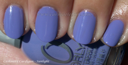
How awful can this application have been on me?! To make it worse, I had grabbed the wrong top coat (I have 2 of the same, but I reserve one for dark colors and another for light colors) and now you can see the red from an old cold color I had worn a few days prior. I had so much trouble with this formula. I reached the 4th coat phase and said with much grace and dignity, “F*** it. I’m done.” To make matters worse, the formula took AGES to dry. 4 top coats later – and they weren’t even thick coats, fairly thin – they were barely dry enough to put the top coat on so I could photograph them. The formula was pretty sticky, too. ugh. I like sticky in my base coats, not my nail polish, ok?

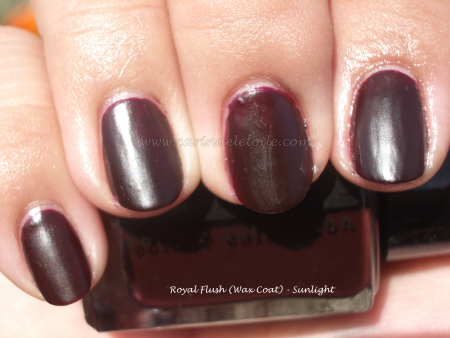
This was another color I had issues with, but not as bad as I did with Rescue Beauty Lounge. This is a 3 coater…and it annoyed me, too. This color actually didn’t look bad on me either…despite it being a yellow. I admit to buying it purely for the name – Yellow Kitty. I kept thinking Hello Kitty and giggling to myself.

Rescue Beauty Lounge – Spring 2010

Friday, 19 March, 2010

In an odd way, I like this collection…Rescue Beauty Lounge’s Spring 2010 colors are based on Proenza Schouler’s spring 2010 collection – a surfer girl chic.

Pardon the ghetto manicure on the right hand. I’m not a leftie! πŸ™‚ This shade sings to me – it’s not quite teal, but it’s such an awesome mix of grey thrown in for good measure. How can one NOT like it?

It looks like a sea grey…when I lived on the beach back in San Francisco, I often called this the “boo boo grey wave day”…

Oh man…it’s not quite coral red and when I saw this I thought it would be too warm for my skin tone. Oddly enough, it’s just enough on the cool side for me to carry it off.

I like 360 and Diddy Mow moreso than Bangin’. Formula was much better than in previous batches so I’m happy – it’s not thick nor does it take forever to dry. Only needed 2 coats per application.

Ginger & Liz – More Love!

Thursday, 18 March, 2010

Yea, I admit it…I really like the formula for Ginger & Liz and the brush is pretty awesome. I was a bit disconcerted at first, but found that the brush really does make a difference. I like it.

This sort of reminds me of Rage from Orly Foil FX, but this is more champagne/gold toned. However, it’s not as gold like Luxe (thank God). This color is currently rockin’ my fingertips.

Aww yea, baby! I’ve said that other colors remind me of Chanel’s original Vamp, but this…this truly comes closest to it, IMO. Others were a bit too dark, some too wine-y, some too red, while others had a smidge of purple. This is what I remember Vamp (Rouge Noir) looking like on me, but glossier. This is a semi-matte (or semi-gloss as hubby said last night over dinner) and I’m loving it.

I can’t wait to get the other G&L colors on my fingers and take pics!

Zoya nail polish swatches Zoya swatches

Happy St. Patrick's Day!

Wednesday, 17 March, 2010

Obligatory green!

Such prettiness. I think Zoya was able to do what OPI couldn’t – make a pretty matte that didn’t seem so dull and lifeless. Go on with your bad self, Zoya!

Now, something NOT green. πŸ™‚

I spoke about Ginger & Liz, my new nail polish crush…and here is Trance.

I think it was supposed to be a holographic, but it’s not showing up here. In person…it is some serious wow factor. Definitely one of my faves! I have a few more bottles from Ginger & Liz and I’ve a feeling I’m going to be loving every single one of them.

Ginger & Liz

Tuesday, 16 March, 2010

I’ve been waiting for a shipment of nail polish to come in from a new company called Ginger & Liz – and it’s finally arrived…pity a bottle (Tough Luxe) got broken in transit and it spilled everywhere, but the colors that did make it are fabulous! Tough Luxe sure looked pretty enough all over the inside of the packaging and on the other bottles. I was finally able to clean off the broken bottle’s contents off the remaining shipment…and what a treasure, indeed.

I was so excited I had to share. So much for putting up a green nail polish in honor of St. Patrick’s Day. Guess that’ll happen tomorrow because for now it’s all about Ginger & Liz, my new nail polish crush.

I’m going gray, baby!

Ginger & Liz – remember those names because the colors and application will rock your world. I love the wax coat finish on Gray Area and I’ve got to bust out with Royal Flush now. The finish is awesome – it’s not super shiny and it’s not like other mattes out there – this is a wonderful compromise that reminds me of candle wax. It’s a nice dull shine! I only needed 2 thin applications of the prettiness.

Check it out below. πŸ™‚

Zoya Polish

Monday, 15 March, 2010

I keep looking at this color and thinking, it’s the sister to Midori! I’m going to have to do a comparison swatch…it’s darker, edgier with a lovely golden shimmer. It warms it up enough but doesn’t detract from the coolness of the color – if it had been too warm it would look like green pewp on me.

And no it’s not like Midori – my bad! Midori is lighter and more golden…but still gorgeous. πŸ™‚

I was having China  Glaze flashbacks when I put this on. This is suspiciously close (at least in color and shimmer) to CG’s Lasso My HeartOops, compared swatches and I’m wrong. This is richer, fuller…much prettier. I definitely prefer Zoya’s take on this.

Note on the formula – these were 3 coaters for me. 2 looked ok, but 3 really showed the true beauty of these babies…and look ma — NO BUBBLES! It dried fast and smooth.

Will be doing more Zoya colors during the week because I ordered quite a few when we got our tax return. πŸ˜‰

Essie – Angora Cardi swatches

Sunday, 14 March, 2010

So much for me keeping Cashmere Cardigan on for the weekend. I got all distracted by Essie’s Angora Cardi. It was a winner for the weekend. πŸ™‚ It’s not quite a rose color and it’s close to Butter’s Tramp Stamp.

Very pretty! πŸ™‚

Orly – Cashmere Cardigan

Friday, 12 March, 2010
Orly Cashmere Cardigan

Ok, I’m wearing this right now…and am loving it. Hopefully I can keep it on for the weekend unless I get distracted by another color in my collection! Essie’s Shelter Island and OPI’s No Room For the Blues still keep calling me.

How pretty is this? LOVE IT!!! πŸ™‚

Now I must wear Essie’s Angora Cardi on Monday…or tomorrow. πŸ˜‰