This is in the same color palette as Butter’s Scoundrel – a very pretty creme that’s a pinky-purple.
What do you think?
Personally I found this was a bit lighter, more delicate. See below. 🙂
This is in the same color palette as Butter’s Scoundrel – a very pretty creme that’s a pinky-purple.
What do you think?
Personally I found this was a bit lighter, more delicate. See below. 🙂
It’s not a glitter, but a fabulous creme. I happened to like this shade because it’s that cross between a darker shade of pink with enough purple in it to fall into an almost pink/lavender category. However, this shade is richer and just more luscious. How can anyone not love this color?!
Application was a little lumpy and hard to work with on the first coat but it all worked out on the second. Still smells kind of nice and not like nail polish.
You can see the cuticle issues on my middle finger. This pink had a shimmer in it that was meant for someone either younger or older, but not me. I’m very fussy about my pink nail polish and this is definitely not one for me.
See? Cuticle pull again! This orange…is orange. I love orange nail polish, but this was a bit too sheer and almost a jelly like quality. This is 2 coats and it’s still slightly sheer. Not sure if you can see that.
A lovely creme that I absolutely loved in the bottle. Sadly, it looks like I’ve glued some pastel colored M &Ms onto my fingers. It looks surreal and very odd. I was hoping that it would look ok on me, but it really didn’t. I love, love, LOVE this color. I really wish this would look good on me. Oh well…plenty of polish for me to choose from so I’m not lamenting my lack of choices. 🙂
Essie’s Summer 2010 Collection
Looks pretty and enticing, right?
Look at the reality below.
Sunlight washed this color out, but I felt it was the prettiest of the lot…It did remind me of their blue collection from last summer.
A pretty pink that works for me, but pink isn’t my color.
It looked like a grey in the bottle, but it ended up being a bit of a dull, lifeless beige on me. 🙁
A pretty sea foam green.
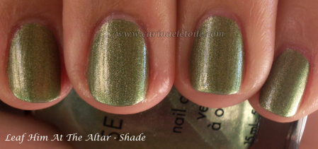
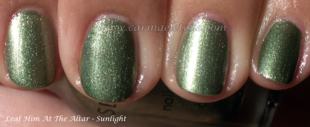 Lately I’ve been into green nail polish. It all started with Nubar’s Going Green Collection and I don’t see any signs of my current green fixation stopping any time soon. When shades of green like Leaf Him At The Altar keep coming out, how can I say no?
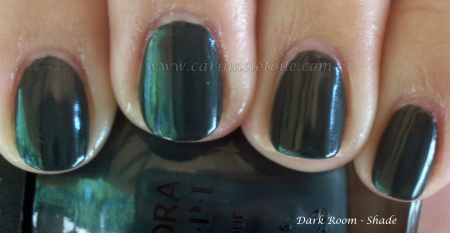
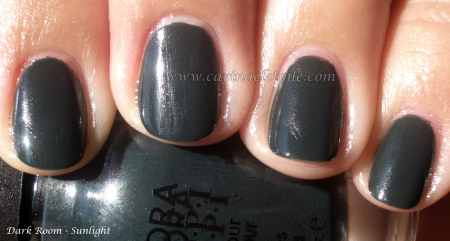 This is such a strong match for MAC’s Beyond Jealous, but I’ll have to do a side by side comparison…However, you’ll have to settle for the post that shows the picture. I actually prefer the formula in $OPI because it wasn’t difficult to work with.
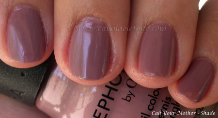
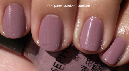 Ahh…this color came out the same time as $OPI’s Metro Chic. So I’d say about Fall 2008. I didn’t purchase this until recently. I did, however, purchase Metro Chic the moment it came out because I love that whole mushroom-y, taupe-y color. This is the lighter, more spring version. Think youthful sister, if you will. While I prefer the edgier and darker Metro Chic, I won’t complain if this finds its way on to my fingertips.
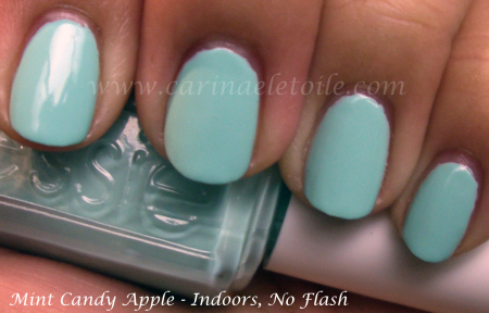
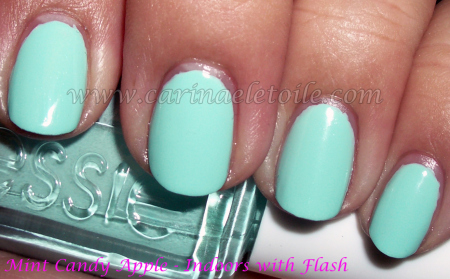 I thought I was gonna love this color when I put it on me. Nerp. Nope. Didn’t like it one bit…NOT ONE BIT. It almost looks like I’ve got skittles on my fingers, doesn’t it? LOL
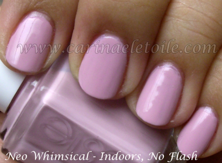
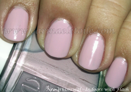 Not a bad shade of a pastel. It’s not too obnoxious, but it will do. 🙂 At least it doesn’t look like Skittles. 😀
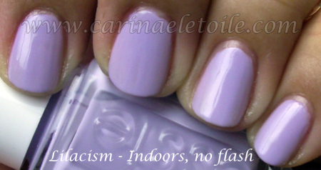
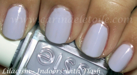 This is my favorite of the three. I guess when it comes down to it, I like purple – even if it’s lavender.
I went to my least favorite nail place in Mesa, AZ, a few weeks ago and on whim I checked to see if the guy carried any of the OMG/Kaleidoscope line – imagine my surprise when I found Octa Gone Wild – one of the more difficult of the Kaleidoscope colors to find. Well, it’s been difficult for *me* to find. I bit the bullet and paid his price of *weeps* $6 – there went my lunch money.
I found the biggest difference between the Kaleidoscope and OMG line is that the OMG line’s holographic nature is far more prevalent than in Kaleidoscope. K is more subtle. OMG is all bling blang in your face LOOK AT ME! kind of thing. Application was a bit difficult at first because Nubar’s Reclaim had me mega spoiled in terms of coverage and flow. CG’s formula is one that dries super quick so you have to know what you’re doing or hope you can make up for it in the 2nd coat. Hope I am making sense.
Anyway, here is Octa Gone Wild and some others of the OMG line I was able to procure.
The nail polish guy I go to here in AZ had these puppies on CLEARANCE for a mere dollar. HOLLA!!! I grabbed as many as I could, but sadly, not all colors are here. I’m not about to go and buy from an e-tailer because the colors I’m missing aren’t ones I think I really I want, anyway.
I love green nail polish and this is no exception. I didn’t understand the fuss, now I do. Definitely one that I am happy to have in my collection!
Now this…this really stole my heart – can you see why? I swear it reminds me of my favorite colors from my junior high days. This color was flattering on my skin tone – definitely a keeper, too!
So the girl who loves dark nail polish (that’s me!) loved this, too…despite the faint shimmer running through this. This was such a deep dark eggplant kind of purple that I ended up liking the faint shimmer. It brought a kind of depth that I didn’t know I’d truly appreciate until I saw it on me.
A lovely ocean blue nail polish with a shimmer and and some subtle micro glitter thrown in for good measure…and what a difference that makes!
This is another eggplant-y shade that they had…but they threw in some warm gold micro glitter that really…really made this color seem slightly bronze-y and just a beautiful shade to have on your nails.
Ok, now this…this is the total surprise for me of the collection. Not quite a black nail polish, but the base was so dark a green it appeared black. Then they had put some shimmer to it that was gold. The result? A gorgeously mysterious dark green nail polish with some beautiful gold/bronze shimmer. A real gem!