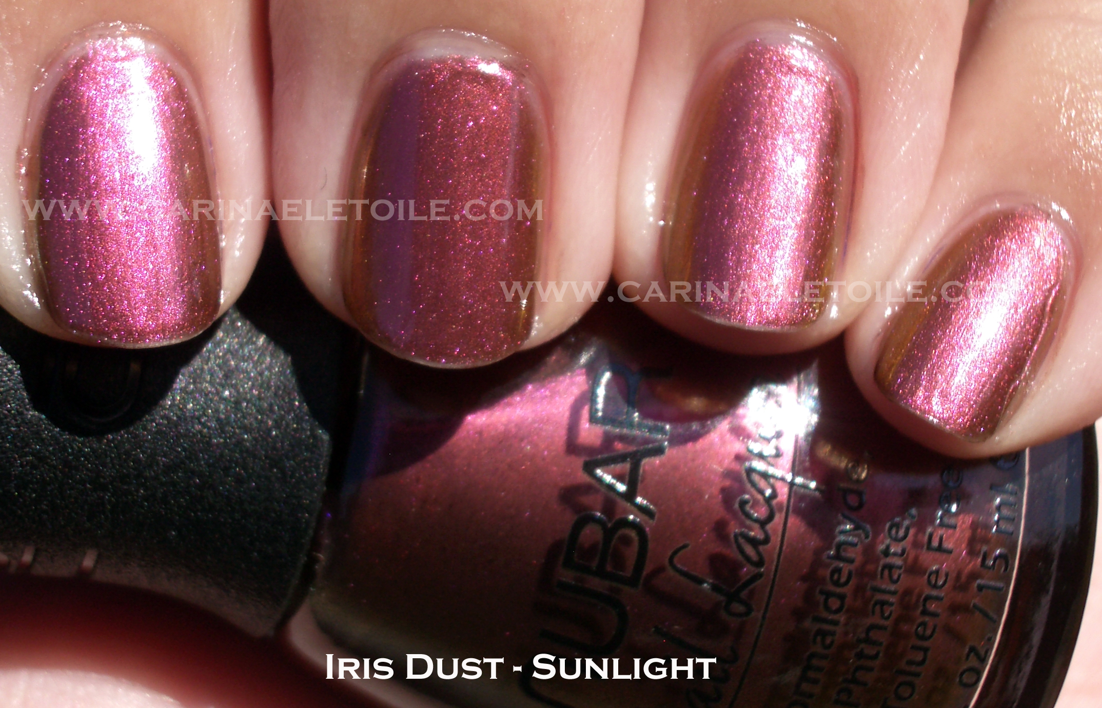
Not sure when this came out, but I happened to find it while browsing the duo chrome section on Nubar’s site.
Formula was a bit on the thin side and I had to do three coats to get it opaque because I didn’t think this was a sheer color.


Not sure when this came out, but I happened to find it while browsing the duo chrome section on Nubar’s site.
Formula was a bit on the thin side and I had to do three coats to get it opaque because I didn’t think this was a sheer color.
Formula was awesome – quick drying and flawless. All of these were two coat applications.
China Glaze is seriously knocking it out of the ball park with their seasonal collections. I enjoyed Awakening and I’m seriously looooving their Christmas Collection – Tis the Season To Be Naughty and Nice. That is up for Friday. All 16 colors. Anyway…
Here are the three colors from Awakening with a comparison of Mummy May I to Deborah Lippmann’s Bad Romance.
Warning: This is an image heavy post.


A black jelly nail polish packed with orange glitter. Very Halloween. Very fun…and I may be rocking it the next few days to support the Giants. Yea, I’m a Bay Area sports girl – born and raised so I feel a lot of loyalty to my home teams.


Really liking this green because I don’t have anything like it. I’ve heard it’s similar to SpaRitual’s Optical Illusion, but I haven’t had the chance to compare it because I don’t have OI and SpaRitual is a lot harder to get ahold of than most nail polishes. Pity SpaRitual doesn’t sell on their site because I’d rather purchase through there.
And finally…oldie but goody comparison of Mummy May I and Deborah Lippmann’s Bad Romance. BR is a collaboration she did with Lady Gaga. You can also read the original review here.


Bad Romance has different shapes of glitter and the base is a deeper, denser black. Had I not done a side by side comparison, I’d never have even thought that these were even different aside from the glitter size. Mummy May I is a cute name! I just looked back on my notes when I swatched these and BR and MMI are 3 coats.
The overall formula for MAC is thin and runny. That being said, it dried quickly.
I do wish MAC had put some Villains on the polish bottles. They did it for the other items in the line, so why not this one? Kind of bums me out. Overall the colors were cute, but as you can see, nothing that really wowed me. I’ve seen Mean & Green and Formidable! before thanks to Orly. I’m still going to hang on to these, though. 😀
This is an image heavy post…you have been warned! I tried to best capture the shimmers of the polishes.


 There really is no discernible difference between the two, is there? Even the size of the glitter, etc. M&G is a bit thinner than SC. 3 coats of each.


 MAC’s formula is thinner and runnier than Orly. You can see it. Other than that, no real discernible difference. This is 3 coats of each polish.
 Bottle shot for MAC


 This formula was very thin and required 3 coats. But even after 3 coats, you can still see my nail under it. 🙁
 Bottle shot
A reader asked me to do more pinks, corals (*barfs*) and sheers. I’ll start doing that. 🙂 Even down to the corals. *cries*
With that out of the way, here are the final 2 colors of the Flutter Collection.


Application was a bit runny, but if I had to pick between this or the pink…I’d choose this. It looks a gorgeous, almost burnt orange here but it’s not. It’s really bright. The pictures make the color look a lot more mellow than what it really is when you see it in person.


These pictures belie the brightness of the polish. There is a subtle amount of glitter in it that really doesn’t quite show up. I look at these photos I took and I think, “Wow, what a pretty shade of pink!” Don’t fall for it. If you don’t like brights I suggest getting Catch Me In Your Net. It’s the only one in this entire collection that stands out.
I’m pretty much disappointed with OPI’s colors for summer. I loved the Shrek collection but that’s because it appealed to the girl in me that loves funky and unusual colors. I am still loving Fiercely Fiona and Who The Shrek Are You?
The formula on this was also difficult to work with. I found it incredibly runny and slow drying. I think for the slow drying thing I’ll have to factor in the awful rise in humidity right now. Either way, I wasn’t a fan of this formula or the colors.
The last two I have to show. The sun washed out the colors, but some of the shade shots turned out decently. Nidhi’s incandescent lighting shot turned out beautifully.
See below. 🙂


Raspberry in color, it’s not a shade that looks good on me. I think the shade shot brought the good part of the polish out, but it wasn’t enough to convince me that I would like it enough to wear it on my nails during the summer.


See how gorgeous this color was until the sun hit it? Ugh. I’ll fix it, though. I look forward to wearing it a lot this summer.


You can see the cuticle issues on my middle finger. This pink had a shimmer in it that was meant for someone either younger or older, but not me. I’m very fussy about my pink nail polish and this is definitely not one for me.


See? Cuticle pull again! This orange…is orange. I love orange nail polish, but this was a bit too sheer and almost a jelly like quality. This is 2 coats and it’s still slightly sheer. Not sure if you can see that.


A lovely creme that I absolutely loved in the bottle. Sadly, it looks like I’ve glued some pastel colored M &Ms onto my fingers. It looks surreal and very odd. I was hoping that it would look ok on me, but it really didn’t. I love, love, LOVE this color. I really wish this would look good on me. Oh well…plenty of polish for me to choose from so I’m not lamenting my lack of choices. 🙂


Found these on clearance…woo hoo! 🙂 Snagged ’em for a mere $1.25. Scha-weet!


