Two things:
1) click the thumbnail you want to see, then click the same thumbnail again after it’s taken you to another page
2) Please excuse the badly mangled cuticles and lack of moisturizing on them…OPI said don’t use a base coat, don’t use a top coat, don’t use any lotions, etc while wearing this. Blah, blah, blah. I followed it for the most part…except on a few where they said “NO BASE COATS!!!” I used one. Bite me.
For the most part, I won’t be saying anything really because the pics really do speak for themselves. 🙂


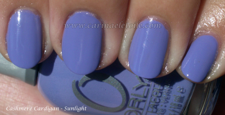
 IMO, it looks best with a top coat…don’t you agree? It just makes the color so much prettier!


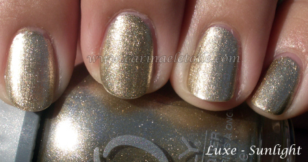
 Again, I like it better with the top coat…it just brings out the prettiness of the color.

 Hm. Jury’s out on this one for me.


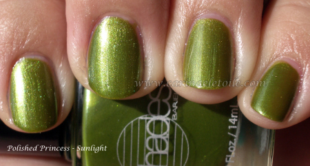
 Very pretty! 🙂