Orly – Cashmere Cardigan
Friday, 12 March, 2010
How pretty is this? LOVE IT!!! 🙂
Now I must wear Essie’s Angora Cardi on Monday…or tomorrow. 😉
Orly – Foil FX
Thursday, 11 March, 2010I’m currently wearing this on my nails – loving this shiny foil like effect!

Out of all the 3 Foil Fxes, this one flattered me the most and I loved it. I looked at it on me and the only thought that ran through my head was, “This reminds me of rose gold!”

It looked super futuristic on me, but I did like this…it reminded me of an old school Urban Decay I had about 15 years ago.

Not one my favorites…only because it’s too close to gold and I look awful in gold. Rose gold (I love it makes things have an antique-y feel to it!) is a bit cooler in tone so I find I tend to favor it than straight up yellow gold. When I looked at this color from a distance on me it really wasn’t very flattering for me.
It's like…Butter!
Monday, 8 March, 2010
One of those eponymous greys for this spring. It’s similar to Chanel’s Particuliere and Color Club’s High Society. This has a bit more grey than the others…it’s nice, but I def prefer Tramp Stamp.
I don’t know why but this color really had love written all over for me. It looks like a light raisin color in the sun, but it’s not. It’s truly a rich, gorgeous purple-y brown…freaking fabulous. The color is closer to real life in the shade shot. Isn’t it beautiful?
1) click the thumbnail you want to see, then click the same thumbnail again after it’s taken you to another page
2) Please excuse the badly mangled cuticles and lack of moisturizing on them…OPI said don’t use a base coat, don’t use a top coat, don’t use any lotions, etc while wearing this. Blah, blah, blah. I followed it for the most part…except on a few where they said “NO BASE COATS!!!” I used one. Bite me.
For the most part, I won’t be saying anything really because the pics really do speak for themselves. 🙂


IMO, it looks best with a top coat…don’t you agree? It just makes the color so much prettier!


Again, I like it better with the top coat…it just brings out the prettiness of the color.
As always, click the thumbnails to see the bad cuticles up close. 😉
I’m not partial to pastels and I guess Orly had to put up some pastels because well, it’s spring and what is that season without pretty happy colors for me to throw up on?
I did have problems on most of them. I tried different base coats and they still had a tendency to be a bit chalky and unpredictable. All were 2 coats aside form Cotton Candy. I think I had a bunk bunch of bottles. Oh well. *shrugs*

Pixy Stix – Shade (L) and Sunlight (R)
Not quite as bright as some other pinks out there, but…it’s got a pretty darn close neon factor.

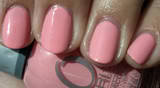
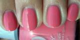
Cotton Candy – Shade (L) and Sun (R)
Dunno why, but I think ‘coral’ when I see this on me.

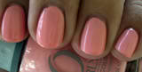
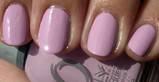
Gumdrop – Shade (L) and Sunlight (R)
I thought of China Glaze’s For Audrey when I put this on. Will amend post later to add in a comparison swatch

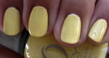
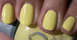
Lemonade – Shade (L) and Sunlight (R)
Just reaffirms my belief that I was never meant to wear pastel yellow OR yellow nail polish, period. Ever.

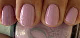
Lollipop – Shade (L) and Sunlight (R)
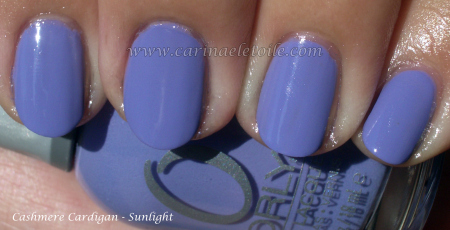
This reminds me of a lavender shade that’s been liberally doused with pink…

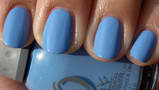
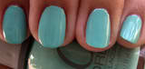
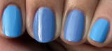
Snowcone – Shade (L) and Sunlight (R)
I thought it was a periwinkle color, but it’s more along the lines of a light turquoise.
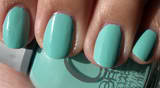
Snowcone vs China Glaze’s Secret Peri-wink-le
Pinkie and Index finger – Snowcone
Middle and Ring Finger – Secret Peri-wink-le


