Browsing Tag

green

comparison

Chanel vs Essie vs Rescue Beauty Lounge – Khaki Vert vs Sew Psyched vs Diddy Mow

Monday, 18 October, 2010

I had to do these three compared because next to each other (or as my friend Kristen from Rhode Island taught me, “Side by each!”) they were so blindingly close that I felt a little ripped off. In my excitement I didn’t take a picture of the bottle side by each, but I will soon and update this post.

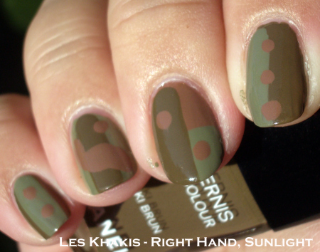
These three were definitely in the same color family, but I love the subtle differences…and I love that they’re cremes. Hope you fall for these military greens the way I did.


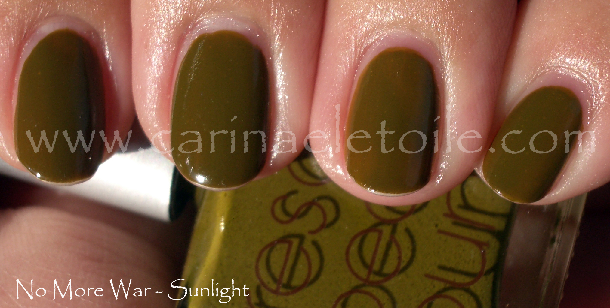
In sunlight you can see the obvious difference between KV, SP and DM. KV has more green while SP and DM have more grey in it. Mr. CarinaeLetoile was so cute when he looked at Khaki Vert on me and commented, “It’s really like a military green. I think Army when I look at it.”

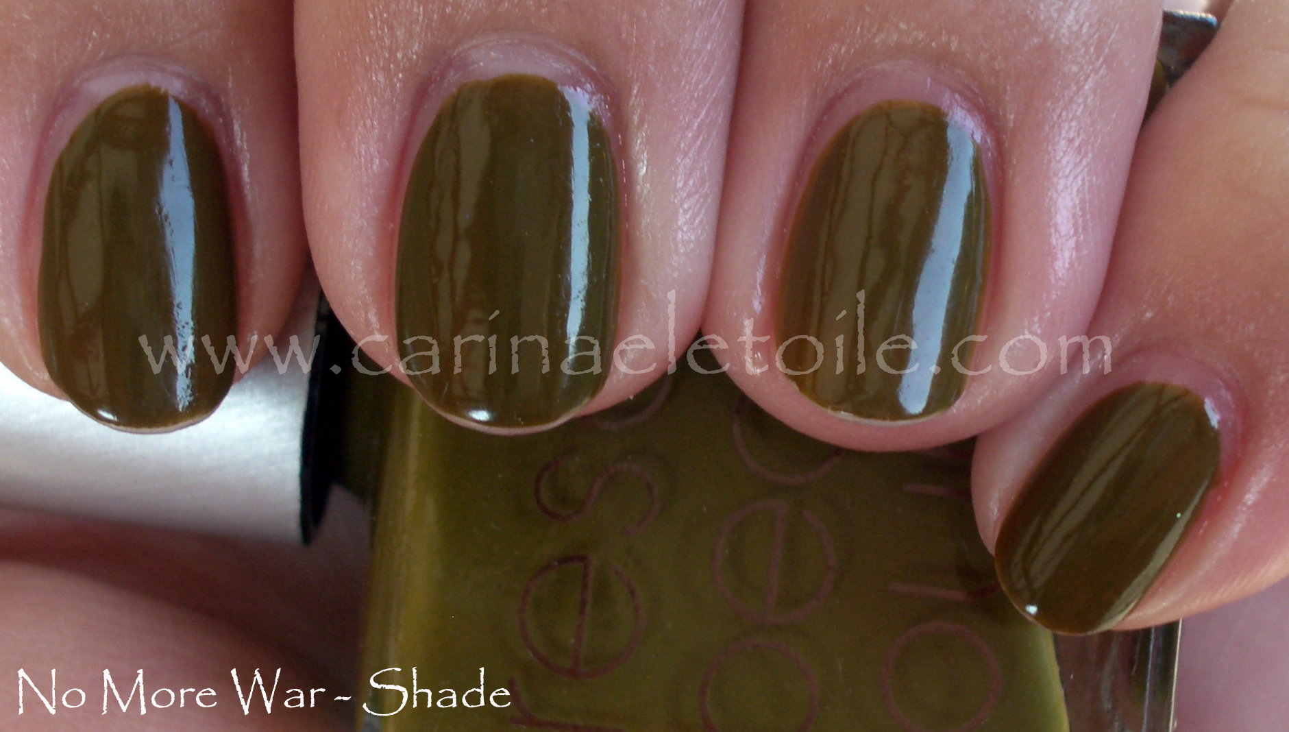
At first glance, SP and DM seem like dupes. But only in the picture. Both have an extremely faint shimmer in it. Both have a good amount of grey in it, but that is it. The difference in person is extremely subtle, but because I’m such a nail fanatic I know the difference – or so I tell myself. LOL I wore SP during the weekend, but kept KV and DM on my swatching hand. It was so subtle that no one could see the difference in the restaurants and dim places we went to this weekend. If you can grab SW, go for it. It’s a cheaper alternative to RBL’s DM. However, if you have DM no need to get SP. If you don’t have KV and want to get it…go for it. While I felt Les Khakis was a bit pricey, I felt it was well worth it.

Chanel – Les Khakis

Wednesday, 13 October, 2010

I was trying to play around with these colors. I am apologizing for my mega n00b attempt at nail art. I can add these to my epic fail manicures. 😀

This is why I just paint my nails and not attempt anything else.

I was surprised – this formula was like butta. It took a smidge longer to to dry but I suspect it was my ‘nail art’ that really made it take forever and a day to dry. After all the lemmings for Khaki Vert, I found I preferred Khaki Brun with my skin tone. In the end it was Khaki Brun that really looked green on me. I’m not slamming Khaki Vert because I did like how it looked on me as well, but for me it was Khaki Brun that was the star of the show. Khaki Rose was a bit…meh. It didn’t really look all that wonderful on me.

These were a hefty price to pay – $25 each. I am sure there are dupes/polishes that are similar out there to keep your wallet from screaming in pain.


Please pardon the lack of clean up and the dry cuticles. I wasn’t expecting to take a picture of my right hand but decided to at the last minute.

Nars – Zulu

Monday, 11 October, 2010

I had been wanting Zulu for a long, long time. But not for $100+ price tag I had seen on eBay. I wasn’t willing to pay $39.99 for it when I last looked. Why do that when I could wait 2 months and get it for under $20?

It was worth the wait. I don’t know how the original Zulu compares to the re-release, but I do love this version.

Drying time was a little slow, but 2 coats and this baby was lovely and luscious – a deep green, but not like OPI’s Here Today, Aragon Tomorrow. I felt like this was almost like a jelly, but the finish was so creme-y that I couldn’t make up my mind!

Absolutely fabulous and worth every penny. I ordered this online at www.nars.com along with 5 other colors from their retro collection. I can’t wait to show them to you. However, for now…here is Zulu!


Orly – 'Tis the Season – Holiday 2010

Friday, 8 October, 2010

Orly’s Holiday collection is filled with some pretty fun colors. I love the application and the glitter. The red creme and the color Naughty Or Nice is just wonderful. What I’ve done is try to layer some of the glitters over the cremes. It’s an epic fail, but you’ll still see it. 😀

All the colors dried quickly and were opaque in 2 coats. The glitters were wonderfully dense and very fun to look at on their own.

This is an image heavy post – beware.


How awesome is this red? It is freaking gorgeous and I’m happy to include it in Red Nail Polish Friday. On the middle finger is one coat of Winter Wonderland and on the ring finger it’s 2 coats.


2 coats of Winter Wonderland on three fingers and 2 coats of WW over Naughty or Nice. I love how WW really does remind me of snow.


Normally I don’t like golds like this, but for some reason I found I liked this a lot. Naughty Or Nice is on three fingers while G&G is on my pointer finger. G&G is a dense, heavy glitter. Removal wasn’t so bad! One coat of G&G over NON to see how it would look. Meh.


I thought this color was so fabulous in the bottle. Then I put it on me. All the initial beauty of it was washed out by my skin and the sunlight. It’s much, much prettier in person and the shimmer/glitter is well done.

I’ve heard that MMUTM is a dupe for Zoya’s Ivanka. I don’t think so. Below are pictures of Ivanka. Ivanka is lighter while MMUTM is darker, more of a holiday green.


Monday Morning Blue – OPI's Glacier Bay Blues

Monday, 4 October, 2010

I sometimes like and can tolerate Mondays. However, today with the overcast skies and funky cold weather, I can’t deal with it. I haven’t uploaded this swatch, but it’s been sitting in my archives for forever and a day. I busted out with it to cheer me up.

Great flashes of color – the base is a dark blue that’s a wonderful ocean color with flashes of green and just a host of other surprises that are good. The only truly bad thing is that this formula is OPI’s old formula. You know – formaldehyde, tuloene and ethyl blah blah blah. In short it’s not 3 free. And it stanks. Yuck.

Rescue Beauty Lounge No More War

Thursday, 23 September, 2010
Rescue Beauty Lounge No More War Sunlight

I missed the boat on the first round, but when Rescue Beauty Lounge No More War was re-released you can bet I was all over it. I am so glad I did.

While some hated Rescue Beauty Lounge No More War, on me when I was wearing it, I liked it and didn’t really care what others said.

I didn’t count on posting 3 Rescue Beaty Lounges in a row, but in case you can’t tell I am a huge fan. Formula on this was a bit runny, but it was opaque in two coats. Please don’t mind the heavy handed application on the ring finger. Loved that this dried super quick. I was done in under half an hour – that’s pretty darn good.

I know a few bloggers who are not fond of shades like this. They call them ‘poo’ colors. I saw this and just thought, “What a pretty olive green this is…” I’m so glad that I totally scored Rescue Beauty Lounge No More War.

Rescue Beauty Lounge No More War Sunlight.

Rescue Beauty Lounge No More War Sunlight

Now that you’ve seen Rescue Beauty Lounge No More War, do you feel like you’ve missed the boat on this? Will you be trying to find a way to get your hands on a bottle?

Rescue Beauty Lounge – Anne and Jane

Wednesday, 22 September, 2010

I was going to write something witty about the last two colors of RBL’s The Real Housewives of the Tudor Dyntasty, but I decided against it. I’m not feeling it right now, but I do like these colors.

Unlike the other 2 Catherines, these colors were runny and took a while to dry. Both of these colors are three coaters because they were thin coating, even when I went super heavy handed on the second coat.

Seriously pretty and gorgeous almost but not quite grey green. At least it looks grey green on me! Definitely a great color that Ji’s pulled off.

Crazy up close shot of the color in the bottle.

Super faint shimmer in this shot. So faint it was that I honestly thought it was the camera messing up. Then I looked at it again.

You can see the shimmer here and even the shimmer while it’s in the bottle. Very pretty. However, the color really isn’t me – doesn’t look good at all. Maybe I’ll learn to like the neutral colors, but this type of neutral doesn’t entice me. 🙁

Up close shot of the color in the bottle.

China Glaze – Cherish

Tuesday, 7 September, 2010

Every time I see this polish’s name, the lyrics for Madonna’s Cherish comes flying through my head along with the images of the video. Maybe it’s me. Maybe not. Then it inevitably flies out of my mouth…the sound an offensive emittance that in no way remotely resembles Madonna’s song at all. At. All. Consider yourself lucky I haven’t included an audio clip for with this post. Sadly, Mr Carinae isn’t as lucky as you. In closed capacity of our car, he has suffered my offkey singing…and I think he is now officially hearing impaired. Ooops. I thought I had the corner on that market.

Anyway, here is this frosty, shimmery minty green from China Glaze. I’m going to have to compare it to Leaf Him At The Altar because that’s what it reminded me of. I’ll make sure to include them at the bottom of the post.

For now, here is the Cherish-ed prettiness.

Ok, I was wrong about them being similar…my bad!