13 February, 2010
4:29PM
Let me first start out by saying that there hits and misses for me in this collection. There are some bright colors in here and that’s what I’ll be showing first. They hurt my eyes…big time. I definitely enjoyed the rest of the collection, too. Very pretty and very not what I expected. I had seen it on some other people, but on me…I fell in love. For once, there was no black nail polish involved. 😀
The formula itself was pretty good, too…I normally have issues with cremes because I am little miss heavy handed in application. You’ll see it here and there throughout the pics but overall no problems. Please excuse the messiness of the manicures. I’m normally a lot more careful in application, but all the colors and the excitement got to me. Haha. Sad, but true.
As always, click to make the pics bigger!
AÂ Good Man-Darin Is Hard To Find
Shade (L), Sunlight (R)
Yea, this was the brightness I was talking about…ouch. My eyes. They feel like burning!
Chop-Sticking To My Story
Shade (L), Sunlight (R)
Ok, for some reason, I loved this color…a lot. It’s not quite pumpkin orange on me and there is enough orange mixed in with a hint of brown that makes it very appealing. I normally would never wear something this color, but for some reason, this really made me excited!
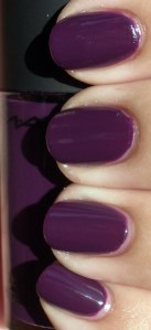
Dim Sum Plum
Shade (L), Sunlight (R)
While it wasn’t my favorite color, I was having flashbacks to their previous Fall 2009 collection’s color Ate Berries in the Canaries. I’ll do a comparison side by side if I remember to after I do a write up on all of these. 😀 I won’t swatch it but I will put my previous pics up. DSP is a pink that I think will go well with people who love these kinds of shades. I really have to be in the mood for this sort of color. While it’s fun to swatch, it’s not one I’d actively wear if given a choice.
Hot &Â Spicy
Shade (L); Sunlight (R)
Wow. In the bottle it looked like a bit of an orange coral. Out of the bottle and on me it looks like…an orange coral. Not me. So not me.
Red My Fortune Cookie
Shade (L) and Sunlight (R)
It’s not quite tomato and not maraschino cherry…It didn’t look bad on me, but it didn’t look good either.
Pearl of Wisdom
Shade (L); Sunlight (R)
Even in the shade the polish was able to capture a beautiful shimmer and give off a slight hint of the pinkness within. In the sunlight you can really see the prettiness. This is a sheer color and I think wearing it over a darker color would definitely be the best thing you can do with it.
Now this is where I think the Spring Collection starts to really shine…
Lucky Lucky Lavender
Shade (L) Sunlight (R)
This wasn’t quite as lavender as I was expecting. It’s really kind of…well, a pink lavender, don’t you think? I don’t know why, but the sun really washed out any hint of lavender in this color.
Panda-Monium Pink
It’s actually even prettier in person. I thought I had this confused with Lucky Lucky Lavender, but no…this was the correct bottle and swatch. I’m not a fan of pinks or pastels, but this didn’t stand out on my fingers like spring colored M&Ms. (BTW – love that I went a little nutso with the cleaning of my cuticle on my index finger?! Haha. Silly little Sally Hansen manicure clean-up pen.)


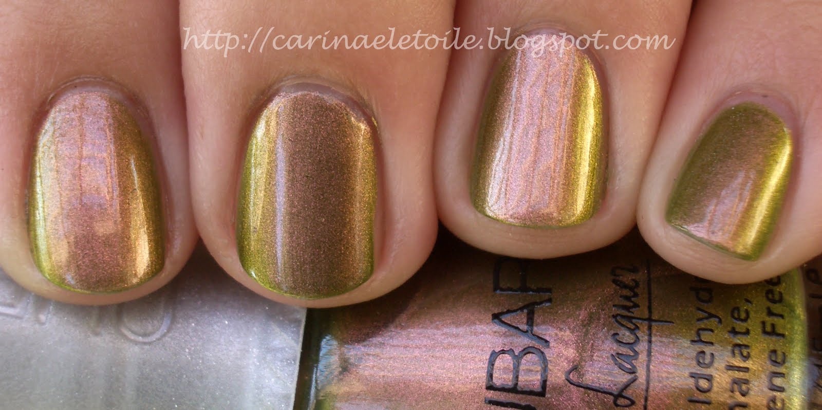
Meet Me On The Star Ferry
Shade (L) Sunlight (R)
Now this color…blew me away. Only because waaaay back in the mid 80s, I found a color by Sally Hansen that was very similar to this. I used it until it dried out and I threw it away. I never was able to get another bottle because for some reason, the jr high kid in me had managed to pick the ONEÂ color that was a limited edition. That alone should’ve been an indicator on my nail polish obsession…anyway, here it is, looking just as good, if not better than what I had in high school. Beautiful berry with a lovely shimmer running through it. The shot of it in the shade reminds me of my much loved and much lamented Chanel’s Brown Sugar. This color really defines the collection for me.
Bling Dynasty
Shade (L); Sunlight (R)
I LOL’d mightily at the name of the polish. I cringed when I saw it in the bottle, but I fell in love with it when I put it on. What a gorgeous shade of gold this is. Definitely a keeper in my book!
Jade Is The New Black
Shade (Top); Sunlight (Bottom)
What rockin’ shade of green this is…I have a dark green that’s more forest green and a light green…and a minty green. I don’t have this kind of green…and I’m in LOVE. Very very pretty.
Suzi Says Feng Shui
Shade (L); Sunlight (R)
This is a gorgeous teal/dusty blue. In fact, it was a color I wanted to paint the walls of our bedroom in but Colin said no. I guess I’ll have to settle for it on my fingers! 🙂


 Awesome…I can’t even put it into words…I just know I LOOOOOOOOOVE IT!!!!
 The more I look at this color, the more it reminds me of MAC’s Beyond Jealous. It’s still a gorgeous, gorgeous color.
 While a pretty purple, I still feel it’s a color I’ve seen before.
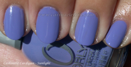


