Butter London – No More Waity, Katie
Tuesday, 5 April, 2011However, that does not pertain to nail polish – I know! Recently a friend of mine found 3 bottles of Revlon’s Perplex at Big Lots! So I now have Perplex to compare against Paradoxal and another color with a CND nail effect on top of it. YAY! Slowly but surely coming back to the polish love. I’ve also got 15 Zoya colors coming in and I still need to swatch the Intimate collection. Too much for a gal to do, in addition to doing taxes and the crazy job search…plus, little Rex had 2 seizures yesterday. Inherent to his breed (he’s a Cavalier King Charles spaniel), but still scary to see. He does bring lots of joy into my life and he’s my little guy. I’d be so heartbroken if anything bad happened to him.
I ramble. I’m sorry. Check out the pictures and review of this polish after the jump.
Butter London – Marrow
Thursday, 27 January, 2011Anyway…
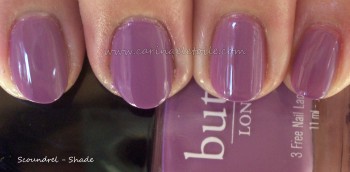
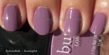
Butter – Scoundrel
Wednesday, 12 May, 2010It’s not a glitter, but a fabulous creme. I happened to like this shade because it’s that cross between a darker shade of pink with enough purple in it to fall into an almost pink/lavender category. However, this shade is richer and just more luscious. How can anyone not love this color?!
Application was a little lumpy and hard to work with on the first coat but it all worked out on the second. Still smells kind of nice and not like nail polish.
For Hubby – Butter's British Racing Green
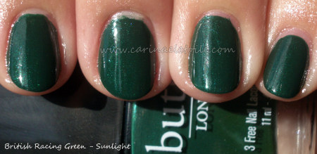
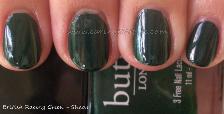
Wednesday, 28 April, 2010Butter London (oddly enough, it’s an American company!) came up with their version of it and called it…British Racing Green. It’s sexier, sleeker and one I’d gladly sport on my nails when I want a sexy green.
Even better news? Butter’s Three Free and claims they are vegan! 🙂 Just a small note – Butter doesn’t even smell like nail polish. It’s not harsh or overbearing.
Deceptive…yet lovely! Looks like another green polish here.
Then hello sunlight! Look at that subtle silvery/pearlescent-ish shimmer that runs through it and keeps it from being like the others!
It's like…Butter!
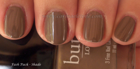
Monday, 8 March, 2010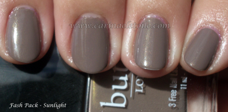 One of those eponymous greys for this spring. It’s similar to Chanel’s Particuliere and Color Club’s High Society. This has a bit more grey than the others…it’s nice, but I def prefer Tramp Stamp.
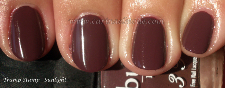
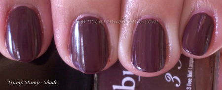
I don’t know why but this color really had love written all over for me. It looks like a light raisin color in the sun, but it’s not. It’s truly a rich, gorgeous purple-y brown…freaking fabulous. The color is closer to real life in the shade shot. Isn’t it beautiful?

