This is another image heavy post from me, so I’m just warning you now! I’m hiding them behind the jump.
Come on over and see what CG offers us for Spring 2011…
Let me preface these colors with this statement: The formula sucked. I had to do three coats on these colors unless otherwise noted. It was runny and extremely difficult to work with. I nearly called it a day and was going to skittle swatch them. I changed my mind and persevered…well, except for a couple of colors. 😀
Hope you like them.

 I know everyone raved about this green and I told myself I wasn’t going to be persuaded. Ok, I swooned a bit. I like this shade and it looked pretty darn good on me, too!

 Both colors (Sea Spray and Pelican Grey) had a nice shimmer…and both were eerily similar that I almost messed them up. Sea Spray is something I felt I saw before from Essie’s Northfork Collection from summer 08. The color then was called Sag Harbor. I may have to do a comparison!

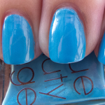
 Did some layering as you can see. First Mate is a pretty cool blue…and I really did like it. I liked it even more with CND’s Amethyst Sparkle on it! White Cap is, I feel, a layering polish and not a standalone, so I swatched one nail. Don’t hate me!

 White Cap. Two coats. Fairly sheer with gold microglitter. Definitely best as a layering polish. Maybe even a franken?

 Had I had the patience with this formula, I’d have done three coats. However, I was so exasperated to discover that I needed three coats on all the colors. This was two. I had to do two. I needed to save my sanity…or I’d have thrown these bottles against the wall. 🙁

 When I first put this on, I thought of the Wizard of Oh Ahz collection. Cowardly Lyin’. I was wrong. Cowardly Lyin’ is definitely more subtle and refined. This is very brassy when put side by side.

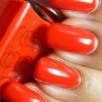
 I couldn’t make up my mind on this…and my camera was thrown for a loop. It’s a soft, muted orange in these pictures, but you have to see it in person. It actually has enough cool tones for me to pull it off. Most shades like this look awful on me.

 I didn’t know what to make of this, thinking they were going for a shimmery/glittery neutral. It didn’t look bad on me, but I was left scratching my head, completely baffled.

 I felt like I was yet another red creme that was a cooler shade of coral on me. After RBL’s Bangin’, this doesn’t wow me like it would’ve.

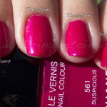
 Ahoy! was this really strange fuchsia. Normally fuchsia tones don’t look good on me and this really surprised me. It was great! The right amount of cool and popping shade of raspberry saved this from looking like Strawberry Field on me. Look for it in my blog – I wanted to *cry* when I saw Strawberry Field on me. It was awful. Marianna, this is one shade you can’t have. I’ll keep this Mrs. Roper color to myself! 😉