Luminescence is part of L’oreal’s Limited Fall 2010 Collection.
Formula was good and dried quickly. I had no problems with application and the brush was fine.
See below.


Obligatory label shot. 😀

Luminescence is part of L’oreal’s Limited Fall 2010 Collection.
Formula was good and dried quickly. I had no problems with application and the brush was fine.
See below.
Obligatory label shot. 😀
Because the purples spring out and get me when I least expect it.
OOTH is no exception. In fact, I wore this when I went to see Craig Ferguson this past Saturday at Davies Symphony Hall. I am loathe to take this color off my nails. I’m thinking of foregoing swatching for the week. This color is that gorgeous for me.
It’s this nearly black plum creme base with some lovely fine microglitter that just floats to the top and sits there, making the polish look purple…so effin’ gorgeous. It really is.
Wouldn’t you agree with me? Please do! 🙂


Fall 2010 is that collection for Orly…well, this one is – Space Cadet.
Where can I even begin? I was rendered speechless on the first coat. Then on the second? I just could not stop staring. The color change, the glitter, the glitz oh my!
The formula was really one that I think a lot of polishes should strive for if they’re going to do something like this – fast drying and easy to work with. I did 3 coats because I was really curious to see how it would look past 2 and it really was just flat out gorgeous. I didn’t need a third coat. It was like gilding the lily.
Ok, I’ll stop raving and just show you the mother lode of pictures I took.
Small note – I honestly thought that this was close to a Nubar shade called Wildlife…Wildlife is this awesome duochrome color that is gorgeous in and of itself and I felt that Space Cadet is the pumped up rocker chick sister version of it.
Pic spam commences…NAO!


What wasn’t conveyed in the sunlight shot was this freaking AWESOME play of black and pink/purple glitter. It was really hard to capture.
Nubar’s Wildlife is below – the shade shots of Space Cadet above is what made me think of this color.


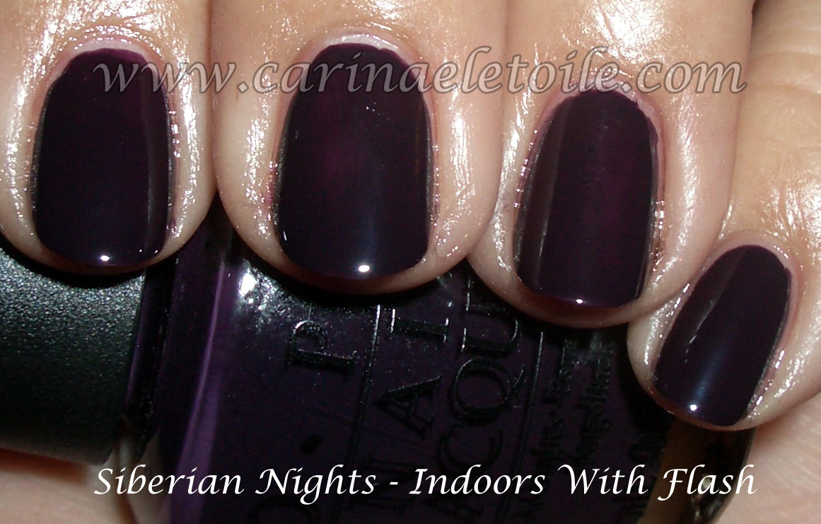
You can still find some of these colors, but not all, should you decide to go on a hunt for them. I will re-swatch these (along with the French Collection) with proper lighting. For now, settle for the indoor and flash only.
I rocked Russian Navy for so long that I have 3 – yes THREE – bottles of them.


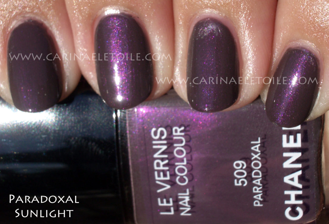
Revlon’s color, Rock, is part of their fall collection…I couldn’t get the glitter companion for it because it was sold out. I still love this purple, though. I’m sure the glitter would’ve rocked it.
Here is Rock on me and then a comparison with Paradoxal on my thumb.
Formula: Wonderful and fast drying. Opaque on the second coat. Pity their brush was all jacked up.


Less than 24 hours after putting on the polish, the color chipped on the right hand – the pinky and the ring finger. It was marginal chipping and I honestly believed that it would just get worse. I was concerned that I would have mega ghetto nails after 48 hours. Such was not the case.
I took the picture exactly one week after application. I like to think it was the awesome base coat that I used (Hello, Nubar!) and the top coat (Posche, fast drying) that helped contribute to the longevity of the manicure.
Not bad after 7 days, right? It could’ve been much, much worse.

I received this for my birthday after I played with it in Nordstrom a few weeks ago. I wanted this color. Seriously obsessed over this color. Thought I would DIE if I didn’t get this color. Was seriously going to maim the person closest to me if I didn’t get this color.
I got it and … this formula is perfect. Much better than previous Chanels. It didn’t bubble, it dried fast and…it’s so me. I’ve made no secret that my first true nail polish crush came about 15 years ago with Chanel’s Rouge Noir (aka Vamp) and Brown Sugar. I seriously could not get enough of those colors…and then they were discontinued.
Here we are again and I want to have a back up bottle of this shade…I am going to wear this until the bottle no longer has polish in it! This color is something that spoke to me and I hate the thought of spending $23 on a bottle of polish when I can purchase so many more brands that are historically better in their formulas than Chanel.
Ok, I’ll shut up and just show you the fabulousness of this color.
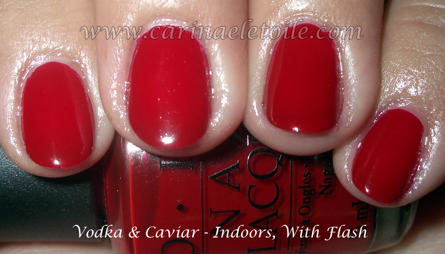
Now that I’ve got Vodka and Caviar, I really do love it. I know it looks like every other OPI red out there and face it – OPI has always gone overboard on red. I know I’m not the only one to complain about it. 😉
So here is OPI in their full, overkill red glory…which they’ve called Vodka and Caviar. Their other color that I love is Catherine the Grape.


Catherine the Grape is a very pretty purple with a plum/red shimmer running through it. It is definitely a gorgeous color! I’d say it’s one of the must haves of this collection.
