Browsing Tag

OPI

OPI – Yodel Me On My Cell

Wednesday, 3 November, 2010

Pretty, pretty blue….how I do love you.

Please excuse the VNL – I tried a new technique on application and it failed me. I’ll try it again later, but if it keeps failing me I’ll go back to how I used to apply.

This formula was thin and a bit moody. I had to do 3 coats to get it to look this color, but you can still see nail line. Grr. It dried quickly, that was one of the saving graces…oh, and the brush wasn’t jacked up, either. YAY!

I’ve heard this shade described as an aqua blue, but it doesn’t really remind me of any kind of aqua nor does it remotely remind me of the sea. I kept thinking, “TEAL! Teal light.” However, the shimmer in this is just freaking fabulous. I mean, Rachel Zoe shut it down, I DIE kind of fabulous.

As always, keep clicking the thumbnails because the pictures get HUGE. These are merely thumbnails. The one downside to making the picture the original size is that you really see all the imperfections in my nails and in application. Oh well. That’s a risk I’m willing to take.

PS I’m still squeeing a little bit for my Giants! I’m TiVo’ing the parade and will watch with hubby when he gets home tonight…he took caltrain in to work and said the place was a MADHOUSE. Good thing I opted to drop him off at the Santa Clara Station, but even then, it was insane. I retweeted the picture and you can find it in my twitter feed in case you’re interested.

OPI – Burlesque, Part II, Holiday 2010

Friday, 15 October, 2010

If I had to choose, I would definitely pick the glitters over this part of the collection. I’m not saying this half is not up to snuff, but when I think Burlesque, I do think of sequins and shiny under the lights…a lot of sparkle and flash.

This half is subtle but still gorgeous.

This post is image heavy…you have been warned!

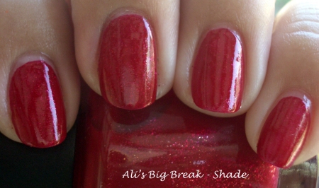
Hello, Friday Red. What isn’t visible in the picture is the pink undertones. I’m looking at the bottle right now and the pinkness isn’t shown. I love the faint shimmer that makes if glow. Bravo, OPI!
 

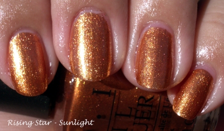
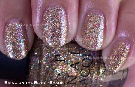
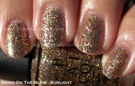
Bronze-y orangey goodness…I can’t believe this actually looked good on me!


It looks so different in these two pictures, but I assure you they’re the same ones. Sunlight made it appear a more deeper gold. Absolutely gorgeous!
 

A hot magenta.
 

I honestly thought this color from OPI (The Show Must Go On!) would be a clone for MAC’s Bad Fairy. It’s not. Not even close. BF is more on the orange side, while TSMGO is more on the pink/magenta side. Both share the same orange glass flecks. I had to do 3 coats of BF while OPI’s formula was wonderfully opaque in 2 coats. Though vastly different, there are enough similarities to make them seem almost identical. Owning both would be wonderful, but owning either of the two is still good enough.

I’ve posted this comparison before, but to not include it would be silly because Tease-y Does It is part of the collection. You can read more about Tease-y Does It here.

OPI – Burlesque Part I, Holiday 2010

Thursday, 14 October, 2010

For some reason, I was so enamored with these glitters, knowing full well I hate glitters…yet I just had to have them. They’re a pain to remove, no matter how much foil you use. I’m a sloppy glitter remover. I get frustrated using foil and I end up with the sparkle explosion all over my fingers, as you will see in the pictures.

The formula was easy to use. It dried quickly – yay! No clunky, clumpy glitter. I did two coats of every color. My only regret is that I didn’t do three coats to get the full on glitter effect.

I am going to be doing a blog give-away of these 6 colors. They’ve been swatched once, but I just really don’t want any extra glitter in my collection unless absolutely necessary. So keep watching for the giveaway.

I do like how these glitters look – they’re dense and it’s glitter that’s suspended in clear lacquer. I am generally not a fan of that, but it definitely makes the glitter sparkle and pop. I’ve done some comparisons to OPI’s Absolutely Alice and Mad As A Hatter for a point of reference.

Warning: This is image heavy…you have been warned!


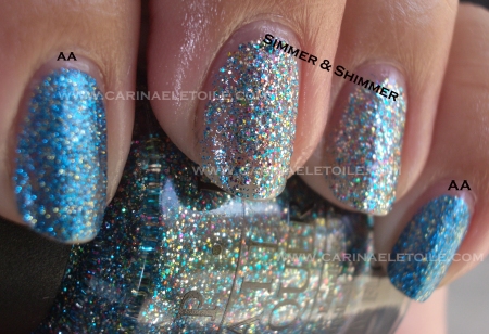
I thought this was really close to Absolutely Alice, but it seems I was wrong. So wrong. The glitter in AA is more fine and dense.  The color is also far more popping. Simmer & Shimmer is a bit more subtle…well, as subtle as this whole collection of glitters can get. 🙂


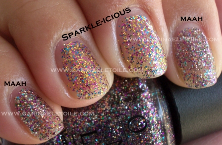
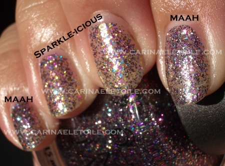
I feel like the colorful glitter in here is the same – filled with red, purple and a plethora of other colors. However, the one big difference is the base glitter they used. Mad As A Hatter is silver based whereas Sparkle-icious is gold.


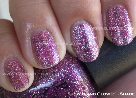
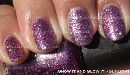
I’ve been on a purple kick lately. What appeals to me about this particular color/glitter is that it’s not quite purple and it’s not quite pink. Several years ago I was on a purple and pink design sprees for my jewelry. It sold quite well. I guess I wasn’t the only person who loves purple and pink together.


I love this green. It reminded me of the super tiny limes I used to see in India. It’s not the rind, but the inside of the lime…and I always said I wanted a creme in that color. Instead, I’m looking at the sparkling version of it. LOVE IT!


Currently wearing this on my nails and on me, it looks more salmon colored than orange. This mercifully is not a crazy Halloween orange, but a nice rich burnt orange. The gold glitter thrown in is absolutely fabulous.


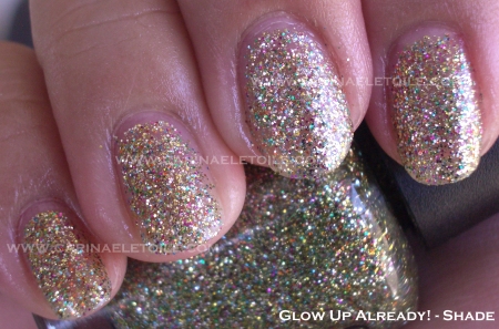
How pretty is this? I was a bit overwhelmed by the sheer amount of glitter, but this one really made me consider liking gold in general.

OPI Tease-y Does It vs Nubar Raspberry Truffle

Tuesday, 12 October, 2010

Got my Burlesque glitters. Got the rest of the Burlesque collection, too. I was thrilled because OPI really outdid themselves on the glitter collection for Christmas 2010. I hate glitter, but I had to have these. Anyway, the one color that really had me holding my breath was Tease-y Does It.

I was so happy to have finally been able to put Tease-y Does It on my nails. It looked totally gorgeous in the bottle, but in the back of my mind a tiny voice was saying, “You have something like this…You have something like this…”

I was like, “Shut up. Shut up. No, I don’t.” Conversations with yourself really doesn’t bode well, but at least I wasn’t talking out loud.

Then I started doing a re-org of my 2 Helmers (I am going to need a 3rd now, btw) and started a drawer for Nubar…What is this? Raspberry Truffle? It looks like…No, it can’t be. Ce n’est pas vrai! Non. Mais oui, mes amies. Mais oui.

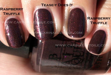
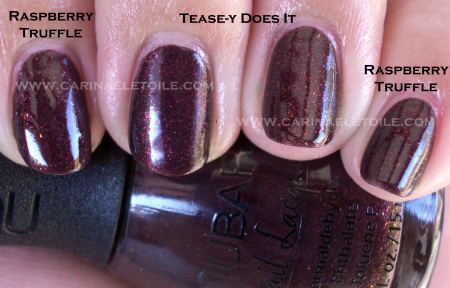
I actually dare to call OPI’s Tease-y Does It a dupe for Nubar’s Raspberry Truffle.

Don’t weep if you can’t get Tease-y Does It. Nubar still has Raspberry Truffle on their site.

OPI’s formula was the winner of the two. While both were easy to apply with no problems, RT tended to take about five minutes longer to dry than TDI.

Check out the dupeness for yourself – RT is on the pointer and pinky while TDI is on the ring and middle fingers.

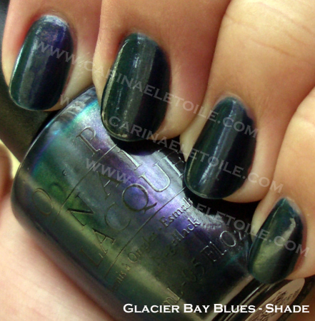
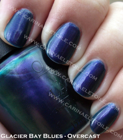
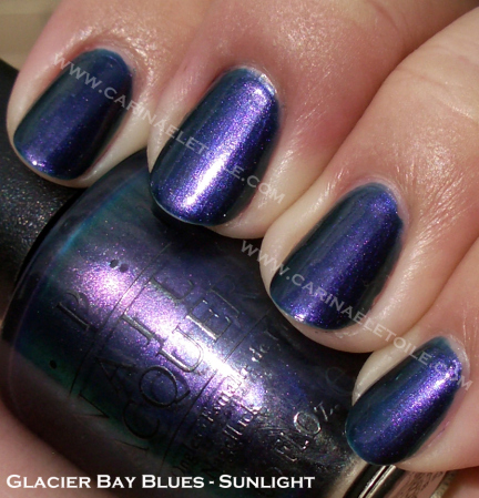
Monday Morning Blue – OPI's Glacier Bay Blues

Monday, 4 October, 2010

I sometimes like and can tolerate Mondays. However, today with the overcast skies and funky cold weather, I can’t deal with it. I haven’t uploaded this swatch, but it’s been sitting in my archives for forever and a day. I busted out with it to cheer me up.

Great flashes of color – the base is a dark blue that’s a wonderful ocean color with flashes of green and just a host of other surprises that are good. The only truly bad thing is that this formula is OPI’s old formula. You know – formaldehyde, tuloene and ethyl blah blah blah. In short it’s not 3 free. And it stanks. Yuck.

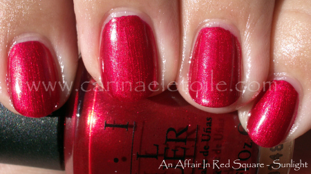
OPI – An Affair In Red Square

Friday, 24 September, 2010

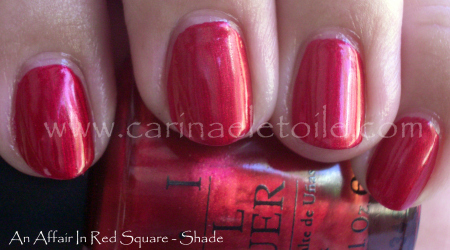
I finally found this color amongst some other bottles I hadn’t sorted and organized…and it’s a pretty one, isn’t it? I still prefer cremes and I think this would’ve been a lot better had it not been for the shimmer. It’s a bit on the pink side and I’m fairly ok with that.

Formula was good, but the brush was jacked up. I took a picture of the brush, meaning to post it. I’ve decided that I will post pics from here on out of my OPI bottles with messed up brushes because I find it’s OPI who has the worst quality control when it comes to their brushes.

In the meantime, enjoy Red Nail Polish Friday! 🙂

Epic Fail Manis

Tuesday, 14 September, 2010

I do try things on my nails other than just swatching and wearing colors. So horrified I was by my attempts, I took pics with my phone. I didn’t bother busting out with the camera trying to take a perfect picture of my failure.

As you can see from below…

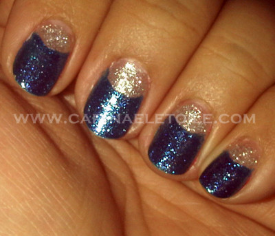
Epic fail moon manicure taken last year…I used China Glaze’s Dorothy Who? and China Glaze’s Tinsel.

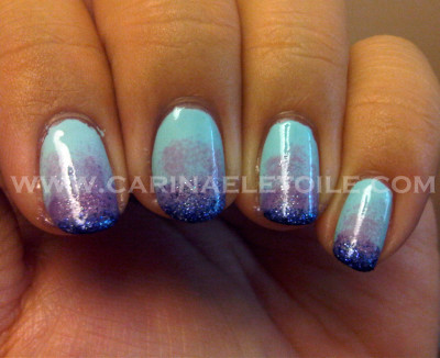
Epic fail gradient manicure.

This was the most frustrating for me. I kept at it for 3 days. This was my final attempt. I said “F— it.” after my last try. It doesn’t help that I have tiny nail beds.

I used Finger Paints’ Blissfully Blue, OPI’s Done Out In Deco, China Glaze’s Grape Juice and Finger Paints’ Easle-y Entertained (it’s the dark glitter).

Finally…this one wasn’t so hideous, but it still was a massive disappointment.

Nail tape n00b alert! Yea, I used nail tape. What of it? I knew better than to try and freehand it…well, after I had freehanded it. I used Finger Paints’ Harvest Hues and OPI’s Damone Roberts 1968.

China Glaze – Cherish

Tuesday, 7 September, 2010

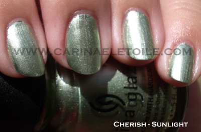
Every time I see this polish’s name, the lyrics for Madonna’s Cherish comes flying through my head along with the images of the video. Maybe it’s me. Maybe not. Then it inevitably flies out of my mouth…the sound an offensive emittance that in no way remotely resembles Madonna’s song at all. At. All. Consider yourself lucky I haven’t included an audio clip for with this post. Sadly, Mr Carinae isn’t as lucky as you. In closed capacity of our car, he has suffered my offkey singing…and I think he is now officially hearing impaired. Ooops. I thought I had the corner on that market.

Anyway, here is this frosty, shimmery minty green from China Glaze. I’m going to have to compare it to Leaf Him At The Altar because that’s what it reminded me of. I’ll make sure to include them at the bottom of the post.

For now, here is the Cherish-ed prettiness.

Ok, I was wrong about them being similar…my bad!