10 February, 2010
11:23PM
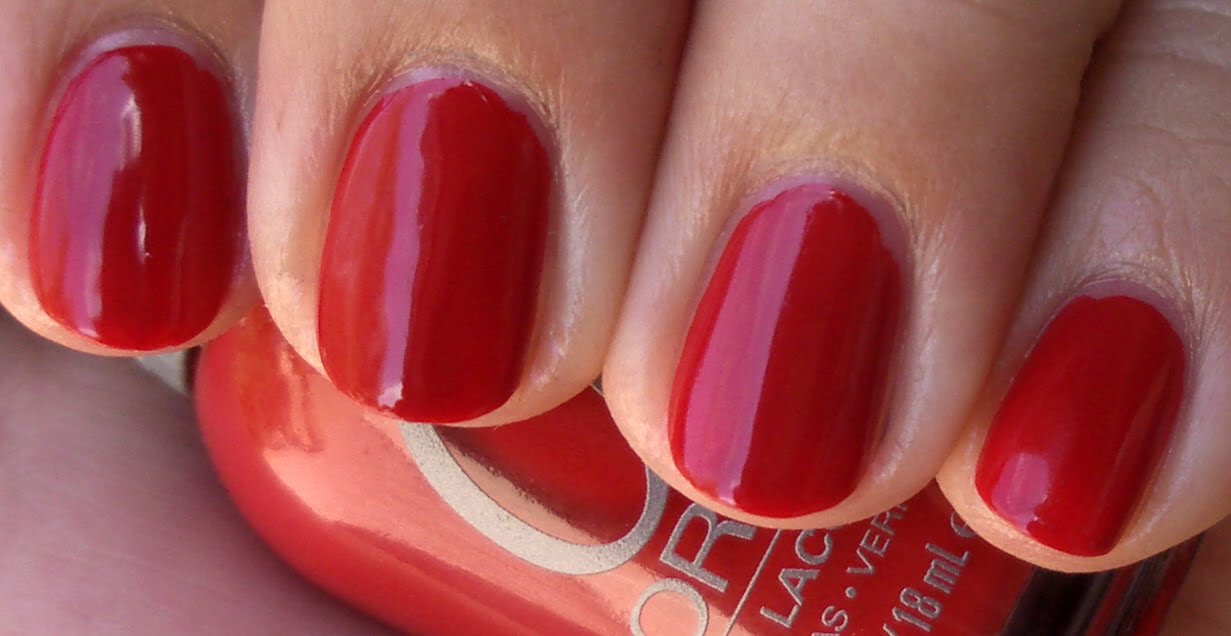
So I made a trip to the drugstore and my friend also sent me some drugstore polishes…
I also did a comparison of OPI’s Done Out In Deco and Rimmel’s Commander in Chic.


Index and Pinkie: OPI’s Done Out In Deco
Middle and Ring: Rimmel’s Commander in Chic
I love mushroom-y taupe-y colors and was thrilled when I saw Commander In Chic. It cost $3.99 and was well worth it. It’s not breaking the bank, but I know some people have issues with paying more than 99 cents for a bottle of nail polish. I don’t know why I thought CIC was similar to OPI’s Done Out In Deco, but I put whatever it was I was smoking down and saw it all clearly. I’ll have to compare OPI’s You Don’t Know Jacque with CIC and see how it stacks against it each other.


Street Wear by Revlon: Scheming
I was so surprised that I really liked this color…I mean really liked this color. There are little gold sparks that show up when in direct sunlight. Application was mega easy and dried quickly. Pity this line was discontinued.


Rimmel’s Marine Blue
These types of shades always reminds me of the ocean…I know it’s meant to, but I love colors like these. It’s a pity they don’t look good on me, though. Ugh. I am going to be sending this color to my friend Lauryn.


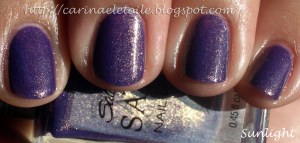
Sally Hansen’s Arabian Night
A gorgeous purple polish with some rockin’ gold glitter to break up the purpleness. To be honest, I think the purple would’ve been really pretty without the gold glitter. Nonetheless, it’s still a gorgeous polish all together…pity it’s a real pain in the butt to remove thanks to the glitter. Not as bad as China Glaze’s Dorothy Who? in removal, but darn close!