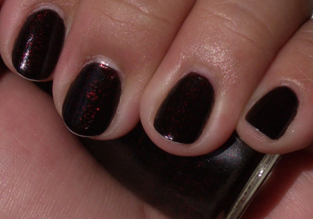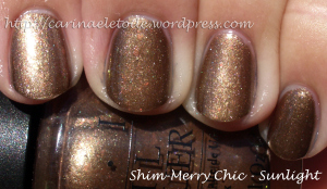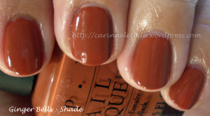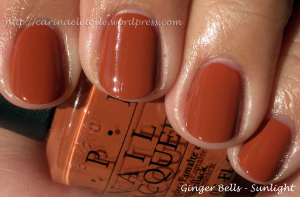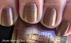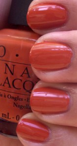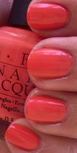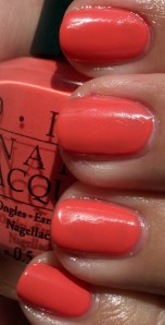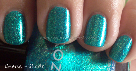
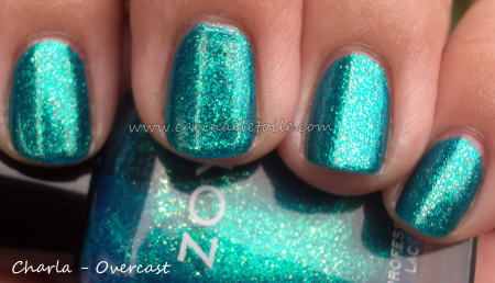
 Boo over cast days! Did my best to get what I could, but the shade and overcast are frighteningly similar. Much as I loved this color, it’s not for me. I should’ve known better! However, I can still believe it’s a gorgeous, gorgeous color…just not on me.
China Glaze – Sour Apple and Electric Lilac
Thursday, 1 April, 2010Surprise~ April Fool! Only fool here was me thinking these colors would rock it on my nail. Only saving grace for these? They dried quickly.
Yea. Hm. With a name like Electric Lilac, I expect you to be electric. And lilac. I wouldn’t quite call this lilac. I would venture to call this a light purple. Glitter was ok on it, but this wasn’t worth the few dollars I shelled out for it. Maybe I didn’t shake it enough. Nah, I know I did. This was the color at 3 coats. I wasn’t in the mood to go for 4.
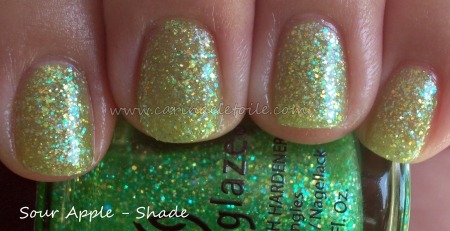
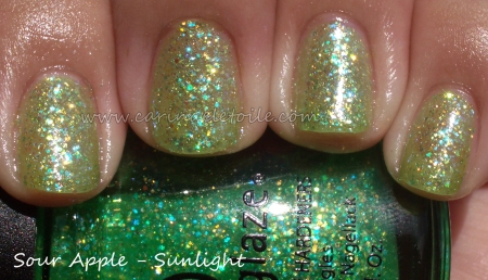 When I put this on, I kept thinking, “Wow…delayed St. Patrick’s Day for me.” Flecks of green and gold glitter suspended in a not quite neon green jelly base. I think I’m getting too old and fussy for certain types of glitter. I can accept that. This didn’t wow me.
Orly's Goth & Barielle's Slate of Affairs
Tuesday, 23 March, 2010
 So the little black nail polish wearing, corset sporting, goth girl at heart loves this color…and not because of the name! I’ve always had a tendency to lean towards dark nail polish and this is no exception…even if it has glitter. What I love about this is actually the glitter…it’s silver against black – yay!! – but not only that it’s different sizes: big, medium and small. Very cool. What a way to play on glitter, Orly. Smart move!

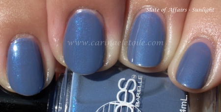 I am so sweet on this blue gray. I wish I could carry off gray nail polish and I wish I could carry off some of the blues I see out there…and this is a perfect compromise! This concrete blue hints at periwinkle, too. It’s got a mild blue shimmer that runs through it, making this blue-gray a total winner in my book!
Zoya Polish
Monday, 15 March, 2010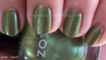
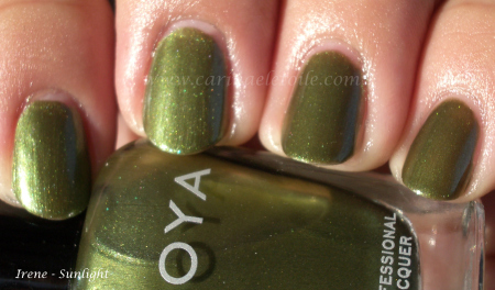 I keep looking at this color and thinking, it’s the sister to Midori! I’m going to have to do a comparison swatch…it’s darker, edgier with a lovely golden shimmer. It warms it up enough but doesn’t detract from the coolness of the color – if it had been too warm it would look like green pewp on me.
And no it’s not like Midori – my bad! Midori is lighter and more golden…but still gorgeous. 🙂
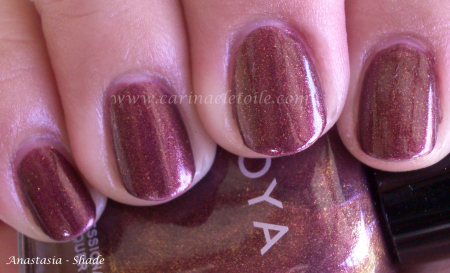
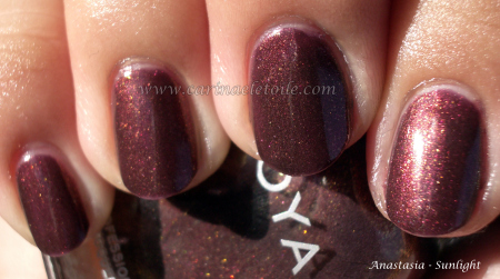 I was having China Glaze flashbacks when I put this on. This is suspiciously close (at least in color and shimmer) to CG’s Lasso My Heart… Oops, compared swatches and I’m wrong. This is richer, fuller…much prettier. I definitely prefer Zoya’s take on this.
Note on the formula – these were 3 coaters for me. 2 looked ok, but 3 really showed the true beauty of these babies…and look ma — NO BUBBLES! It dried fast and smooth.
Will be doing more Zoya colors during the week because I ordered quite a few when we got our tax return. 😉
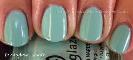
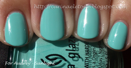 China Glaze’s tribute to Audrey Hepburn. They made a Tiffany blue just for her. As some or most of you know, Tiffany’s holds the patent for the blue so you can only get close to replication, but not the actual blue…or green. Or whatever color it is.
Indoors, no Flash (Top) and Indoors with flash (bottom)
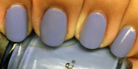
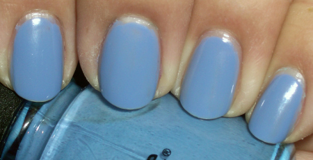
Oddly enough…I really liked this color. It is a true periwinkle. While this color never looks good on me in reality, in my head I say it looks fabulous and keep on wearing it. 😀
Indoors, no flash (top); Outdoors (bottom)
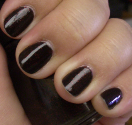
Not one of my favorite colors. I thought this was the ghetto cousin of Midnight In Moscow. Yea, I went there.
Nubar's Cleopatra Collection – Part II
Sunday, 28 February, 2010
 The glitter in this very pretty purple isn’t as obnoxious as say…your regular glitter type of polish. It’s still a pita to remove, though! But it’s nothing like OPI’s Absolutely Alice or anything like that. Thank God! It’s a bit of a reddish purple that some may find very appealing

 I look at this color and think…disco roller derby night. Those scary satin shorts. Tube tops. I don’t know why those images flash into my head. Yet, they have and they remain there…Hm…the shimmer in here is so strong it makes it almost like a metallic, doesn’t it? This color reminds me more of a raspberry than a purple, to be honest. Well, at least it looks that way on my skin! 🙂

 Good googalamoogala! The shimmer in this bad ass baby saved it from being a flat out boring purple creme. Well, to be honest, I think it would’ve been a gorgeous purple creme on its own, but the subtle shimmer in it makes it so purty!

 Oh. My. Stars. Oh. My. Goodness. While this color reminds me of Yoga-Ta Get This Blue (it’s that micro shimmer/glitter thing going on in the polish), it’s the darker more seductive cousin of the two. I’ve always been a sucka for dark nail polish and this truly made my heart sing! A beautiful indigo that has some gorgeous reddish/purple shimmer/glitter thrown in…OMG – *swoons*Â You’ve got to see the full technicolor blown up pic of this – click the thumbnail for the sunlight version. It will take you to another page with the same image. Click on the image and the pic will be HUGE and you can see the absolute detail on this gorgeous, fantabulous, kick a** color. I’m serious! It’s that freaking gorgeous to me.
OPI Holiday Collection 2009 – Holiday Wishes – Part II
Friday, 26 February, 2010Spring 2010 – OPI’s Hong Kong Collection
Saturday, 13 February, 20104:29PM
Let me first start out by saying that there hits and misses for me in this collection. There are some bright colors in here and that’s what I’ll be showing first. They hurt my eyes…big time. I definitely enjoyed the rest of the collection, too. Very pretty and very not what I expected. I had seen it on some other people, but on me…I fell in love. For once, there was no black nail polish involved. 😀
The formula itself was pretty good, too…I normally have issues with cremes because I am little miss heavy handed in application. You’ll see it here and there throughout the pics but overall no problems. Please excuse the messiness of the manicures. I’m normally a lot more careful in application, but all the colors and the excitement got to me. Haha. Sad, but true.
As always, click to make the pics bigger!
Shade (L), Sunlight (R)
Ok, for some reason, I loved this color…a lot. It’s not quite pumpkin orange on me and there is enough orange mixed in with a hint of brown that makes it very appealing. I normally would never wear something this color, but for some reason, this really made me excited!
Shade (L), Sunlight (R)
While it wasn’t my favorite color, I was having flashbacks to their previous Fall 2009 collection’s color Ate Berries in the Canaries. I’ll do a comparison side by side if I remember to after I do a write up on all of these. 😀 I won’t swatch it but I will put my previous pics up. DSP is a pink that I think will go well with people who love these kinds of shades. I really have to be in the mood for this sort of color. While it’s fun to swatch, it’s not one I’d actively wear if given a choice.
Shade (L); Sunlight (R)
Wow. In the bottle it looked like a bit of an orange coral. Out of the bottle and on me it looks like…an orange coral. Not me. So not me.
Shade (L) and Sunlight (R)
It’s not quite tomato and not maraschino cherry…It didn’t look bad on me, but it didn’t look good either.
Shade (L); Sunlight (R)
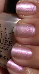
Even in the shade the polish was able to capture a beautiful shimmer and give off a slight hint of the pinkness within. In the sunlight you can really see the prettiness. This is a sheer color and I think wearing it over a darker color would definitely be the best thing you can do with it.
Shade (L) Sunlight (R)
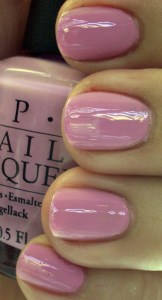
This wasn’t quite as lavender as I was expecting. It’s really kind of…well, a pink lavender, don’t you think? I don’t know why, but the sun really washed out any hint of lavender in this color.
It’s actually even prettier in person. I thought I had this confused with Lucky Lucky Lavender, but no…this was the correct bottle and swatch. I’m not a fan of pinks or pastels, but this didn’t stand out on my fingers like spring colored M&Ms. (BTW – love that I went a little nutso with the cleaning of my cuticle on my index finger?! Haha. Silly little Sally Hansen manicure clean-up pen.)
Shade (L) Sunlight (R)
Now this color…blew me away. Only because waaaay back in the mid 80s, I found a color by Sally Hansen that was very similar to this. I used it until it dried out and I threw it away. I never was able to get another bottle because for some reason, the jr high kid in me had managed to pick the ONEÂ color that was a limited edition. That alone should’ve been an indicator on my nail polish obsession…anyway, here it is, looking just as good, if not better than what I had in high school. Beautiful berry with a lovely shimmer running through it. The shot of it in the shade reminds me of my much loved and much lamented Chanel’s Brown Sugar. This color really defines the collection for me.
Shade (L); Sunlight (R)
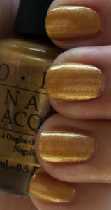
I LOL’d mightily at the name of the polish. I cringed when I saw it in the bottle, but I fell in love with it when I put it on. What a gorgeous shade of gold this is. Definitely a keeper in my book!
Shade (Top); Sunlight (Bottom)
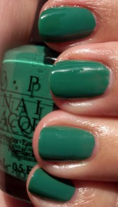
What rockin’ shade of green this is…I have a dark green that’s more forest green and a light green…and a minty green. I don’t have this kind of green…and I’m in LOVE. Very very pretty.
Shade (L); Sunlight (R)
This is a gorgeous teal/dusty blue. In fact, it was a color I wanted to paint the walls of our bedroom in but Colin said no. I guess I’ll have to settle for it on my fingers! 🙂


