


I couldn’t make up my mind, so I ended up just trying on Knight’s Armor, then deciding to swatch it. So it’s a sloppier than usual application for ALL these swatches. I just got a little too excited.
As for the Damone Roberts one, I had originally been wearing Knight’s Armor on my left hand and DR1968 on the other. Hah. I liked how DR1968 looked on my right hand, so I took off KA (as you might see some glitter in the DR1968 swatch) and now all my fingers are sporting DR1968…with one lone exception: my thumb. That has Nubar 2010 on top of it. I was all over the place today.

Thumbshot – Damone Roberts 1968 with Nubar 2010. Regular Shade and Sunlight shots below!


I was fully prepared to NOT like this color. I put it on…and I really liked it. I bought a few extra bottles because I plan on having a give away here soon, so stay tuned. Anyway, this formula was slightly thicker than the usual OPI but what I liked most is that it dried fast, which is unusual. This is 3 coats because I suck at applying nail polish.


I think my really bad photography skills came into play here. I feel like I made this polish look ugly. It’s not. It’s so gorgeous. I wanted to compare it to Orly’s Goth, but it wouldn’t be fair to either of the polishes. This glitter is all one size and the base for this is a bit more dark grey. Also, there is more glitter in this than Goth. Orly’s Goth is a black base with different sizes of the glitter. This was truly fabulous. Knight’s Armor is part of Nubar’s Fortress Collection.
The formula dried quickly and wasn’t as gritty due to the glitter. I have the Sparkles collection as well and that glitter collection is beautiful, but it’s so dense that when I applied a top coat, it never was a full glossy shine. You’d end up seeing and feeling the texture of the glitter underneath.
I’ll be swatching Nubar’s Fortress Collection soon, but in the meantime, I just had to get this pretty color out there and into my swatch blog.
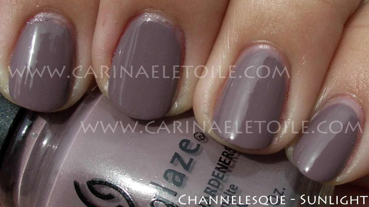
This is in the same color palette as Butter’s Scoundrel – a very pretty creme that’s a pinky-purple.
What do you think?
Personally I found this was a bit lighter, more delicate. See below. 🙂


It’s not a glitter, but a fabulous creme. I happened to like this shade because it’s that cross between a darker shade of pink with enough purple in it to fall into an almost pink/lavender category. However, this shade is richer and just more luscious. How can anyone not love this color?!
Application was a little lumpy and hard to work with on the first coat but it all worked out on the second. Still smells kind of nice and not like nail polish.


MAC’s formula dried quickly and was not opaque on the first coat. With the initial application it was kind of gross – it looked like…well, poo. I’ll stop right there and let your imagination fly.
Once again, SB’s formula is superb – flawless application, fast drying and opaque when it should be. Strange Beautiful would be my favorite brand, but the fact that they’re limited editions and don’t come out with nearly enough colors to appease me bumps them to the bottom part of my top 7 fave brands.
Enough of the rambling, on to the polish!


Oddly enough, this color looked fabulous on me!

This was a gorgeous color and I really liked seeing it on me. I didn’t put a top coat on this because I forgot to. I had been in a rush. Oops. Sorry it’s not as shiny and perty as it could be!
I was able to swatch these yesterday and I pretty much fell in love with all of the OPI Shrek collection. I like kind of odd, close to putrid colors…plus, these were crèmes, how can anyone not love crèmes?! Formula wise it was a dream – went on well with minor problems and dried fast. Yay! It’s a win, win all around.
OPI Shrek consists of 3 dark colors (blue, purple and green) and 3 not-quite-pastel, but I felt they were to complement the darker colors. Like a mani/pedi combo for the summer thing. Very tips and toes! Come and see what I’m rambling about.


Indoors and in the shade, this color didn’t look so bad on me. I loved the fact that it wasn’t like Sally Hansen’s Yellow Kitty. I thought it might be, but it wasn’t. This is definitely far more opaque and not at all hard to work with.


This is the sister color for Fiercely Fiona…well, at least I thought so. Shrek and Fiona should always be together, right? I love this type of green. It reminds me of a sweater I bought way back in the day. It’s this color. My cousin hated it. Hated it. Hated that shade of green. Made sure I knew it everytime he saw me wearing it. Yet he’d get so incensed when people would compliment me on it, always asking where I got it. When he died, I was tempted to throw that sweater into the casket so he’d spend eternity with it. How wrong am I? Thing is, everyone in the family understood and thought it was funny I was tempted to do that. Then again, that’s just my family’s twisted sense of humor. Some day I’ll share those with you, but for now I won’t.


This color wasn’t so bad on me, but it’s a pastel and pastels hate me. It’s ok. I hate them back. Yet I still try to wear them thinking that I look good in them. NOT.


A very pretty purple crème that’s come a bit too late in the purple game. Sorry, OPI. I mean, I still appreciate it, but Nubar, Rescue Beauty Lounge and China Glaze have beaten you to the punch on this.


Out of the entire collection, Who The Shrek Are You? and What’s With The Cattitude? are my favorites. This isn’t quite as deep a turquoise as it could be, but it’s still pretty darn beautiful. The correct shade that I can really associate it most in terms of gem stones is called Sleeping Beauty Turquoise. Sleeping Beauty Turquoise is mined in Arizona. What makes it different from regular turquoise that is prevalent in Native American jewelry is the lack of intense color. It has a slight shade of purple that runs through it making it less bright, bringing it to a muted shade of turquoise that works well with my skin tone. When set in silver and gold, Sleeping Beauty Turquoise doesn’t look as ‘plastic’ as some other turquoise can. Ok, sorry, digressing. I love jewelry and making jewelry and I shouldn’t pull that into a nail polish post!


Not quite electric but not exactly dull, either. This was the first color I applied and had some issues in application because my brush’s bristles were a little on the uneven side. It took me a few minutes to get used to application and it shows. However, it doesn’t detract from the blue goodness of this color, does it?
OPI Shrek collection is out now…grab the colors while you can. I’ve a feeling they will go pretty fast.


You can see the cuticle issues on my middle finger. This pink had a shimmer in it that was meant for someone either younger or older, but not me. I’m very fussy about my pink nail polish and this is definitely not one for me.


See? Cuticle pull again! This orange…is orange. I love orange nail polish, but this was a bit too sheer and almost a jelly like quality. This is 2 coats and it’s still slightly sheer. Not sure if you can see that.


A lovely creme that I absolutely loved in the bottle. Sadly, it looks like I’ve glued some pastel colored M &Ms onto my fingers. It looks surreal and very odd. I was hoping that it would look ok on me, but it really didn’t. I love, love, LOVE this color. I really wish this would look good on me. Oh well…plenty of polish for me to choose from so I’m not lamenting my lack of choices. 🙂
Anyway, I now present the first half of SpaRitual’s Spring 2010 collection called Believe. It came with these cute little charms with words and sayings on them like, “Wish”, “Believe” and “I Can”. You’ll even see a tag in one of my swatches!
I loved SpaRitual’s formula – it was even and smooth with a minimal chance of me messing it up – which I did. Can you spot the flaws on the application, aside from my obvious cuticle pull mishaps? 🙂 Formula was so easy to work with and it dried so fast I was a bit stunned. The brush on Spread Your Wings was a bit jacked – more bristles than the other bottles and at a strange 15 degree angle. I thought it was supposed to be like that until I noticed some bristles less than a millimeter longer than the rest in the bottle.
I split this collection into 2 – Part I is the ZOMG MUST SHOW YOU and Part II is I MUST SHOW YOU THESE LATER! In other words, the first part wowed me while the second part made me look and go, “Oh. ok. Not so bad.”
Enough of my nattering – here are the pics.


How gorgeous is this purple?! I love cremes and this purple creme makes my heart beat a little faster.


Despite the jacked up brush, this color really moved me. This is the shade of red that I love wearing. How can one NOT love wearing a color this luxurious?

Hello, green lover…*purrs* How beautiful is this? I didn’t have to do anything to this picture – just cropped it. The green looked exactly perfect and when I ran it through PhotoShop, it barely did anything to it to balance it out. When I had this one, this green shot straight to the #1 spot for my greens. IMO, this is the go to green for me. I used to dislike green polish, but the ones that have come out in the past couple of years have really made me change my mind.

Perfection in the sun, too.

Was playing about and put NFU Oh’s #55 on top. The sunlight washed it out, but it was a lovely combination. The NFU is lighter and what you can’t really is the dimensional depth the glitter added. I had a shade shot that was slightly blurry but even in that you couldn’t see the difference. You can really see it in person.