Browsing Tag

creme

StrangeBeautiful Volume I

Strange Beautiful – Puce – Volume I

Friday, 9 July, 2010

I love that Jane Schub has has inspirations for her collections of StrangeBeautiful…however, for the lesser artist that I am, I have a hard time figuring out some of the colors. I think I’ve pegged about five of the eight colors. I keep thinking I’m being inaccurate and to be so would be a big injustice to Jane’s collection of … fabulosity.

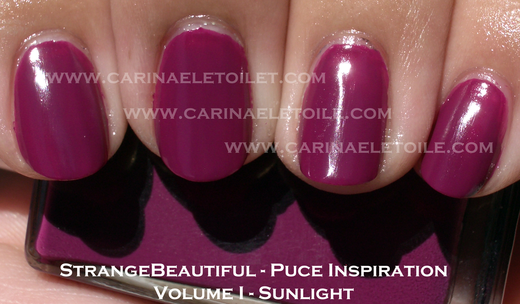
This particular color I dubbed raspberry merely for generic purposes, but I think it’s “…the color Puce which I remember mixing when oil painting as a child, …” I do hope I’ve got it correct.

Puce, while not a pretty sounding word, means flea in French. However, the color has a bit of an extended range. While technically a dark red, it can run the gamut from purple-red to gray-red. I think Jane got a good handle on it here as it’s a purple red. Frankly, when I saw it on me, I identified it as Alexandrite…an extremely rare stone that is far more precious and expensive than a diamond. While diamonds are a girl’s best friend, Alexandrite was once the birthstone for June babies (and named in honor of Tsar Alexander II of Russia) – before it was discovered to be an extremely rare stone. So rare it is now that when I last checked, it ran for over $11,000 a carat. Yea, try to one up that, diamonds! What makes Alexandrite so unique is that it has the ability to change colors in ambient lighting and…Ok, I digress…Sorry. Back to my regularly scheduled nail swatch review.

Again, color and application is flawless – two coats that dried quickly. No bubbles. Yay!

See why I am so enamored with StrangeBeautiful…

Illamasqua – Muse

Thursday, 17 June, 2010

Teal, glorious teal. How I love thee. Let me count my bottles.

Application was a breeze. Lovely. Quick drying. Perfectly opaque. A wonderful creme…oh, a creme. Come and check it out.

StrangeBeautiful Volume I

StrangeBeautiful – Red, Volume I

Monday, 14 June, 2010

This shade of red is…flawless. I rarely wear red nail polish because…well, um. Because. I have no excuse now. Actually, let me clarify – I do wear red nail polish. Just not OPI. There we go. I’m a bit tired of OPI always having some shade of red in their collection. I was pleased that OPI didn’t have it in their Shrek Forever After or Flutter collections.

Jane Schub doesn’t give nail polish color names. Instead, she tends to tell you what her influences were when she produced the color. In this instance, it’s a red Valentine Typewriter. In case you do not know what she’s referencing, here is a link to it.

It’s a beautiful red. It’s shiny. It’s pretty and looks fabulous on me. Formula was great – quick drying and opaque. Two coats were needed. Woo hoo!

Enjoy.

Essie – Chinchilly

Thursday, 10 June, 2010

I love this color…how can you not? It’s a creme. It’s a mushroomy/taupe-y color. It dried quickly. It didn’t bubble. In a word? Fabulous! (Saying that in my best Tim Gunn voice, btw.)

Please excuse my bad manicure application on my right hand.

OPI – A Grape Fit!

Wednesday, 9 June, 2010

I’ve been complaining about OPI and their inconsistent formulas and craptastic unpredictable brushes.

When OPI gets it right, they get it right. This is one of those times when they get it right. Formula dried beautifully and the brush’s bristles were actually uniform. Somehow I seem to be a magnet for picking a lame bottle of OPI.

OPI – Green-Wich Village (and a rant)

Tuesday, 8 June, 2010

It’s sounds truly silly, but I had been having a hard time finding this color. Most of my nail polish sellers didn’t sell it and I wasn’t going to buy OPI online. I went to my nail polish man here in California and BAM! he miraculously had one bottle of my good greenness.

I bought it, totally excited.

What a let down. The formula was runny. The brush was so freakin’ messed up I couldn’t paint my nails to save my life. This took FOREVER and a day to dry. I literally waited an hour between two coats. What did I get for that wait? BUBBLES. Yes, it BUBBLED. After almost 3 hours, I was ready to throw this nail polish bottle at the next person who cut in front of  me on the freeway without using their signal. I hated the application of this polish THAT MUCH. Never has a nail polish ever incited such blind rage.

However, that aside, I am starting to really dislike OPI’s brushes. I tweeted the other day that I have about 50 some odd bottles (and after I had looked at my spreadsheet, it’s a little over 100) of OPI and about 7-10 of them have wacked out, jacked up brushes that really mar application. OPI, if you’re going to bitch about quality control and distribution, make sure your brushes in your bottles are good. No other brand has ever had such crap brushes as OPI. What gives? Seriously…what gives? I’m not joking anymore. Ok, rant done.

Now on to the hideously disappointing pictures of Greenwich Village.

Look at those bubbles. 🙁 They make me sad.

OPI Flutter Collection – Part 2 – Summer 2010

Monday, 7 June, 2010

The other two were probably the more attractive ones. I’m a huge fan of cremes. I make no excuses for it. Cremes have always been my favorite. That said…I really don’t know what to say about these cremes aside from they were bright. Really bright. So bright that I am going to send these colors to a friend kind of bright because I think they make my collection glow and I can see it in the middle of the night.

A reader asked me to do more pinks, corals (*barfs*) and sheers. I’ll start doing that. 🙂 Even down to the corals. *cries*

With that out of the way, here are the final 2 colors of the Flutter Collection.

Application was a bit runny, but if I had to pick between this or the pink…I’d choose this. It looks a gorgeous, almost burnt orange here but it’s not. It’s really bright. The pictures make the color look a lot more mellow than what it really is when you see it in person.


These pictures belie the brightness of the polish. There is a subtle amount of glitter in it that really doesn’t quite show up. I look at these photos I took and I think, “Wow, what a pretty shade of pink!” Don’t fall for it. If you don’t like brights I suggest getting Catch Me In Your Net. It’s the only one in this entire collection that stands out.

I’m pretty much disappointed with OPI’s colors for summer. I loved the Shrek collection but that’s because it appealed to the girl in me that loves funky and unusual colors. I am still loving Fiercely Fiona and Who The Shrek Are You?

The formula on this was also difficult to work with. I found it incredibly runny and slow drying. I think for the slow drying thing I’ll have to factor in the awful rise in humidity right now. Either way, I wasn’t a fan of this formula or the colors.

Misa – Dirty, Sexy, Money

Monday, 24 May, 2010

I’ve been lemming this color for a long, long, LOOOONG time. I also scored an extra bottle. What does that mean?

Next week-ish/within the first 2 weeks in June I will do a contest giveaway.

First place winner will receive a bottle of Damone Roberts 1968, a bottle of Misa’s Dirty, Sexy, Money AND all 6 bottles of OPI’s Shrek Forever After Collection. Runner up will receive a bottle of Damone Roberts 1968. So stay tuned.

Here is Dirty, Sexy, Money on me. It’s going to be my manicure for the next few days since rain is in the forecast and I won’t be able to swatch.

Small Note: For those of you who mourned the loss of Trans Design and OPI, my fave nail polish seller in CA said their website is almost done…their prices will be 25 cents more than if you go into their store, but $4.25 for a bottle isn’t bad. I nearly fainted when I saw Zoya in the store, too! (For $3.75 a bottle.) We discussed what shipping fees would be but it sounds like it’s going to be pretty good. I’ll let you know more as soon as I find out more info.

Loved that the formula was so easy to apply and that it dried so quickly! Wonderfully opaque in two coats and it had a nice lovely high gloss. It was so shiny that I actually debated on a top coat (which I did anyway). It reminds me of  Rescue Beauty Lounge’s 360, but not as dusky.