Browsing Tag

creme

Rescue Beauty Lounge – Drifter

Monday, 1 November, 2010

In honor of the crazy sale at rescuebeauty.com, I decided to throw in a color I wore this weekend. I snapped a pic late yesterday, so please pardon the tip wear.

This is a great creme that is a lovely deep plum. However, with my skin tone it ends up looking a bit vampy in the shade, don’t you think? The color definitely looked plum in direct sunlight. I liked this color a lot.

Formula was wonderful (as always). It seemed to dry a bit faster than the other formulas by Rescue Beauty.


Zoya – Maura and a small Project Runway Rant – don’t worry, you won’t see it unless you want to

Friday, 29 October, 2010

Note: I’ll try to post pictures this weekend to make up for the past 2 days of no blog entries. I simply wasn’t motivated to do anything. >< However, I had a request for a pink and I found one I had yet to swatch! So if the weather permits, you will find it here on the weekend. =)

SPOILER WARNING/AVOIDANCE — To read my rant, highlight the paragraph below that you can’t see!

Small diversion/rant: I am not happy with Gretechen aka WRETCHED being the winner that was chosen for Project Runway. Furthermore, I don’t feel the clothing of said designer is now and hip. It’s frumpy. It’s dated. It lacks the wow factor I want in my clothing. It’s effortless dumpy. I don’t like hobo chic. That’s not boho chic. That’s right, I said it HOBO. That clothing is suited for coat rack built girls, not hourglass girls like me. Patterns were awful and I felt the collection was so bland. If that is where fashion is heading, I’m sitting out the next few seasons. Hopefully people won’t fall for the dumpy frumpy look of said designer.

Anyway, rant over…

Part of Summer 2010’s Flash collection, Maura is this wonderful cherry tomato red.

It’s funny because Maura on me looks red while I’ve seen it on some friends and it looks like a coral. OH MY! Friends don’t let friends wear coral. 😉 Just kidding! I’m always jealous of people who can sport colors like that and not look like they’ve aged themselves by 30 years. It’s the green eyed monster in me…pure and simple.

Now what I truly love about this color is that the moment I put it on, it was true to the color in the bottle – bravo! It didn’t have that odd undertone of when you sometimes put on some polishes and go, “Uh, I swear I thought I bought a RED, not a pink.”

Zoya’s formula, as always, is friggin’ fabulous – fast drying and perfectly opaque in 2 coats.

China Glaze – Holiday 2010 – ‘Tis The Season To Be Naughty And Nice

Friday, 22 October, 2010

This is a seriously image heavy post…28 pictures. I didn’t want to break it up because…well, I didn’t want to. 😉 It’s my eye candy and Friday Red. Enjoy!

All of these were two coaters and they dried in record time.

BOOM! Right out of the gate…this is my favorite red this season. Beautiful. Opaque in 2 coats.

I liked this, but it’s not my favorite red. It’s a bit too light for me. I am sure it would look better on someone else where it looked ok on me.

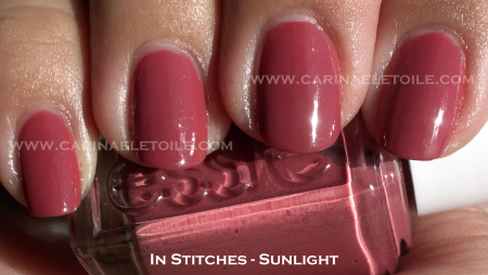
A gorgeous mulberry with a shimmer that makes it a perfect holiday shade.

I didn’t think I would like these, but I do. CTY is a lovely metallic foil that some other brands didn’t quite get right. This really sparkled and shined, truly reminding me of tinsel. MK was a lovely rich foil gold…absolutely gorgeous and I kept thinking it was a wonderful shade of almost 18k. Jingle bells is a bronze that doesn’t quite shimmer like CTY and MK, but it is very subtle. While not flashy, it’s still a pretty shade to behold.

A sheer white base with white glitter thrown in…it reminded me of snow.

This is a wicked shade of green…it glows. I swear, it generates its own electricity! Wouldn’t you agree? I mean, just look at it.

A wonderful blue, but it really reminded me of OPI’s Yoga-ta Get This Blue.

The jury’s still out on this color. I can’t decide if I like it or not. It’s a pinky/red jelly based color with pinky/silver glitter. Removal was a pain, but I’m not sure about this.

I no longer mourn the loss (that much) of my beloved Chanel Rouge Noir. How can I with these fabulous dupes that are 3-Free?

Oh the glitter…the humanity. THE SHINY! I like it a lot, but ugh…the removal. The removal is a pain.

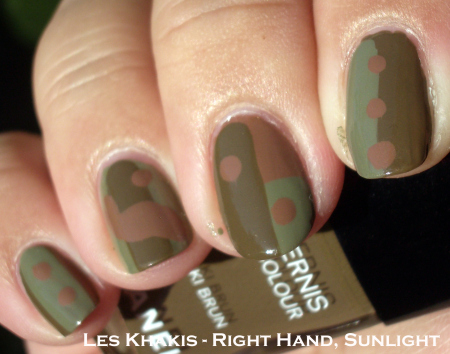
How pretty is this? I love that it’s an olive green tossed into the mix…to make it even 700 shades more awesome, they made this a shimmer. Fabulous!

White creme…’nuff said. I think of this as a base for nail art and not just a color to be worn on its own.

This is China Glaze’s answer to OPI’s Tease-y Does It. I like both and I like that this is lighter and has a fine micro glitter.

Of course, I had to include Mistletoe Kisses because it’s part of the collection, even though I had done a comparison earlier in the week. FYI: MMUTM = Meet Me Under The Mistletoe.

And there we go…all 16 colors swatched. Yay! Hope you enjoyed it.

comparison

Chanel vs Essie vs Rescue Beauty Lounge – Khaki Vert vs Sew Psyched vs Diddy Mow

Monday, 18 October, 2010

I had to do these three compared because next to each other (or as my friend Kristen from Rhode Island taught me, “Side by each!”) they were so blindingly close that I felt a little ripped off. In my excitement I didn’t take a picture of the bottle side by each, but I will soon and update this post.

These three were definitely in the same color family, but I love the subtle differences…and I love that they’re cremes. Hope you fall for these military greens the way I did.


In sunlight you can see the obvious difference between KV, SP and DM. KV has more green while SP and DM have more grey in it. Mr. CarinaeLetoile was so cute when he looked at Khaki Vert on me and commented, “It’s really like a military green. I think Army when I look at it.”

At first glance, SP and DM seem like dupes. But only in the picture. Both have an extremely faint shimmer in it. Both have a good amount of grey in it, but that is it. The difference in person is extremely subtle, but because I’m such a nail fanatic I know the difference – or so I tell myself. LOL I wore SP during the weekend, but kept KV and DM on my swatching hand. It was so subtle that no one could see the difference in the restaurants and dim places we went to this weekend. If you can grab SW, go for it. It’s a cheaper alternative to RBL’s DM. However, if you have DM no need to get SP. If you don’t have KV and want to get it…go for it. While I felt Les Khakis was a bit pricey, I felt it was well worth it.

Chanel – Les Khakis

Wednesday, 13 October, 2010

I was trying to play around with these colors. I am apologizing for my mega n00b attempt at nail art. I can add these to my epic fail manicures. 😀

This is why I just paint my nails and not attempt anything else.

I was surprised – this formula was like butta. It took a smidge longer to to dry but I suspect it was my ‘nail art’ that really made it take forever and a day to dry. After all the lemmings for Khaki Vert, I found I preferred Khaki Brun with my skin tone. In the end it was Khaki Brun that really looked green on me. I’m not slamming Khaki Vert because I did like how it looked on me as well, but for me it was Khaki Brun that was the star of the show. Khaki Rose was a bit…meh. It didn’t really look all that wonderful on me.

These were a hefty price to pay – $25 each. I am sure there are dupes/polishes that are similar out there to keep your wallet from screaming in pain.


Please pardon the lack of clean up and the dry cuticles. I wasn’t expecting to take a picture of my right hand but decided to at the last minute.

Nars – Zulu

Monday, 11 October, 2010

I had been wanting Zulu for a long, long time. But not for $100+ price tag I had seen on eBay. I wasn’t willing to pay $39.99 for it when I last looked. Why do that when I could wait 2 months and get it for under $20?

It was worth the wait. I don’t know how the original Zulu compares to the re-release, but I do love this version.

Drying time was a little slow, but 2 coats and this baby was lovely and luscious – a deep green, but not like OPI’s Here Today, Aragon Tomorrow. I felt like this was almost like a jelly, but the finish was so creme-y that I couldn’t make up my mind!

Absolutely fabulous and worth every penny. I ordered this online at www.nars.com along with 5 other colors from their retro collection. I can’t wait to show them to you. However, for now…here is Zulu!


Essie – In Stitches

Thursday, 7 October, 2010

This is part of Essie’s Fall 2010 Collection – and I love it. It is a dusky salmon pink. I thought it was super pretty…and then I wore it for a few days. Friends looked at it and agreed – very pretty. Too bad it made my hands look old. Grrr.

I rarely wear pinks and the few times I do I seem to choose those colors that make me look like…2,010 years old!

Great formula and opaque in 2 coats. Fast drying. No cuticle pull. Woo hoo!


Essie – Merino Cool

Wednesday, 6 October, 2010

I love colors like this. Part of Essie’s Fall 2010 Collection, this color is one of my favorites out of all the polishes I have right now. Colors like this have always had a special place in my heart.

Formula was good – dried fast and was opaque in 2 coats.