Browsing Tag

coral

BB Couture – Horned Devil

Tuesday, 3 August, 2010

I loved this color. In the bottle.

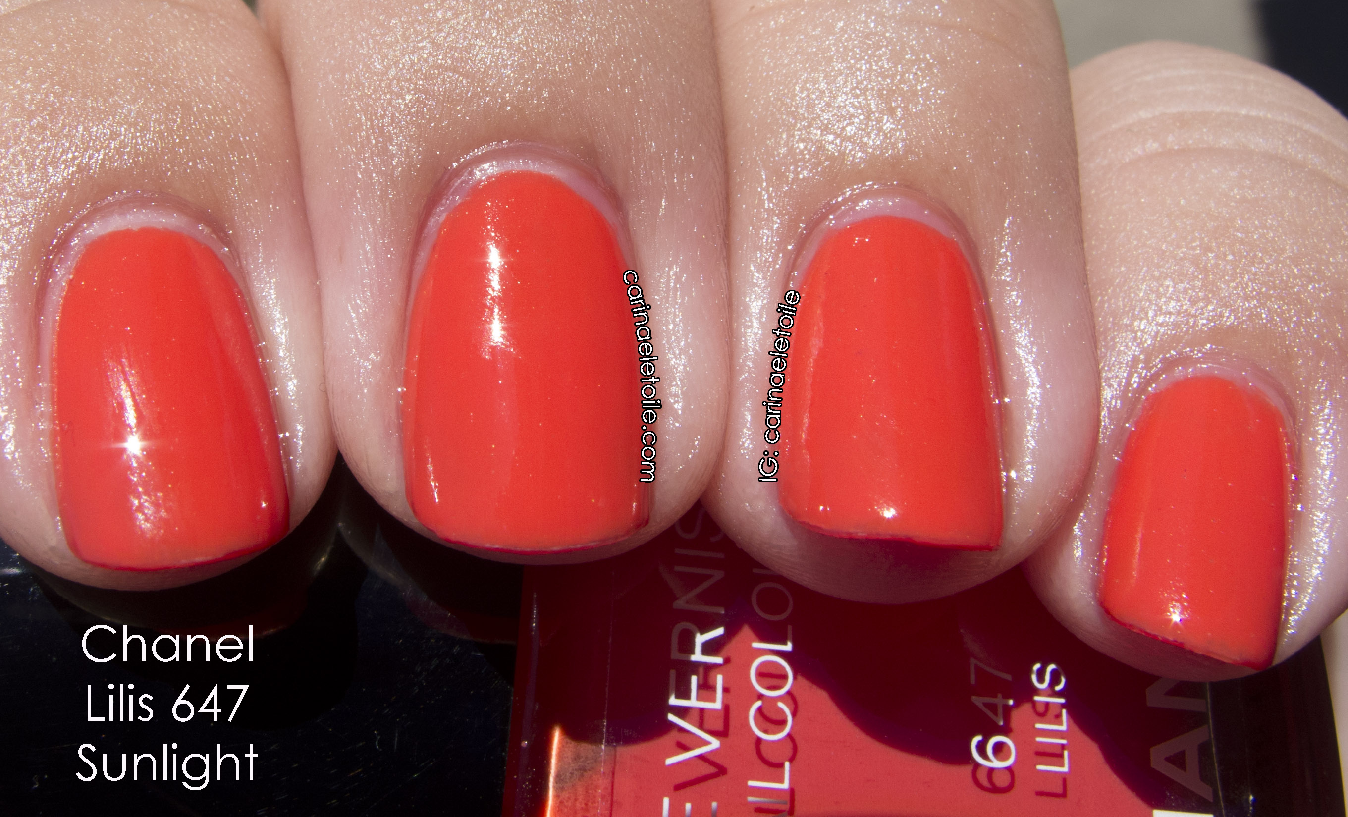
I complained about a color by China Glaze (Strawberry Fields) that aged me and freaked me out to no end because it really made me look like crazy old South Beach, FL, lady. This had a similar effect, but I felt it was Los Angeles, CA, old lady. I kid you not, I swear that this color brought out every single line and never-seen-before line out in my hands. My hands looked wrinkled. Decrepit. LEATHERY. Leathery. Seriously. How does that happen?

Pity the color sucked on me because application was flawless – it’s a jelly base flecked with fine silver glitter. The glitter isn’t so abundant that it overpowers the polish. It is distributed evenly with the brush strokes. I did two coats. See the pictures below!

I think the shade shot is much prettier than the sunlight. It got washed out. 🙁

Zoya – Nidhi and Gilda – Sparkle Collection, Summer 2010

Tuesday, 18 May, 2010

The last two I have to show. The sun washed out the colors, but some of the shade shots turned out decently. Nidhi’s incandescent lighting shot turned out beautifully.

See below. 🙂

Raspberry in color, it’s not a shade that looks good on me. I think the shade shot brought the good part of the polish out, but it wasn’t enough to convince me that I would like it enough to wear it on my nails during the summer.

See how gorgeous this color was until the sun hit it? Ugh. I’ll fix it, though. I look forward to wearing it a lot this summer.

BB Couture

BB Couture – Ode To A Ladybug

Monday, 17 May, 2010
BB Couture Ode To A Ladybug

I’ve always loved ladybugs. Whether they were green, yellow or red. They’re my favorite things. I think they’re so adorable and even now, when I see one, the little girl in me goes, “EEEE!!!! Must play with it.”

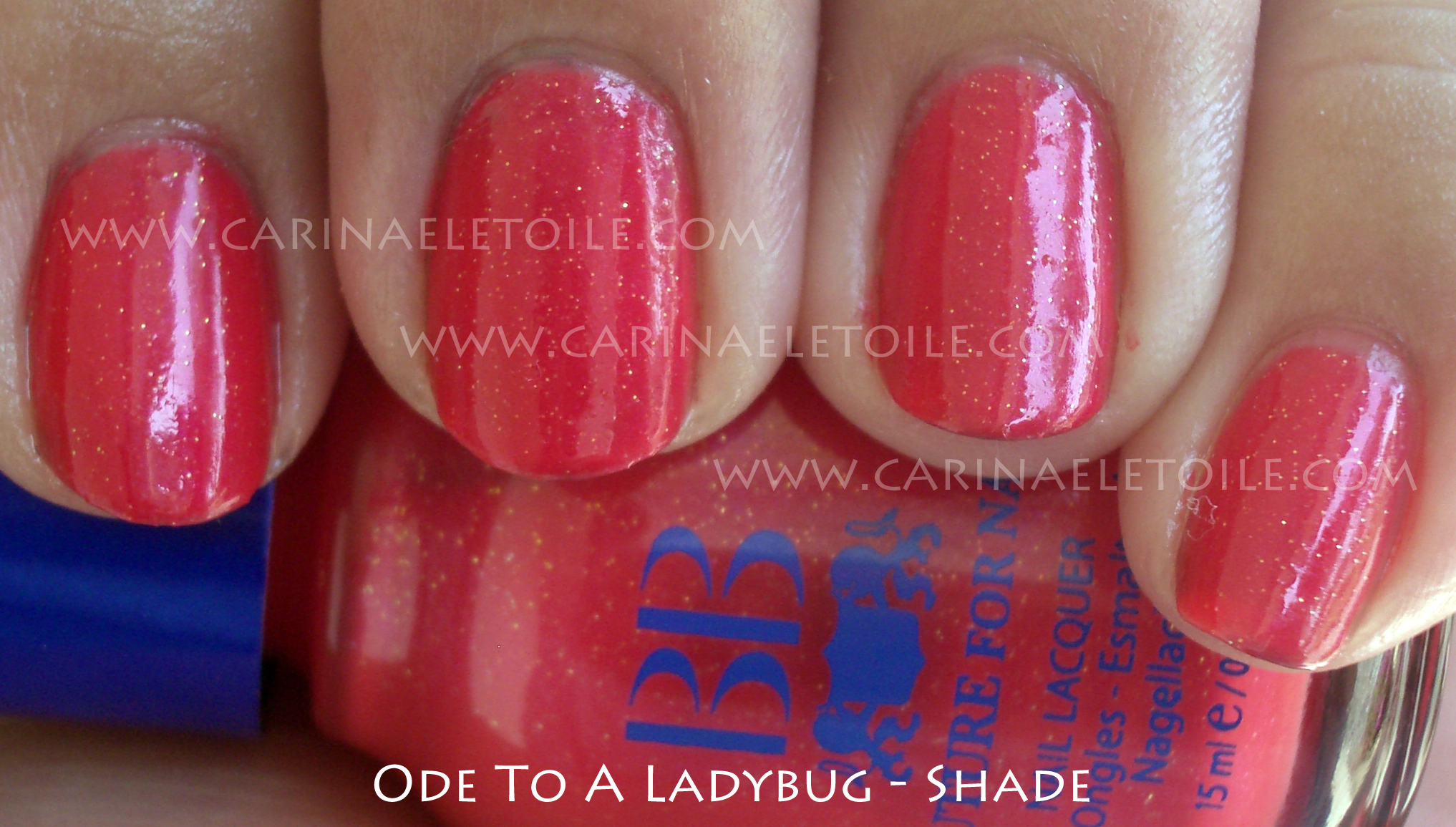
I was so excited to get this color, if not for the name alone. How can you NOT love the name Ode To A Ladybug? It’s so cute! However, it ended up being more of an unflattering coral on me. It looked ok in the shade and in natural light, but I wore it for a weekend and while I loved the shade, my friends were not so keen on it. 🙁 I got various comments, “You’re not old enough to be wearing a color like that.” to “Oh, girl. What were you thinking?”

I’ll let you decide.

BB Couture Ode To A Ladybug

Formula rocked it (as usual) – dried fast and this is three coats. There was a slight glitter in this and it doesn’t really show. I knew there was glitter in the polish just from the lumps I could feel after it dried. However, the glitter really didn’t go KA-POW like I’m used to. No other complaints, though. 🙂

Hong Kong Collection OPI Spring 2010

Spring 2010 – OPI’s Hong Kong Collection

Saturday, 13 February, 2010

13 February, 2010
4:29PM

Let me first start out by saying that there hits and misses for me in this collection. There are some bright colors in here and that’s what I’ll be showing first. They hurt my eyes…big time. I definitely enjoyed the rest of the collection, too. Very pretty and very not what I expected. I had seen it on some other people, but on me…I fell in love. For once, there was no black nail polish involved. 😀

The formula itself was pretty good, too…I normally have issues with cremes because I am little miss heavy handed in application. You’ll see it here and there throughout the pics but overall no problems. Please excuse the messiness of the manicures. I’m normally a lot more careful in application, but all the colors and the excitement got to me. Haha. Sad, but true.

As always, click to make the pics bigger!

A Good Man-Darin Is Hard To Find
Shade (L), Sunlight (R)
Yea, this was the brightness I was talking about…ouch. My eyes. They feel like burning!
Chop-Sticking To My Story
Shade (L), Sunlight (R)
Ok, for some reason, I loved this color…a lot. It’s not quite pumpkin orange on me and there is enough orange mixed in with a hint of brown that makes it very appealing. I normally would never wear something this color, but for some reason, this really made me excited!
Dim Sum Plum
Shade (L), Sunlight (R)
While it wasn’t my favorite color, I was having flashbacks to their previous Fall 2009 collection’s color Ate Berries in the Canaries. I’ll do a comparison side by side if I remember to after I do a write up on all of these. 😀 I won’t swatch it but I will put my previous pics up. DSP is a pink that I think will go well with people who love these kinds of shades. I really have to be in the  mood for this sort of color. While it’s fun to swatch, it’s not one I’d actively wear if given a choice.
Hot & Spicy
Shade (L); Sunlight (R)
Wow. In the bottle it looked like a bit of an orange coral. Out of the bottle and on me it looks like…an orange coral. Not me. So not me.
Red My Fortune Cookie

Shade (L) and Sunlight (R)
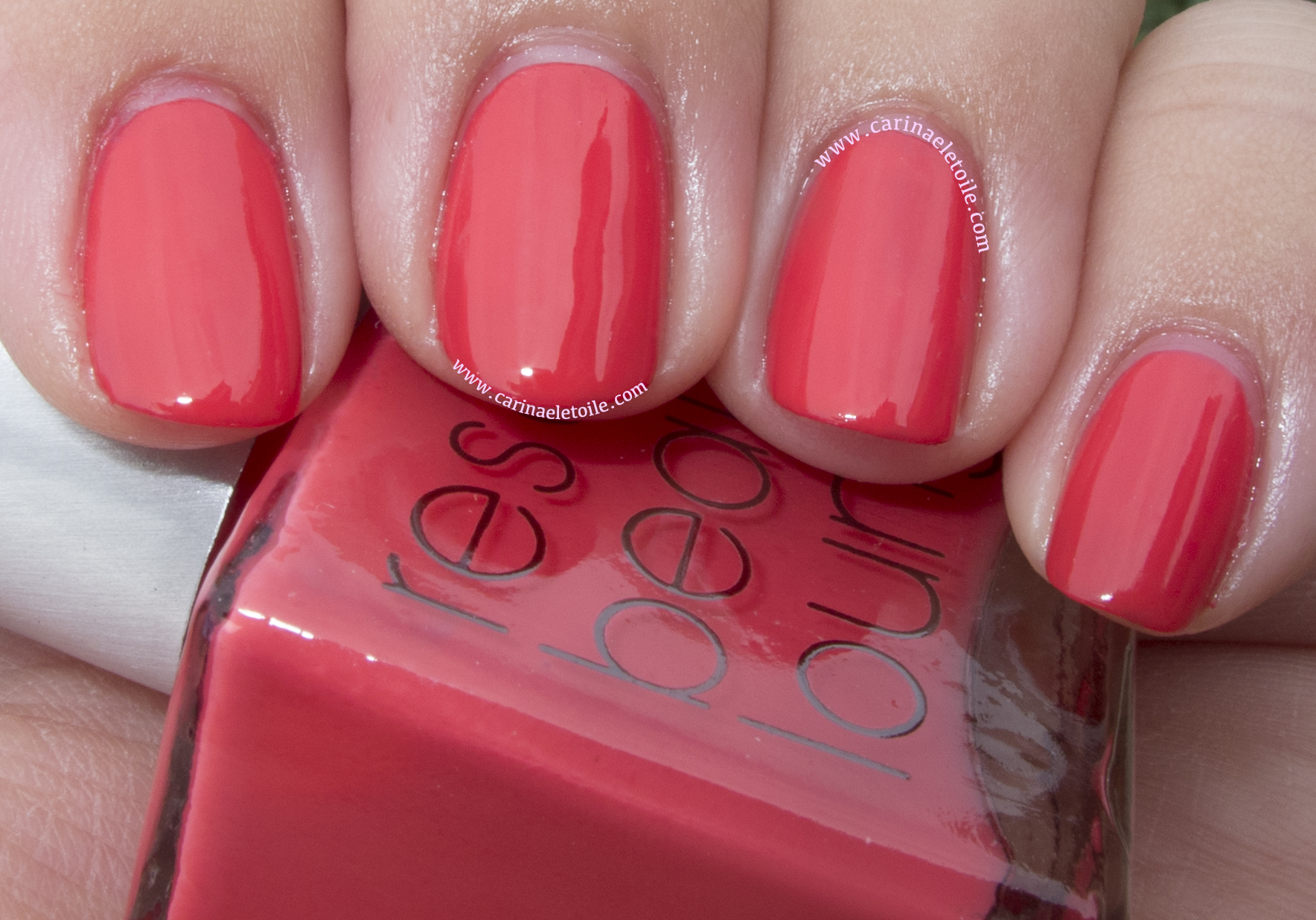
It’s not quite tomato and not maraschino cherry…It didn’t look bad on me, but it didn’t look good either.

Pearl of Wisdom
Shade (L); Sunlight (R)
Even in the shade the polish was able to capture a beautiful shimmer and give off a slight hint of the pinkness within. In the sunlight you can really see the prettiness. This is a sheer color and I think wearing it over a darker color would definitely be the best thing you can do with it.
Now this is where I think the Spring Collection starts to really shine…
Lucky Lucky Lavender
Shade (L) Sunlight (R)
This wasn’t quite as lavender as I was expecting. It’s really kind of…well, a pink lavender, don’t you think? I don’t know why, but the sun really washed out any hint of lavender in this color.
Panda-Monium Pink
It’s actually even prettier in person. I thought I had this confused with Lucky Lucky Lavender, but no…this was the correct bottle and swatch. I’m not a fan of pinks or pastels, but this didn’t stand out on my fingers like spring colored M&Ms. (BTW – love that I went a little nutso with the cleaning of my cuticle on my index finger?! Haha. Silly little Sally Hansen manicure clean-up pen.)
Meet Me On The Star Ferry
Shade (L) Sunlight (R)
Now this color…blew me away. Only because waaaay back in the mid 80s, I found a color by Sally Hansen that was very similar to this. I used it until it dried out and I threw it away. I never was able to get another bottle because for some reason, the jr high kid in me had managed to pick the ONE color that was a limited edition. That alone should’ve been an indicator on my nail polish obsession…anyway, here it is, looking just as good, if not better than what I had in high school. Beautiful berry with a lovely shimmer running through it. The shot of it in the shade reminds me of my much loved and much lamented Chanel’s Brown Sugar. This color really defines the collection for me.
Bling Dynasty
Shade (L); Sunlight (R)
I LOL’d mightily at the name of the polish. I cringed when I saw it in the bottle, but I fell in love with it when I put it on. What a gorgeous shade of gold this is. Definitely a keeper in my book!
Jade Is The New Black
Shade (Top); Sunlight (Bottom)
What rockin’ shade of green this is…I have a dark green that’s more forest green and a light green…and a minty green. I don’t have this kind of green…and I’m in LOVE. Very very pretty.
Suzi Says Feng Shui
Shade (L); Sunlight (R)
This is a gorgeous teal/dusty blue. In fact, it was a color I wanted to paint the walls of our bedroom in but Colin said no. I guess I’ll have to settle for it on my fingers! 🙂
opi spring 2008

OPI Spring 2008 – India Collection

Saturday, 30 January, 2010

30 January, 2010
12:43AM

I have 10 out of 12. URGH!!! I can laugh now, but at the time I was about to tear my hair out! Someday I’ll get the last 2 colors — MonSooner or Later and Moon Over Mumbai. Then I can add it to the swatches here. 🙂

Overall, not sure what the heck was going on with the brushes in this collection. The bristles were a bit too thick and some had minds of their own! The formula wasn’t too bad…something I could easily deal with.


Charmed by a Snake
Shade (Top); Overcast (Bottom)
It looks a bit gold, yet slightly bronze on me. When I wore this color 2 summers ago, I disliked it because I had acquired a tan, making me even darker than I usually am (*cues* mommy voice, “Carinae, YOU ARE SO DARK!! YOU WILL NEVER GET MARRIED.” *as mommy makes the sign of the cross and prays for my immortal soul*) and it made the color appear this pallid, pathetic bronze on me. While this time around it’s infinitely more charming I still have bitter memories of that bronze shade.
Curry Up Don’t Be Late
Shade (Top); Overcast (Bottom)
I’m not one for golds, but this wasn’t so bad. It’s pretty lightweight and I felt it was more of a sheer than an actual opaque. I also had issues with it because there were a few jacked up errant bristles that really got in the way of application.
Elephantastic Pink
Indoors, No Flash (Top); Indoors with Flash (Bottom)
Wow…talk about BLING BLANG BRIGHT! ’nuff said.

Get Me To The Taj On Time
Indoors, no flash (Top); Indoors with Flash (Bottom)
Pretty little sheer with a slight hint of an iridescent shimmer…I’d wear this again for sure.
I’m Indi-a Mood For Love
Indoors, no flash (Top); Indoors With Flash (Bottom)
The name alone made me giggle. I’ve got to say, they’ve nailed it head on with the whole Indian pink shade here. It really popped a lot more in person…and when I put this on, I smiled remembering my time in India.
Lunch At The Delhi
Indoors, No Flash (Top); Indoors With Flash (Bottom)
Oh…it’s a coral color. It is *so* not me. I’m not 60 yet.
Keys To My Karma
Shade (Top); Sunlight (Bottom)
I liked this red…kinda tomato-y, kind of maraschino cherry…it’s almost got a retro vibe to it. Kind of power color ‘bitch in the boardroom’ kind of thing. Very Alexis Carrington!
Black Cherry Chutney
Outdoors in Shade (Top); Sunlight (Bottom)
This was my staple color until the end of 2008…we moved to India and I didn’t want to haul my stash of nail polish – I just bought more there instead. 😉 …And that’s only 3 bottles of swatching. I left behind so many. Not one of my finer moments…I thought I was going back, but as it turns out, I never did. 🙁 Anyway, what I truly love about this color is that it’s got a hint of an orange/pink shimmer running through it. In the bottle, I saw it and went, “oh…a padparadscha sapphire kind of color!!” I had to buy it. But when I put it on, I nearly wept from the sheer beauty of it. The pictures don’t do it justice at all.
Royal Rajah Ruby
Outdoors in Shade (Top); Sunlight (Bottom)
A super pretty shade of red that I’d wear here and there, but Black Cherry Chutney was the one that I still love…I am going to have to get a back-up bottle before it’s too late.
Yoga-ta Get This Blue!
Outdoors in Shade (Top and Bottom)
Ok, I can’t even begin to explain how much I love this color. It got 4 pictures in here! I loved Russian Navy and I thought this would be a ghetto sister to it…oh no. This one really stands out on its own. It’s this navy color that’s got a lovely shimmer running through it. Absolutely freaking gorgeous. I know the swatches may look identical, but the subtleties are there, I promise! 🙂
Yoga-ta Get This Blue!
Sunlight (Top and Bottom)