All Posts By

carinaeletoile

Sephora By OPI – aka $OPI

Friday, 26 March, 2010

Lately I’ve been into green nail polish. It all started with Nubar’s Going Green Collection and I don’t see any signs of my current green fixation stopping any time soon. When shades of green like Leaf Him At The Altar keep coming out, how can I say no?

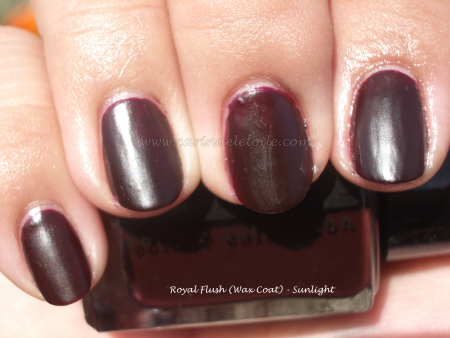
This is such a strong match for MAC’s Beyond Jealous, but I’ll have to do a side by side comparison…However, you’ll have to settle for the post that shows the picture. I actually prefer the formula in $OPI because it wasn’t difficult to work with.

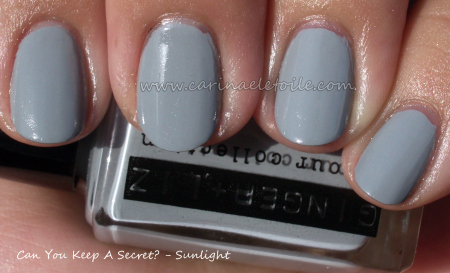
Ahh…this color came out the same time as $OPI’s Metro Chic. So I’d say about Fall 2008. I didn’t purchase this until recently. I did, however, purchase Metro Chic the moment it came out because I love that whole mushroom-y, taupe-y color. This is the lighter, more spring version. Think youthful sister, if you will. While I prefer the edgier and darker Metro Chic, I won’t complain if this finds its way on to my fingertips.

Essie – North Fork Collection, Summer 2009

Thursday, 25 March, 2010

I’m late, I’m late…oh well. I was fortunate enough to score these colors long after the collection stopped being seen on shelves. I can definitely see why! I honestly thought I wouldn’t like any of these colors. WRONG! Totally fell for them in a big, bad and ugly kind of way.

This color was the star of the collection, the one that sold out the fastest. It was also the one that was hard to get long after the collection stopped being on regular retail shelves. I was fortunate enough to score the whole set from an e-tailer. I can see why this color sold out and out of the three, this was my least favorite. However, this color did look good on me. I preferred the other two.

This color was very deceptive in the bottle. I thought it was a blue gray while I was indoors, but once outside it really wowed me even more. Sadly, due to the overcast day, you can’t see the very faint shimmer that runs through it – it is absolutely GORGEOUS. Easter is coming up and I’m having a hard time deciding which color to wear – this or Shelter Island, as you will see below.

I kept this color on my nails for TWO WEEKS! That’s a record for me. Why? Because I loved it THAT MUCH. It is slightly hard to find, but it’s one that is well worth it. However, if you can’t find it an extremely close dupe is OPI’s No Room For The Blues.

And just to refresh your memory, here are the comparison swatches again.

Ginger & Liz – Can You Keep A Secret?

Wednesday, 24 March, 2010

Yes, I can keep a secret. I’ll be honest, this is one secret I don’t want to keep! I know I’ve gone on and on about how much I love the Ginger & Liz colors and the brush in addition to the application…and I know I’m going to wear myself (and you) out, but I’ll keep on singing their praises. Nubar and Ginger & Liz = the 2 BEST nail polish in terms of application and wear I’ve ever encountered. They make China Glaze, OPI, Essie and everything else mega ghetto in my eyes.

Anyway, here is even MORE Ginger & Liz love…more will follow during the day because I’ll be adding two more swatches to this post or I’ll post twice in one day! G&L have made me that much of a fan.

I truly wish I could carry off a wonderful dove gray like this, but I can’t. If it had a hint of blue in it, it’d have a fighting chance with my mega asian girl skin tone. None the less, isn’t it a gorgeous color?!

Orly's Goth & Barielle's Slate of Affairs

Tuesday, 23 March, 2010

So the little black nail polish wearing, corset sporting, goth girl at heart loves this color…and not because of the name! I’ve always had a tendency to lean towards dark nail polish and this is no exception…even if it has glitter. What I love about this is actually the glitter…it’s silver against black – yay!! – but not only that it’s different sizes: big, medium and small. Very cool. What a way to play on glitter, Orly. Smart move!

I am so sweet on this blue gray. I wish I could carry off gray nail polish and I wish I could carry off some of the blues I see out there…and this is a perfect compromise! This concrete blue hints at periwinkle, too. It’s got a mild blue shimmer that runs through it, making this blue-gray a total winner in my book!

MAC Cosmetics – Blue India

Monday, 22 March, 2010

UPDATE: When I woke up this morning, I noticed a chip on my middle finger. 🙁 I started sporting this color on Saturday…so that’s less than 48 hours and it’s already chipped. I blame the top coat which was used – Seche Vite. I know some other bloggers love it, I am not a fan. I prefer Poshe and will be going back to that. Was hoping to see how long it would be before this color chipped. Well, now I know. Bummer. Was hoping to change polishes on Tuesday. Looks like I’ll have to do it today. Hm…Ginger & Liz’s New Money has been calling me for the past few days so maybe it’s a good thing. 😉

I was seriously excited about this color…and it didn’t disappoint. Love that it’s a gorgeous blue gray. I love the packaging as well. All the necessary shots are in here!

How gorgeous is this color? I’m going to try and wear this until it chips so we can see how good the formula is. 🙂 It’s not quite blue, it’s not quite grey, it reminds you of teal…but overall this color is just so pretty I can’t stop staring at it!

Here are some other pictures I took…I just noticed that I didn’t include one of the actual polish in the box – I was that excited.

The inside of the box is so cute.

Just a note – Liberty of London teamed up with MAC to create a make-up line that brings the brand’s prints and colors to your face and nails! Also, you can find Liberty of London at Target. Check it out…I think I’ve fallen in love. According to All Lacquered Up, the unusual packaging is “based on William Morris’s Strawberry Thief print from 1883…” Whatever the history and whatever their reasons for choosing this packaging is quite all right by me!

Difficult Formulas I've Used – Rescue Beauty Lounge and Sally Hansen

Sunday, 21 March, 2010

These were colors that people said were so cute – you must try them! and I did…much to my horror and chagrin. I actually did 4 coats of each of the polishes below before I called it a day.

Both were a bit like jelly – and it shows in the application for me. I’ve looked at other people’s swatches of these colors and am jealous that they’ve turned out so well. Maybe it was me. 🙁 Anyway, here they are.

How awful can this application have been on me?! To make it worse, I had grabbed the wrong top coat (I have 2 of the same, but I reserve one for dark colors and another for light colors) and now you can see the red from an old cold color I had worn a few days prior. I had so much trouble with this formula. I reached the 4th coat phase and said with much grace and dignity, “F*** it. I’m done.” To make matters worse, the formula took AGES to dry. 4 top coats later – and they weren’t even thick coats, fairly thin – they were barely dry enough to put the top coat on so I could photograph them. The formula was pretty sticky, too. ugh. I like sticky in my base coats, not my nail polish, ok?

This was another color I had issues with, but not as bad as I did with Rescue Beauty Lounge. This is a 3 coater…and it annoyed me, too. This color actually didn’t look bad on me either…despite it being a yellow. I admit to buying it purely for the name – Yellow Kitty. I kept thinking Hello Kitty and giggling to myself.

Rescue Beauty Lounge – Spring 2010

Friday, 19 March, 2010

In an odd way, I like this collection…Rescue Beauty Lounge’s Spring 2010 colors are based on Proenza Schouler’s spring 2010 collection – a surfer girl chic.

Pardon the ghetto manicure on the right hand. I’m not a leftie! 🙂 This shade sings to me – it’s not quite teal, but it’s such an awesome mix of grey thrown in for good measure. How can one NOT like it?

It looks like a sea grey…when I lived on the beach back in San Francisco, I often called this the “boo boo grey wave day”…

Oh man…it’s not quite coral red and when I saw this I thought it would be too warm for my skin tone. Oddly enough, it’s just enough on the cool side for me to carry it off.

I like 360 and Diddy Mow moreso than Bangin’. Formula was much better than in previous batches so I’m happy – it’s not thick nor does it take forever to dry. Only needed 2 coats per application.

Ginger & Liz – More Love!

Thursday, 18 March, 2010

Yea, I admit it…I really like the formula for Ginger & Liz and the brush is pretty awesome. I was a bit disconcerted at first, but found that the brush really does make a difference. I like it.

This sort of reminds me of Rage from Orly Foil FX, but this is more champagne/gold toned. However, it’s not as gold like Luxe (thank God). This color is currently rockin’ my fingertips.

Aww yea, baby! I’ve said that other colors remind me of Chanel’s original Vamp, but this…this truly comes closest to it, IMO. Others were a bit too dark, some too wine-y, some too red, while others had a smidge of purple. This is what I remember Vamp (Rouge Noir) looking like on me, but glossier. This is a semi-matte (or semi-gloss as hubby said last night over dinner) and I’m loving it.

I can’t wait to get the other G&L colors on my fingers and take pics!