All Posts By

carinaeletoile

StrangeBeautiful Volume I

StrangeBeautiful – Red, Volume I

Monday, 14 June, 2010

This shade of red is…flawless. I rarely wear red nail polish because…well, um. Because. I have no excuse now. Actually, let me clarify – I do wear red nail polish. Just not OPI. There we go. I’m a bit tired of OPI always having some shade of red in their collection. I was pleased that OPI didn’t have it in their Shrek Forever After or Flutter collections.

Jane Schub doesn’t give nail polish color names. Instead, she tends to tell you what her influences were when she produced the color. In this instance, it’s a red Valentine Typewriter. In case you do not know what she’s referencing, here is a link to it.

It’s a beautiful red. It’s shiny. It’s pretty and looks fabulous on me. Formula was great – quick drying and opaque. Two coats were needed. Woo hoo!

Enjoy.

Nubar – Sparkle Collection – Spring 2010

Friday, 11 June, 2010

I did show Hyacinth sparkle earlier, but I decided to add it in here again because it wouldn’t be fair to that poor swatch to not be part of the kewl krowd!

Notes: Formula dried fast. I’m not a fan of glitter, but I did fall in love with these. Nubar, Zoya and China Glaze are my favorites. SpaRitual really doesn’t fall in there (even though I love their nail polish) because they are extremely hard for me to come by. If SpaRitual would let  me buy on their site or if my fave nail polish man here in CA would sell it, I would be reviewing SR a lot more. The glitter in these are extremely dense. So dense that even 2 coats of a top coat couldn’t produce a smooth surface. I don’t like dented polish. I know it sounds silly, but that’s just me. Each of these polishes were 2 coaters unless otherwise noted. They went on extremely well and no clumpy, lumpy, piss-me-off messes. Way to go Nubar! 🙂

You’ve seen this before. 🙂 I wore it a few weeks ago to cheer me up when we were going into a rain filled weekend.

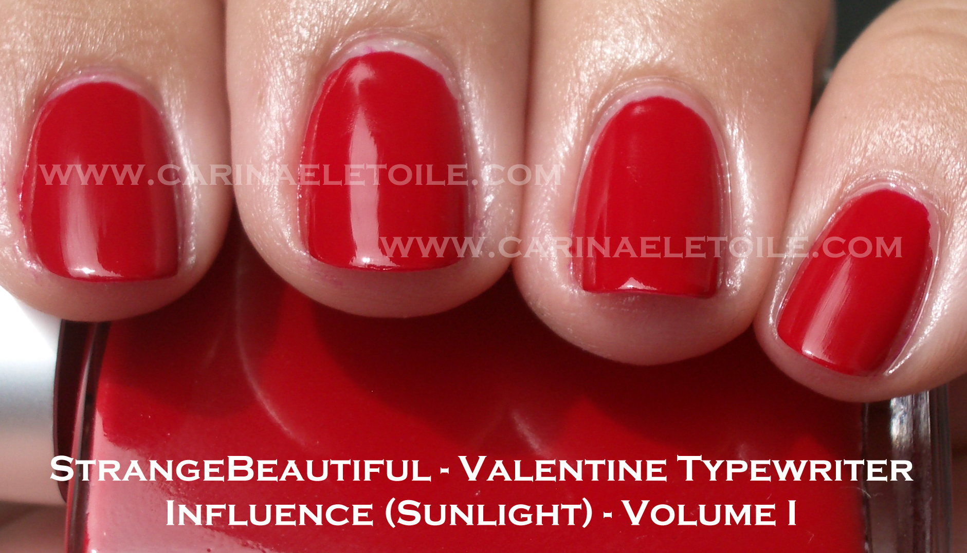
Not sure why but when I saw this I was reminded of China Glaze’s Ruby Pumps. This was far prettier in the shade than in the sunlight. Sun totally washed it out.

Dug this light green green glitter that had the right combo of warm and cool hues. I think people of both skin tones can wear this safely.

Mega dense glitter that really sparkled so intensely I think it actually tamed the sunlight that shined down on this color. One of my faves from this collection.

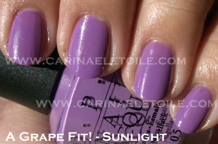
I couldn’t make up my mind as to whether I liked this or not. I’m leaning more towards like. Pretty magenta-esque color that was easy to apply.

This aptly named color could have benefited from 3 coats instead of 2. This one is at the bottom of the list for me.

I think this is the type of glitter polish that you use over other dark colors to bring out a prettiness to them. I don’t feel this is a stand alone glitter…maybe I should’ve done three coats.

For me this one and Hyacinth sparkle were my all time favorites. I’m going to have to put this on for the weekend.

Essie – Chinchilly

Thursday, 10 June, 2010

I love this color…how can you not? It’s a creme. It’s a mushroomy/taupe-y color. It dried quickly. It didn’t bubble. In a word? Fabulous! (Saying that in my best Tim Gunn voice, btw.)

Please excuse my bad manicure application on my right hand.

OPI – A Grape Fit!

Wednesday, 9 June, 2010

I’ve been complaining about OPI and their inconsistent formulas and craptastic unpredictable brushes.

When OPI gets it right, they get it right. This is one of those times when they get it right. Formula dried beautifully and the brush’s bristles were actually uniform. Somehow I seem to be a magnet for picking a lame bottle of OPI.

OPI – Green-Wich Village (and a rant)

Tuesday, 8 June, 2010

It’s sounds truly silly, but I had been having a hard time finding this color. Most of my nail polish sellers didn’t sell it and I wasn’t going to buy OPI online. I went to my nail polish man here in California and BAM! he miraculously had one bottle of my good greenness.

I bought it, totally excited.

What a let down. The formula was runny. The brush was so freakin’ messed up I couldn’t paint my nails to save my life. This took FOREVER and a day to dry. I literally waited an hour between two coats. What did I get for that wait? BUBBLES. Yes, it BUBBLED. After almost 3 hours, I was ready to throw this nail polish bottle at the next person who cut in front of  me on the freeway without using their signal. I hated the application of this polish THAT MUCH. Never has a nail polish ever incited such blind rage.

However, that aside, I am starting to really dislike OPI’s brushes. I tweeted the other day that I have about 50 some odd bottles (and after I had looked at my spreadsheet, it’s a little over 100) of OPI and about 7-10 of them have wacked out, jacked up brushes that really mar application. OPI, if you’re going to bitch about quality control and distribution, make sure your brushes in your bottles are good. No other brand has ever had such crap brushes as OPI. What gives? Seriously…what gives? I’m not joking anymore. Ok, rant done.

Now on to the hideously disappointing pictures of Greenwich Village.

Look at those bubbles. 🙁 They make me sad.

OPI Flutter Collection – Part 2 – Summer 2010

Monday, 7 June, 2010

The other two were probably the more attractive ones. I’m a huge fan of cremes. I make no excuses for it. Cremes have always been my favorite. That said…I really don’t know what to say about these cremes aside from they were bright. Really bright. So bright that I am going to send these colors to a friend kind of bright because I think they make my collection glow and I can see it in the middle of the night.

A reader asked me to do more pinks, corals (*barfs*) and sheers. I’ll start doing that. 🙂 Even down to the corals. *cries*

With that out of the way, here are the final 2 colors of the Flutter Collection.

Application was a bit runny, but if I had to pick between this or the pink…I’d choose this. It looks a gorgeous, almost burnt orange here but it’s not. It’s really bright. The pictures make the color look a lot more mellow than what it really is when you see it in person.


These pictures belie the brightness of the polish. There is a subtle amount of glitter in it that really doesn’t quite show up. I look at these photos I took and I think, “Wow, what a pretty shade of pink!” Don’t fall for it. If you don’t like brights I suggest getting Catch Me In Your Net. It’s the only one in this entire collection that stands out.

I’m pretty much disappointed with OPI’s colors for summer. I loved the Shrek collection but that’s because it appealed to the girl in me that loves funky and unusual colors. I am still loving Fiercely Fiona and Who The Shrek Are You?

The formula on this was also difficult to work with. I found it incredibly runny and slow drying. I think for the slow drying thing I’ll have to factor in the awful rise in humidity right now. Either way, I wasn’t a fan of this formula or the colors.

Zoya nail polish swatches

OPI Flutter Collection (Part I)- Wing It! and Catch Me In Your Net / Zoya – Charla – Summer 2010

Sunday, 6 June, 2010

Ok, so…I’ve got some colors here that are a part of OPI’s  Summer 2010 Collection called Flutter.

So the first color I’m showing is called Wing It!

I’m not a fan of this shade. It’s a bit too sheer for my taste…to make matters worse, I feel this pink is a bit too youthful for me. Like Fairy Princess kind of pink for a little girl. What may camera failed to capture was the pretty iridescence of the glitter. It’s actually prettier than the actual base color! So while I was disappointed in this color, it was a bit too pink/too close to coral for my taste.

Look carefully at this color…isn’t it gorgeous? It is, isn’t it? Scroll down for the reality.

.

.

.

.

.

.

.

.

.

.

.

.

.

.

.

.

.

So here we are…literally dupes. You can’t see how gorgeous this (these) color(s) is(are) – it’s like mermaid scales. There is a slight green shimmer and gold glitter that runs through it. Absolutely gorgeous. What a pity that it’s a total dupe of Zoya’s Charla.  So…surprise! If you weren’t able to get a hold of Charla, grab OPI’s Catch Me In Your Net.

Heck, here are the ding dang bottle shots!

The formula on this was runny and hard to work with. Both of the colors above were 2 coaters.

Nubar – Twilight and Sunset – Night Sky Collection – Spring/Summer 2010

Friday, 4 June, 2010

Finally! As promised the rest of the collection…you know, a whole 2 polishes.

Attention: Nail tape newbie strikes again! yes, another epic fail on my part. But I do get credit for trying, right? 🙂 Also, I used the Diamond Top Coat that came with the polishes. It said it would be shiny…and it wasn’t. You’ll see in the pics. Also, I don’t have another Twilight shot because…I deleted it in my attempt to multi-task – you know, book plane tickets, pay bills and run some pics through Photoshop. I learned my lesson, I promise!

Anyway, the formulas dried fast, but I still wasn’t thrilled with them. I guess I’m hard to please? I feel like I’ve seen these colors before and I have – they are Orly’s Metal Goth collection. Sorry, Nubar…I wasn’t impressed with this collection.

Nail tape n00b alert! See? But you can’t really see the shine, can you?

This was sort of matte, sort of shiny…and the top coat wasn’t super shiny and you can see it on my ring and middle finger. I tried to leave the pointer and pinkie finger as a matte.