Browsing Tag

brown

comparison

Comparison: Ginger & Liz’s Trance vs Color Club’s Revvvolution

Tuesday, 15 March, 2011

On Saturday I happened to catch a tweet from Jeanette over at The Swatchaholic and she was talking about a brand’s color that was holographic. I no longer feature that brand on my blog, but I happened to have 2 bottles of said color she was tweeting about.

I went home and compared the 2 and discovered that I did not have the HTF version of that color. After much picture taking from every angle in daylight, shade and flash I gave up. To cheer myself up, I decided to compare two holographic polishes from two lines: Ginger & Liz (whom I have so much love for) and Color Club.


Continue Reading

Chanel – Les Khakis

Wednesday, 13 October, 2010

I was trying to play around with these colors. I am apologizing for my mega n00b attempt at nail art. I can add these to my epic fail manicures. 😀

This is why I just paint my nails and not attempt anything else.

I was surprised – this formula was like butta. It took a smidge longer to to dry but I suspect it was my ‘nail art’ that really made it take forever and a day to dry. After all the lemmings for Khaki Vert, I found I preferred Khaki Brun with my skin tone. In the end it was Khaki Brun that really looked green on me. I’m not slamming Khaki Vert because I did like how it looked on me as well, but for me it was Khaki Brun that was the star of the show. Khaki Rose was a bit…meh. It didn’t really look all that wonderful on me.

These were a hefty price to pay – $25 each. I am sure there are dupes/polishes that are similar out there to keep your wallet from screaming in pain.


Please pardon the lack of clean up and the dry cuticles. I wasn’t expecting to take a picture of my right hand but decided to at the last minute.

OPI Tease-y Does It vs Nubar Raspberry Truffle

Tuesday, 12 October, 2010

Got my Burlesque glitters. Got the rest of the Burlesque collection, too. I was thrilled because OPI really outdid themselves on the glitter collection for Christmas 2010. I hate glitter, but I had to have these. Anyway, the one color that really had me holding my breath was Tease-y Does It.

I was so happy to have finally been able to put Tease-y Does It on my nails. It looked totally gorgeous in the bottle, but in the back of my mind a tiny voice was saying, “You have something like this…You have something like this…”

I was like, “Shut up. Shut up. No, I don’t.” Conversations with yourself really doesn’t bode well, but at least I wasn’t talking out loud.

Then I started doing a re-org of my 2 Helmers (I am going to need a 3rd now, btw) and started a drawer for Nubar…What is this? Raspberry Truffle? It looks like…No, it can’t be. Ce n’est pas vrai! Non. Mais oui, mes amies. Mais oui.

I actually dare to call OPI’s Tease-y Does It a dupe for Nubar’s Raspberry Truffle.

Don’t weep if you can’t get Tease-y Does It. Nubar still has Raspberry Truffle on their site.

OPI’s formula was the winner of the two. While both were easy to apply with no problems, RT tended to take about five minutes longer to dry than TDI.

Check out the dupeness for yourself – RT is on the pointer and pinky while TDI is on the ring and middle fingers.

Orly – 'Tis the Season – Holiday 2010

Friday, 8 October, 2010

Orly’s Holiday collection is filled with some pretty fun colors. I love the application and the glitter. The red creme and the color Naughty Or Nice is just wonderful. What I’ve done is try to layer some of the glitters over the cremes. It’s an epic fail, but you’ll still see it. 😀

All the colors dried quickly and were opaque in 2 coats. The glitters were wonderfully dense and very fun to look at on their own.

This is an image heavy post – beware.


How awesome is this red? It is freaking gorgeous and I’m happy to include it in Red Nail Polish Friday. On the middle finger is one coat of Winter Wonderland and on the ring finger it’s 2 coats.


2 coats of Winter Wonderland on three fingers and 2 coats of WW over Naughty or Nice. I love how WW really does remind me of snow.


Normally I don’t like golds like this, but for some reason I found I liked this a lot. Naughty Or Nice is on three fingers while G&G is on my pointer finger. G&G is a dense, heavy glitter. Removal wasn’t so bad! One coat of G&G over NON to see how it would look. Meh.


I thought this color was so fabulous in the bottle. Then I put it on me. All the initial beauty of it was washed out by my skin and the sunlight. It’s much, much prettier in person and the shimmer/glitter is well done.

I’ve heard that MMUTM is a dupe for Zoya’s Ivanka. I don’t think so. Below are pictures of Ivanka. Ivanka is lighter while MMUTM is darker, more of a holiday green.


Ginger & Liz – More Love!

Thursday, 18 March, 2010

Yea, I admit it…I really like the formula for Ginger & Liz and the brush is pretty awesome. I was a bit disconcerted at first, but found that the brush really does make a difference. I like it.

This sort of reminds me of Rage from Orly Foil FX, but this is more champagne/gold toned. However, it’s not as gold like Luxe (thank God). This color is currently rockin’ my fingertips.

Aww yea, baby! I’ve said that other colors remind me of Chanel’s original Vamp, but this…this truly comes closest to it, IMO. Others were a bit too dark, some too wine-y, some too red, while others had a smidge of purple. This is what I remember Vamp (Rouge Noir) looking like on me, but glossier. This is a semi-matte (or semi-gloss as hubby said last night over dinner) and I’m loving it.

I can’t wait to get the other G&L colors on my fingers and take pics!

Orly Fall 2009 – Once Upon A Time

Monday, 8 February, 2010

8 February, 2010
10:17PM

Orly decided to drop a collection on us called Once Upon A Time, basing colors on fairy tale stories from either their lines or just a vague reference to all stories.

Overall I liked the collection…save for one color, which you will see.

I liked the formula on this – I had no problems or complaints…not even a tiny one!

As always, click to enlarge the thumbnails.

Now, off with her red…oops. That’s OPI’s Alice in Wonderland thang…wrong place to put it – sort of. 🙂

Enchanted Forest
Flash (Top), Sunlight (Middle), Comparison (Bottom)
The last one is a comparison from Orly’s Spring I Bloom Collection with Wandering Vine vs Enchanted Forest. Enchanted Forest is a bit darker, deeper while wandering vine really does remind me of ivy…not the poison kind. 😉
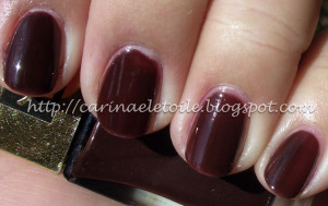
Happily Ever After
Shade (Top), Sunlight (Bottom)
Kind of a nice raspberry color with hints of shimmer and a glitter. Not too shabby, but not for me.
Mirror Mirror
Overcast (Top), Shade (Middle), Sunlight (Bottom)
This color wasn’t so bad on me…I was preparing to dislike it. People are loving and lapping up all the greys that’s carried over from fall into Spring. I’m not a fan of grey nail polish but eh…this one looked decent on me.
Pixie Dust
Shade (Top), Sunlight (Bottom)
Not quite cement grey, but almost a dove grey with some pretty sparkles thrown in for good measure. In some lights it looked almost periwinkle on me!
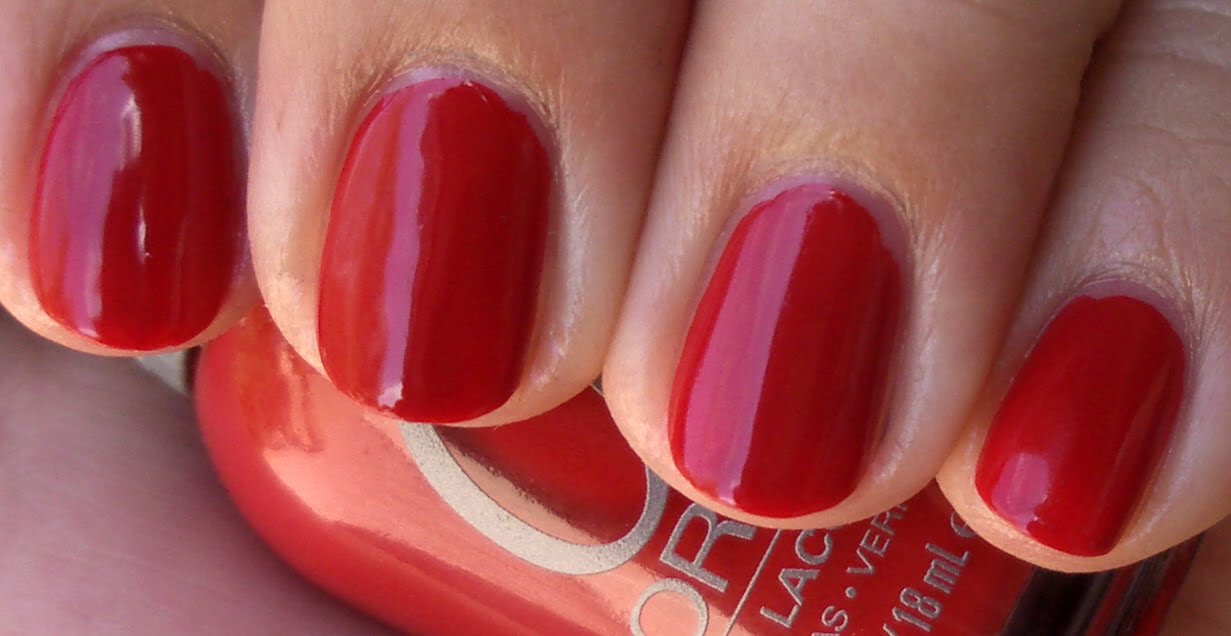
Poison Apple
Shade (Top), Sunlight (Bottom)
Jury’s out on this…it’s almost like a tomato/maraschino red. It’s well…kind of delicious! 🙂
Prince Charming
Shade (Top), Sunlight (Bottom)
Prince Charming failed…application was good, but that color. *barfs* They’d have been better off calling this Tree Bark Brown. Prince Charming was not charming…at all.
29 73524 Vernis Laque Pur

Kickin' It Old School

Friday, 5 February, 2010

Found this in my stash of old polish. It was released the same time as Chanel’s original Vamp, aka Rouge Noire. I forgot how much I loved this color…until I had to wait for it to dry in between coats. URGH!

So this is YSL’s Vernis Laque Pur line, 73521 number 29. You can see from the pics at the bottom.

Overall it was very hard to work with, thin and temperamental…but hey, it’s a teenager!

Shade (L) and in direct sunlight (R)
Shade (Top) and in direct sunlight (Bottom)
Necessary and l33t inf0z!