Not quite keeping up with my self induced promise of mostly green, I present PURPLE! I have more than 18 shades of purple polish between here and Arizona. The colors on this wheel are partially here, but mostly in our desert home.
It was a pain in the butt trying to take a pic of that color wheel and I realized I should’ve broken it up into 4 separate parts, but I was feeling kind of lazy and I hope that when you click on the pics, they become huge and you can see the difference in the colors.
You’ll find lots of shimmer, creme, a matte and a couple of holographics. Enjoy!

Outdoors – Shade
1. China Glaze – Octa Gone Wild (holo) 2. China Glaze – Grape Pop 3. China Glaze – Midnight Ride 4. OPI – Catherine The Grape 5. OPI – Eiffel For This Color 6. OPI – A Grape Fit!
7. China Glaze – Light As Air 8. OPI – Sapphire In The Snow 9. OPI – Visions of Sugarplums 10. Zoya – Savita (matte) 11. Zoya – Pinta 12. Barielle – Grape Escape
13. China Glaze – Grape Juice (Shimmer) 14. Orly – Cashmere Cardi 15. Orly – Midnight Star (slight shimmer) 16. Rescue Beauty Lounge (RBL) – Mismas 17. RBL – Scrangie (shimmer) 18. China Glaze – LOL (holo)

Outdoors – Shade with flash
1. China Glaze – Octa Gone Wild (holo) 2. China Glaze – Grape Pop 3. China Glaze – Midnight Ride 4. OPI – Catherine The Grape 5. OPI – Eiffel For This Color 6. OPI – A Grape Fit!
7. China Glaze – Light As Air 8. OPI – Sapphire In The Snow 9. OPI – Visions of Sugarplums 10. Zoya – Savita (matte) 11. Zoya – Pinta 12. Barielle – Grape Escape
13. China Glaze – Grape Juice (Shimmer) 14. Orly – Cashmere Cardi 15. Orly – Midnight Star (slight shimmer) 16. Rescue Beauty Lounge (RBL) – Mismas 17. RBL – Scrangie (shimmer) 18. China Glaze – LOL (holo)

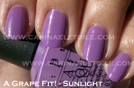
Outdoors – Sunlight
1. China Glaze – Octa Gone Wild (holo) 2. China Glaze – Grape Pop 3. China Glaze – Midnight Ride 4. OPI – Catherine The Grape 5. OPI – Eiffel For This Color 6. OPI – A Grape Fit!
7. China Glaze – Light As Air 8. OPI – Sapphire In The Snow 9. OPI – Visions of Sugarplums 10. Zoya – Savita (matte) 11. Zoya – Pinta 12. Barielle – Grape Escape
13. China Glaze – Grape Juice (Shimmer) 14. Orly – Cashmere Cardi 15. Orly – Midnight Star (slight shimmer) 16. Rescue Beauty Lounge (RBL) – Mismas 17. RBL – Scrangie (shimmer) 18. China Glaze – LOL (holo)
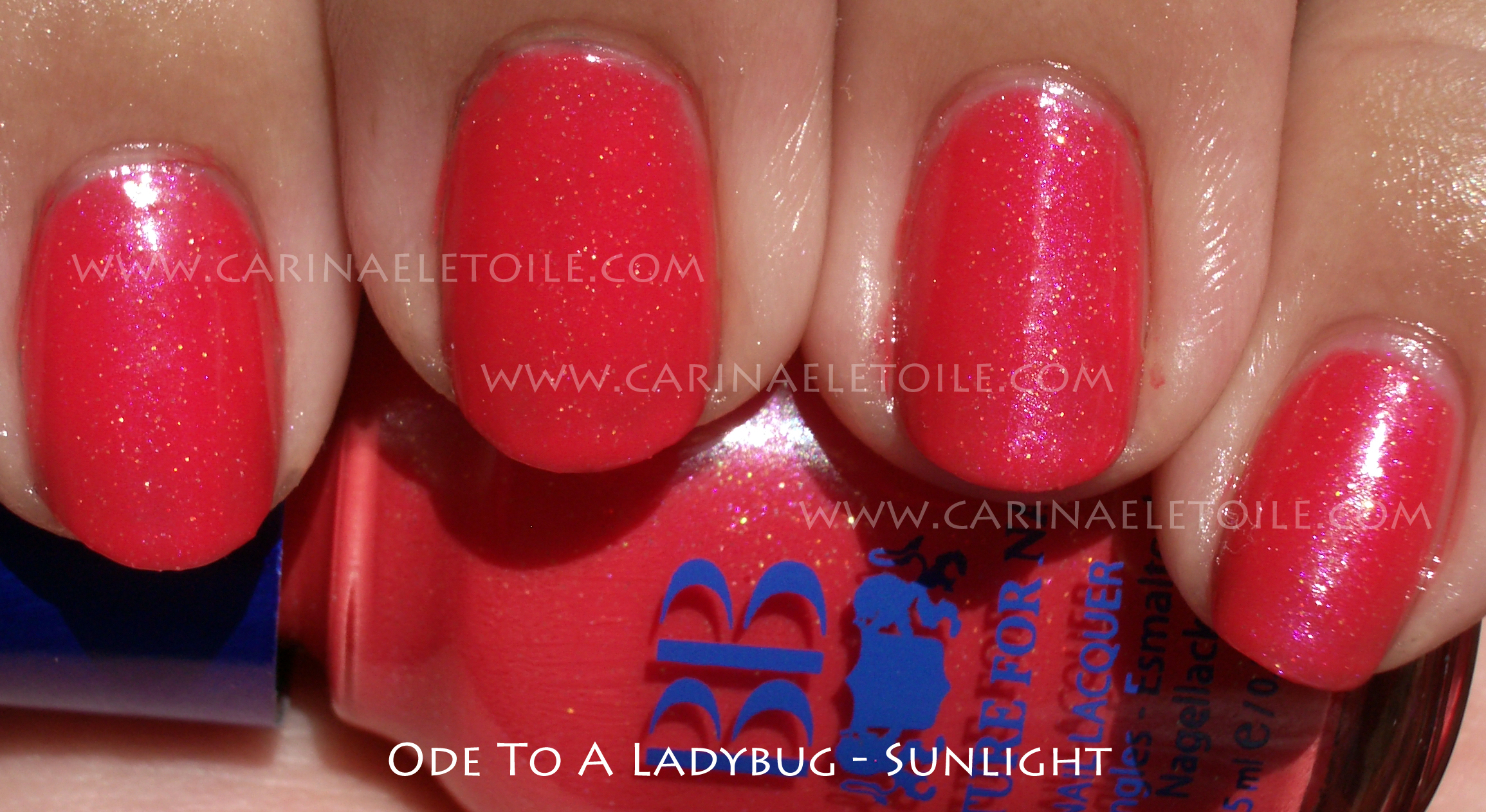
The Promised Green!


What I love about this gorgeous green with a slight yellow undertone is that it has a gorgeous micro glitter that contains more green than gold. One has to literally have it up close and very personal to see it. My camera didn’t do it any justice in capturing the glitter. The very faint yellow in this (heck, it could’ve been the gold micro glitter come to think of it!) wasn’t very strong and didn’t look awful on me. Quite the opposite – it was very flattering! Another stellar choice on my part from BB Couture. This color is from their Men’s Collection. Love it.