Browsing Tag

Friday red

Essie – Limited Addiction

Friday, 19 November, 2010

I haven’t worn red nail polish a lot in the past few years. I think it’s mostly because I wore it for 6 years straight. Loved red nail polish…no other color would do.

Then Chanel’s Rouge Noir (aka Vamp) came along, relegating all my reds to the end of the line.

Lately, I’ve been feeling the need for red again. Like I’m going to seriously binge on red nail polish until I feel I no longer need to wear it again.

That said, I’m wearing Essie’s Limited Addiction in these pictures. LA is part of Essie’s Winter/Holiday 2010 collection. *swoons* I loved how it looked on me – it was lovely and so seductive, but not in a trampy way! Application was flawless – dried quickly and was opaque in two coats, despite my heavy handed application. See for yourself!

OPI – Color So Hot It Berns

Friday, 5 November, 2010
www.carinaeletoile.com

This color is part of OPI’s Swiss Fall 2010 Collection.

I was a bit dubious when it came to this color, but I had such fond memories of Rescue Beauty Lounge’s Bangin’, I thought I’d slap this on my nails and see.

I’m also working on getting my left handed skills up and running again, so I’m going to start swatching with my right hand more often. Please be prepared for bad cuticles because I am very rough on my hands.

Formula was fast drying for this and frankly, the opaqueness really was wonderful. Two ultra thin coats was all it needed.

What I loved about this color is that it reminded me of old Hollywood Glamour. Would you agree?


www.carinaeletoile.com

www.carinaeletoile.com

Zoya – Maura and a small Project Runway Rant – don’t worry, you won’t see it unless you want to

Friday, 29 October, 2010

Note: I’ll try to post pictures this weekend to make up for the past 2 days of no blog entries. I simply wasn’t motivated to do anything. >< However, I had a request for a pink and I found one I had yet to swatch! So if the weather permits, you will find it here on the weekend. =)

SPOILER WARNING/AVOIDANCE — To read my rant, highlight the paragraph below that you can’t see!

Small diversion/rant: I am not happy with Gretechen aka WRETCHED being the winner that was chosen for Project Runway. Furthermore, I don’t feel the clothing of said designer is now and hip. It’s frumpy. It’s dated. It lacks the wow factor I want in my clothing. It’s effortless dumpy. I don’t like hobo chic. That’s not boho chic. That’s right, I said it HOBO. That clothing is suited for coat rack built girls, not hourglass girls like me. Patterns were awful and I felt the collection was so bland. If that is where fashion is heading, I’m sitting out the next few seasons. Hopefully people won’t fall for the dumpy frumpy look of said designer.

Anyway, rant over…

Part of Summer 2010’s Flash collection, Maura is this wonderful cherry tomato red.

It’s funny because Maura on me looks red while I’ve seen it on some friends and it looks like a coral. OH MY! Friends don’t let friends wear coral. 😉 Just kidding! I’m always jealous of people who can sport colors like that and not look like they’ve aged themselves by 30 years. It’s the green eyed monster in me…pure and simple.

Now what I truly love about this color is that the moment I put it on, it was true to the color in the bottle – bravo! It didn’t have that odd undertone of when you sometimes put on some polishes and go, “Uh, I swear I thought I bought a RED, not a pink.”

Zoya’s formula, as always, is friggin’ fabulous – fast drying and perfectly opaque in 2 coats.

OPI – Burlesque, Part II, Holiday 2010

Friday, 15 October, 2010

If I had to choose, I would definitely pick the glitters over this part of the collection. I’m not saying this half is not up to snuff, but when I think Burlesque, I do think of sequins and shiny under the lights…a lot of sparkle and flash.

This half is subtle but still gorgeous.

This post is image heavy…you have been warned!

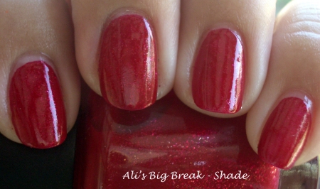
Hello, Friday Red. What isn’t visible in the picture is the pink undertones. I’m looking at the bottle right now and the pinkness isn’t shown. I love the faint shimmer that makes if glow. Bravo, OPI!


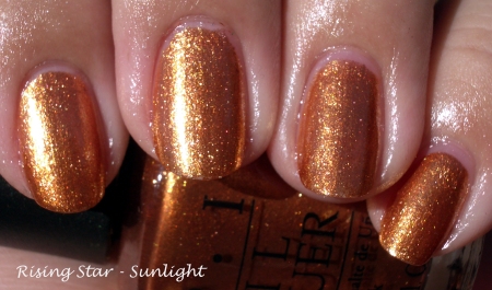
Bronze-y orangey goodness…I can’t believe this actually looked good on me!


It looks so different in these two pictures, but I assure you they’re the same ones. Sunlight made it appear a more deeper gold. Absolutely gorgeous!


A hot magenta.


I honestly thought this color from OPI (The Show Must Go On!) would be a clone for MAC’s Bad Fairy. It’s not. Not even close. BF is more on the orange side, while TSMGO is more on the pink/magenta side. Both share the same orange glass flecks. I had to do 3 coats of BF while OPI’s formula was wonderfully opaque in 2 coats. Though vastly different, there are enough similarities to make them seem almost identical. Owning both would be wonderful, but owning either of the two is still good enough.

I’ve posted this comparison before, but to not include it would be silly because Tease-y Does It is part of the collection. You can read more about Tease-y Does It here.

Orly – 'Tis the Season – Holiday 2010

Friday, 8 October, 2010

Orly’s Holiday collection is filled with some pretty fun colors. I love the application and the glitter. The red creme and the color Naughty Or Nice is just wonderful. What I’ve done is try to layer some of the glitters over the cremes. It’s an epic fail, but you’ll still see it. 😀

All the colors dried quickly and were opaque in 2 coats. The glitters were wonderfully dense and very fun to look at on their own.

This is an image heavy post – beware.


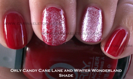
How awesome is this red? It is freaking gorgeous and I’m happy to include it in Red Nail Polish Friday. On the middle finger is one coat of Winter Wonderland and on the ring finger it’s 2 coats.


2 coats of Winter Wonderland on three fingers and 2 coats of WW over Naughty or Nice. I love how WW really does remind me of snow.


Normally I don’t like golds like this, but for some reason I found I liked this a lot. Naughty Or Nice is on three fingers while G&G is on my pointer finger. G&G is a dense, heavy glitter. Removal wasn’t so bad! One coat of G&G over NON to see how it would look. Meh.


I thought this color was so fabulous in the bottle. Then I put it on me. All the initial beauty of it was washed out by my skin and the sunlight. It’s much, much prettier in person and the shimmer/glitter is well done.

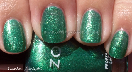
I’ve heard that MMUTM is a dupe for Zoya’s Ivanka. I don’t think so. Below are pictures of Ivanka. Ivanka is lighter while MMUTM is darker, more of a holiday green.


OPI – MonSooner or Later

Friday, 1 October, 2010

Fabulous red that’s part of OPI’s India Collection. I’ve decided that I’m going to start chronicling my messed up OPI brushes.

Great coverage and formula – dried fast and was perfectly opaque in 2 coats!