All Posts By

carinaeletoile

SpaRitual Spring 2010 – Believe Collection (Part I) and NFU Oh

Tuesday, 4 May, 2010

I purchased this collection two months ago and completely forgot about it. 🙁 Well, it was hidden…so out of sight, out of mind. I knew I had purchased it, but didn’t know where it had gone to. The room I share with the cat is where I also have my polish collection. I honestly thought the cat had done something to it. Turns out it was erstwhile hubby, moving things around while looking for a some random cord to connect something to his computer, but that’s another issue completely. I will say that he needs to join Cord Collectors Anonymous.

Anyway, I now present the first half of SpaRitual’s Spring 2010 collection called Believe. It came with these cute little charms with words and sayings on them like, “Wish”, “Believe” and “I Can”. You’ll even see a tag in one of my swatches!

I loved SpaRitual’s formula – it was even and smooth with a minimal chance of me messing it up – which I did. Can you spot the flaws on the application, aside from my obvious cuticle pull mishaps? 🙂 Formula was so easy to work with and it dried so fast I was a bit stunned. The brush on Spread Your Wings was a bit jacked – more bristles than the other bottles and at a strange 15 degree angle. I thought it was supposed to be like that until I noticed some bristles less than a millimeter longer than the rest in the bottle.

I split this collection into 2 – Part I is the ZOMG MUST SHOW YOU and Part II is I MUST SHOW YOU THESE LATER! In other words, the first part wowed me while the second part made me look and go, “Oh. ok. Not so bad.”

Enough of my nattering – here are the pics.

How gorgeous is this purple?! I love cremes and this purple creme makes my heart beat a little faster.

Despite the jacked up brush, this color really moved me. This is the shade of red that I love wearing. How can one NOT love wearing a color this luxurious?

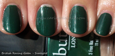
Hello, green lover…*purrs* How beautiful is this? I didn’t have to do anything to this picture – just cropped it. The green looked exactly perfect and when I ran it through PhotoShop, it barely did anything to it to balance it out. When I had this one, this green shot straight to the #1 spot for my greens. IMO, this is the go to green for me. I used to dislike green polish, but the ones that have come out in the past couple of years have really made me change my mind.

Perfection in the sun, too.

Was playing about and put NFU Oh’s #51 on top. The sunlight washed it out, but it was a lovely combination. The NFU is lighter and what you can’t really is the dimensional depth the glitter added. I had a shade shot that was slightly blurry but even in that you couldn’t see the difference. You can really see it in person.

Inglot – #891

Monday, 3 May, 2010

When we moved to India, I was having a hard time finding polishes I liked. MAC was a bit too pricey for me, Chanel was just far too overpriced for my taste…that and I already had the colors.

Wandering through Saket’s Select City Walk mall – which, by the way, if you ever have the chance to go there, go…it’s insanely gorgeous and a fun place to be in – I came across a store called Inglot. The packaging for Inglot is similar to MAC’s – black with white lettering.

Inglot was my first introduction to matte nail polish in the fall of 2008, but that matte polish color will be for another post. This post is the silver metallic grey that caught my eye. I hope you can see why. When first applied, it went on a very dark gun metal grey then when it dried all the silver mega mini micro glitter came out to play. The pictures do not do this justice.

Inglot doesn’t have names assigned to their polishes…merely numbers. I purchased several bottles for myself and a bunch for my fellow polish friend back in the States.

Inglot’s an Eastern European brand and it’s really very pretty, but the colors and bases were definitely made with the eastern european skin tone in mind. A lot of the colors ended up being super bright and scary on me. I gravitated towards the ones that were closer to black, dark grey and dark blue.

You can now find Inglot in New York City located in Times Square, by the way.

Pics of the gorgeous metallic grey below. 🙂

Illamasqua – Milf

Sunday, 2 May, 2010

I just found a whole bunch of Illamasqua swatches I’d done but have not posted. I processed this one and it’s an old one, but a color I’ll wear again. I swatched this back in January when I spending time in our home Arizona house. I can’t believe I forgot I have this!

Looks nice and opaque in the picture. Application was also quite nice, too. I usually have a very hard time with opaque cremes, but this was really so easy I couldn’t believe it! This was a two coater.

Oh that sun! It brings out some realities, doesn’t it? This color still is not bad on me but I have to be careful of the colors I wear because it can turn on me in a second, making my skin look like a dull, almost gray type of yellow.

OPI Update

Friday, 30 April, 2010

First off, a million thanks to my friend and her husband for getting a copy of the complaint to me.

So all the drama that went down can be found below. The information below is from the actual complaint, so this is not my speculation, but the real court filed documents:

In the complaint OPI alleges that TransDesign infringed on their copyright…which TD did.

So, if you ever look at some bottles of OPI, do you notice that it looks like someone’s filed some part of the glass bottle away? That there’s a rough spot on the bottle where it should be smooth? I have and I thought, “WTF was filed away from here?” Now I know!

In the complaint, OPI alleges that TD (as well as other companies) have done that. But here’s where it gets ugly…

The infringement? It’s the pictures we’d see on TD’s website. They (TD) make it sound like they are authorized sellers of OPI. They are not. They have no contract with OPI to sell. So yes, their pictures are an infringement because OPI has no contract with TD, TD can’t get any legit OPI products from OPI. In the complaint, OPI alleges that “Defendants resort to deceptive, fraudulent, and illegal trade practices as well as false pretenses in order to obtain OPI products.”. OPI even has distribution policies and contractual mumbo jumbo on their website under “Anti-Diversion Policy”.

In November 2009, OPI asked TD to stop selling OPI Products on the Internet and to stop using images of OPI on their site (intellectual property).

TD did not comply.

Remember what I said about that filed part of the glass bottle? Well, that filed part of the glass bottle is the OPI Serial Number. That number is crucial to OPI in terms of quality control and detection of fake OPIs. TD knowingly and willfully sold these OPI Products with the missing OPI Serial Numbers.

Why is it important? Because if OPI ever had to do a recall and you had a bottle that was in the recall, how the heck are you to know when there is no serial number on it? Ultimately, OPI doesn’t want lawsuits.

Last, but not least, TD sold OPI products internationally where there was already a distribution setting put in place. So basically, OPI didn’t like TD undermining their distribution set up or their quality control. In TD’s case, it’s a lack of quality control. I can see why OPI would be pissy about it.

After all of this, I wonder if all the bottles I got from VNS and TD are legit OPI colors…hm…

However, sucks to be TD because OPI stated in the complaint they want financial recompense from TD for selling the non-legit OPI. No number was mentioned, but I figure it could be ugly.

You can click icomplaint2 below for a full copy of the complaint. It’s 87 pages long and it has pictures!

ipcomplaint2

Below is me weighing in on the issue.

What do I think? I feel like OPI’s being a bit like the LVMH (Louis Vuitton Moet Hennessey) corporation in tracking down fake Louis Vuittons. It’s all about quality control. But in the grand scheme of things? It’s nail polish. It’s not purses/wallets/suitcases that sell for over $1,000 per item. Relax, OPI.

That’s it. That’s the drama. That’s why our fave cheapie e-tailers don’t have OPI any more.

PS I’m lifting my OPI ban. They weren’t in the wrong for wanting to protect the integrity of their products. If anything, it makes me admire and like them even more.

BB Couture – Peacock

Friday, 30 April, 2010

This yellow reminds me of a school bus. It looked so different in the bottle that I was tempted into buying it…and was horribly let down. It’s not the fault of the polish – it’s me and my yellow/orange skin tone. It looks perfectly fine on Playing With Polish‘s blog . It looks fabulous on her. I saw her swatch on her blog yesterday and remembered I had swatched this color last week, but still had to get around to uploading it.  Here it is.

Notes on the forumula: in better hands it would’ve actually performed much better. I was in a rush because the sun was out and I wanted to get swatches in before cloud cover and rain fell on my polish swatching parade. Haha. It dried quickly and easily which is always a bonus.

Essie – Resort Collection, Summer 2010

Thursday, 29 April, 2010

The collection overall wasn’t so bad. Formula was hit and miss  and a bit too runny and thin. Because of that, it really shows in the swatches below. Please don’t laugh at the visible nail lines. I loved the colors and the preview swatch looks so much prettier than the actual colors look on me.

Essie’s Summer 2010 Collection

Looks pretty and enticing, right?

Look at the reality below.

Sunlight washed this color out, but I felt it was the prettiest of the lot…It did remind me of their blue collection from last summer.

A pretty pink that works for me, but pink isn’t my color.

It looked like a grey in the bottle, but it ended up being a bit of a dull, lifeless beige on me. 🙁

A pretty sea foam green.

OPI – you disappoint me

Thursday, 29 April, 2010

OPI was the brand that brought my love of nail polish back to life after 10 years of not purchasing anything.

Now OPI is disappointing me – badly. To the point where I thought I’d only buy and not swatch, effectively putting a ban on them pictorially. I’m still searching for the court documents, but it seems that OPI has brought a lawsuit against one of my favorite e-tailers (www.transdesign.com) because the e-tailer sells OPI at a lower price than the suggested retail price. If you go to Trans Design, they are liquidating ALL of their OPI products. Seems OPI has won, but have they really?

Here is a link to the suit that was filed in California, but I am looking for a free version of the documents. http://www.rfcexpress.com/lawsuit.asp?id=56040

OPI, I’ve purchased the last lot from you. So unless you come and give me free products, I will not be posting or mentioning you ever again. You’ve made your last dime off me when I made my final purchase. I was going to buy then swatch and post the new Shrek collection you have coming out on May 1, but I won’t now. I’ll be allocating that money towards Nubar’s Fortress Collection.

My followers are not as prolific as Scrangie, the Swatchaholic or any other popular nail blogger, but I am fortunate enough to have a small loyal following. I’m prolific enough on other social network sites where my friends actually purchase colors and brands of nail polish I’ve recommended.

I’m putting out a ban on you…No more OPI products for me and I will strongly encourage my friends to purchase other brands such as China Glaze, Essie, NuBar, Misa and BB Couture.

I’m saddened by how OPI has handled this. I’m even more saddened that OPI’s made me go to this length to show my displeasure because all this blog was really ever meant for was to display my love of nail polish.

I’ve always disliked companies that play bullies. It’s why I don’t shop at Wal-Mart.

UPDATE:

I was able to find the court documents and as far as I can see it really is all about copyright infringement…and the only copyright infringement I ever saw on www.transdesign.com was the images and some of the wording they took off of the OPI displays. OPI could’ve been less – pardon my french – cunty about it, but they decided to take TD to court and OPI won. But a lawsuit? Maybe OPI asked them, TD refused, and OPI’s only alternative was to take them to court. Who knows? But for OPI to do this to e-tailers like Victoria Nail Supply and Trans Design, where people from all over the world, not just the US, purchase OPI polish is ridiculous. They’ve shot themselves in the foot.

I freely admit to not purchasing OPI in a retail setting where bottles cost anywhere from $8 to $10. So it looks like I won’t even be purchasing OPI from e-tailers because OPI has cut them out of the market. I could be tempted to buy from my local nail suppliers who have sold me bottles for $4 or $4.50, but OPI’s overall attitude towards not paying full price has pretty much soured me towards anything OPI related. I’ll be honest in saying I don’t mind paying $12 or $20 for a nail polish so long as it’s department store type of nail polish. NEWSFLASH OPI – you aren’t Chanel. I refuse to pay more than $6 for a bottle of OPI because it’s a mid-grade polish I can find in any nail salon. Exclusive and high end you are not. Don’t ever think that you are. Ever.

What has OPI lost in all of this? Instead of one customer who won’t buy OPI at full price, I’ve decided I won’t buy OPI at all. I wonder when/if OPI will start to go after my favorite nail polish suppliers here in AZ and CA now. “We don’t like that you’re selling OPI for below market price.” Does OPI worry about them suddenly becoming discount nail polish? What gives OPI? What made you become a scheming shrew?

I wonder when physical storefronts will be hit with the OPI Copyright Infringement Bitch Stick.

UPDATE #2:

…and OPI is no longer on any of other fave etailers. OPI, you suck.

For Hubby – Butter's British Racing Green

Wednesday, 28 April, 2010

A lot of the time, my husband misses life in the UK – the politics, the food, the beer, his family…Well, maybe sometimes not his family. 😉 Anyway, Butter came up with a color that was the standard for Britain’s racing cars and was called aptly enough, British Racing Green which was/is a dark green that wasn’t quite forest, but was dignified and very pretty.

Butter London (oddly enough, it’s an American company!) came up with their version of it and called it…British Racing Green. It’s sexier, sleeker and one I’d gladly sport on my nails when I want a sexy green.

Even better news? Butter’s Three Free and claims they are vegan! 🙂 Just a small note – Butter doesn’t even smell like nail polish. It’s not harsh or overbearing.

Deceptive…yet lovely! Looks like another green polish here.

Then hello sunlight! Look at that subtle silvery/pearlescent-ish shimmer that runs through it and keeps it from being like the others!