Browsing Tag

Essie

comparison

Essie – Smokin’ Hot vs Zoya – Kelly

Wednesday, 17 November, 2010

Essie’s Smokin’ Hot is literally, smokin’ hot. It’s gorgeous. It’s plummier, yummier. So gorgeous. Hotter. It’s a great way for Essie to say hello to the Holidays for 2010. Zoya’s Kelly holds its own quite well and is gorgeous, but when pitted against Essie, I definitely prefer Smokin’ Hot.

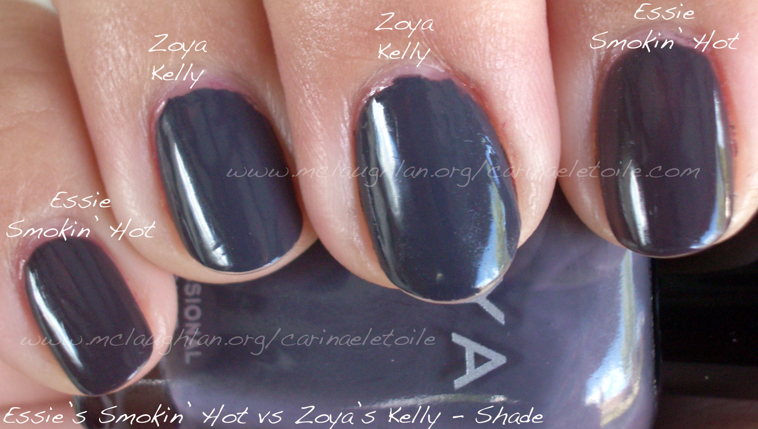
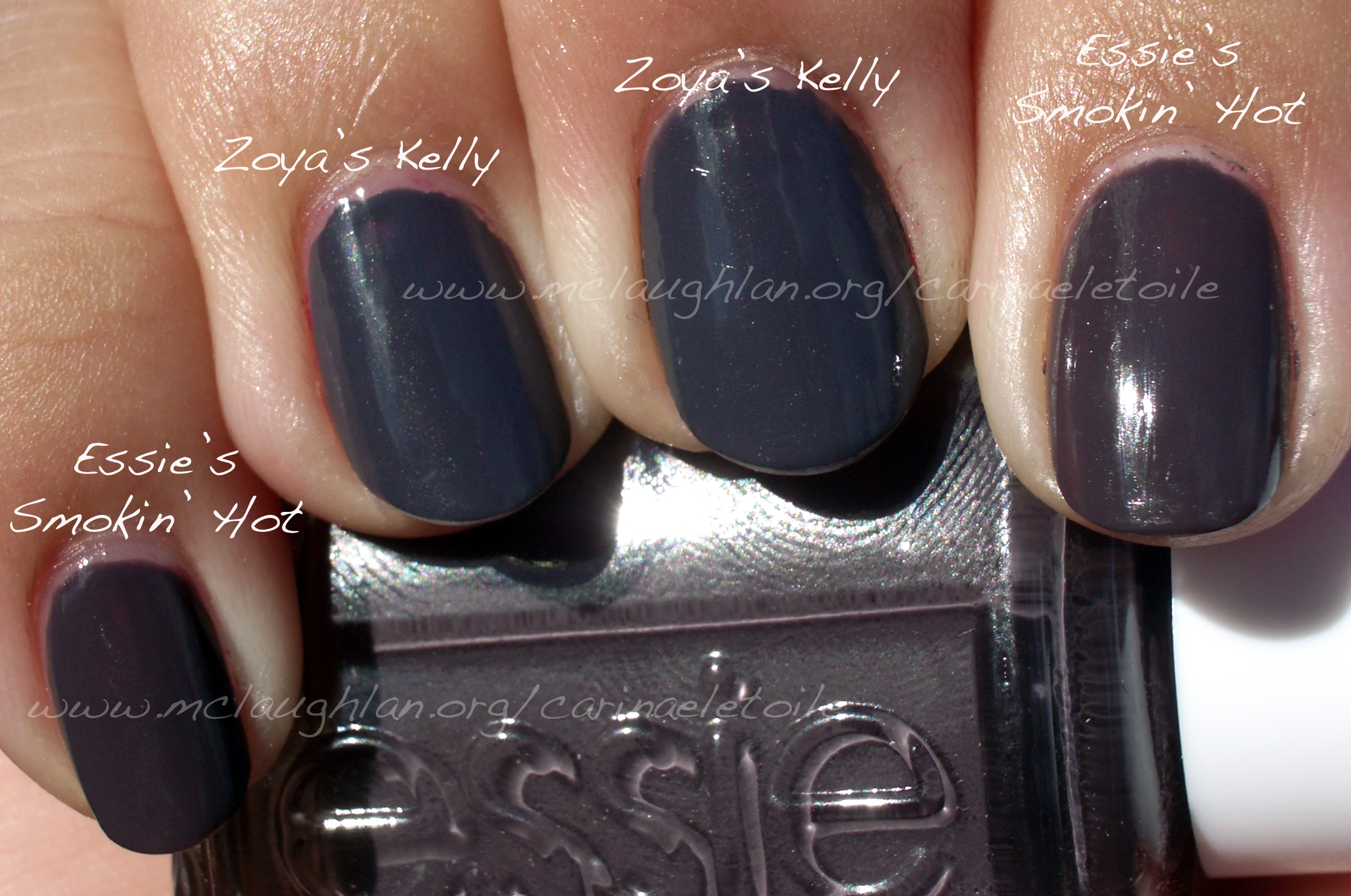
While Essie shines in color, it is, quite sadly, deficient in application. A bit moody – in that godawful once a month kind of way. It took three coats to get it to the color you see in the pictures and it took forever and a day to dry. It held me up for the day I had allocated for swatching. Zoya dried quickly and only needed two coats.

I really should’ve had taken a picture of these colors in artificial lighting because that’s where they both fall extremely similar – you would almost never be able to tell the difference.

Anyway, come see what I mean below. I also tested for wearability on both and found they held their own after 3 days – all you’ll see is tip wear and my ghetto cuticles. It’s my right hand – what can I say?

Essie Smokin Hot Zoya Kelly

.Essie Smokin Hot Zoya Kelly

comparison

Chanel vs Essie vs Rescue Beauty Lounge – Khaki Vert vs Sew Psyched vs Diddy Mow

Monday, 18 October, 2010

I had to do these three compared because next to each other (or as my friend Kristen from Rhode Island taught me, “Side by each!”) they were so blindingly close that I felt a little ripped off. In my excitement I didn’t take a picture of the bottle side by each, but I will soon and update this post.

These three were definitely in the same color family, but I love the subtle differences…and I love that they’re cremes. Hope you fall for these military greens the way I did.


In sunlight you can see the obvious difference between KV, SP and DM. KV has more green while SP and DM have more grey in it. Mr. CarinaeLetoile was so cute when he looked at Khaki Vert on me and commented, “It’s really like a military green. I think Army when I look at it.”

At first glance, SP and DM seem like dupes. But only in the picture. Both have an extremely faint shimmer in it. Both have a good amount of grey in it, but that is it. The difference in person is extremely subtle, but because I’m such a nail fanatic I know the difference – or so I tell myself. LOL I wore SP during the weekend, but kept KV and DM on my swatching hand. It was so subtle that no one could see the difference in the restaurants and dim places we went to this weekend. If you can grab SW, go for it. It’s a cheaper alternative to RBL’s DM. However, if you have DM no need to get SP. If you don’t have KV and want to get it…go for it. While I felt Les Khakis was a bit pricey, I felt it was well worth it.

Essie – In Stitches

Thursday, 7 October, 2010

This is part of Essie’s Fall 2010 Collection – and I love it. It is a dusky salmon pink. I thought it was super pretty…and then I wore it for a few days. Friends looked at it and agreed – very pretty. Too bad it made my hands look old. Grrr.

I rarely wear pinks and the few times I do I seem to choose those colors that make me look like…2,010 years old!

Great formula and opaque in 2 coats. Fast drying. No cuticle pull. Woo hoo!


Essie – Merino Cool

Wednesday, 6 October, 2010

I love colors like this. Part of Essie’s Fall 2010 Collection, this color is one of my favorites out of all the polishes I have right now. Colors like this have always had a special place in my heart.

Formula was good – dried fast and was opaque in 2 coats.


Essie – Demure Vixen

Friday, 16 July, 2010

A nail polish fairy sent this to me the other day and I swooned…I haven’t been able to get my hands on Chanel’s Paradoxal and I know there is a huge difference between the two, but I was honestly hoping that this would kill any lemming moments I would have for Chanel. It didn’t. I am hoping that the nail polish fairy gods will hear my cry for Chanel Paradoxal soon…but I digress…

Demure Vixen is definitely demure, but in my opinion, no vixen. To me, vixen implies a steely sexy edge…this color doesn’t have it. This is one of those colors that I would call a lovely safe shade for work.

See below to understand what I mean.

Don’t get me wrong…this is a lovely shade. I adore this shade – it’s the lighter sister of  Sephora by OPI (aka $OPI)’s  Call Your Mother with a violet shimmer through it. This color was almost a sheer. This was it after three coats. As always, Essie’s formula was like butta!

Essie – Chinchilly

Thursday, 10 June, 2010

I love this color…how can you not? It’s a creme. It’s a mushroomy/taupe-y color. It dried quickly. It didn’t bubble. In a word? Fabulous! (Saying that in my best Tim Gunn voice, btw.)

Please excuse my bad manicure application on my right hand.

Essie – Resort Collection, Summer 2010

Thursday, 29 April, 2010

The collection overall wasn’t so bad. Formula was hit and miss  and a bit too runny and thin. Because of that, it really shows in the swatches below. Please don’t laugh at the visible nail lines. I loved the colors and the preview swatch looks so much prettier than the actual colors look on me.

Essie’s Summer 2010 Collection

Looks pretty and enticing, right?

Look at the reality below.

Sunlight washed this color out, but I felt it was the prettiest of the lot…It did remind me of their blue collection from last summer.

A pretty pink that works for me, but pink isn’t my color.

It looked like a grey in the bottle, but it ended up being a bit of a dull, lifeless beige on me. 🙁

A pretty sea foam green.

Essie – North Fork Collection, Summer 2009

Thursday, 25 March, 2010

I’m late, I’m late…oh well. I was fortunate enough to score these colors long after the collection stopped being seen on shelves. I can definitely see why! I honestly thought I wouldn’t like any of these colors. WRONG! Totally fell for them in a big, bad and ugly kind of way.

This color was the star of the collection, the one that sold out the fastest. It was also the one that was hard to get long after the collection stopped being on regular retail shelves. I was fortunate enough to score the whole set from an e-tailer. I can see why this color sold out and out of the three, this was my least favorite. However, this color did look good on me. I preferred the other two.

This color was very deceptive in the bottle. I thought it was a blue gray while I was indoors, but once outside it really wowed me even more. Sadly, due to the overcast day, you can’t see the very faint shimmer that runs through it – it is absolutely GORGEOUS. Easter is coming up and I’m having a hard time deciding which color to wear – this or Shelter Island, as you will see below.

I kept this color on my nails for TWO WEEKS! That’s a record for me. Why? Because I loved it THAT MUCH. It is slightly hard to find, but it’s one that is well worth it. However, if you can’t find it an extremely close dupe is OPI’s No Room For The Blues.

And just to refresh your memory, here are the comparison swatches again.