Depend – Nr 058
Thursday, 2 June, 2011Rescue Beauty Lounge and China Glaze – Sheer Red and Mrs. Claus
Friday, 3 December, 2010I ordered Sheer Red by Rescue Beauty Lounge. I knew it was going to be sheer, but what I didn’t count on was exactly how sheer it would be. Not that that’s a bad thing. Don’t get me wrong. The formula for SR took a little longer to dry than I would have liked.
I thought the red was close to China Glaze’s Mrs. Claus, but without the glitter…I layered it over Sheer Red.
The base was similar that’s for sure. However, the base of MC is slightly more sheer than SR.
With my skin tone, SR ended up looking more pink on me. Not quite sure if I am liking the sheerness of it. This may be the one color by RBL that I’m not too fond of. 🙁
To see the enlarged original picture, click on the thumbnail and then click on the number in the phrase “Full size is blahblahblah x blahblahblah pixels.”
 I like Mrs. Claus. The pink glitter shown isn’t looking as cool as it does in person. The pinkness doesn’t shine through. It’s really gorgeous in person.
Sunlight totally washed out the glitter, making it look silver. Very cool looking. I think I’d choose MC over SR for a holiday color.
Here is CG’s Mrs. Claus to refresh your memory.
Essie – Demure Vixen
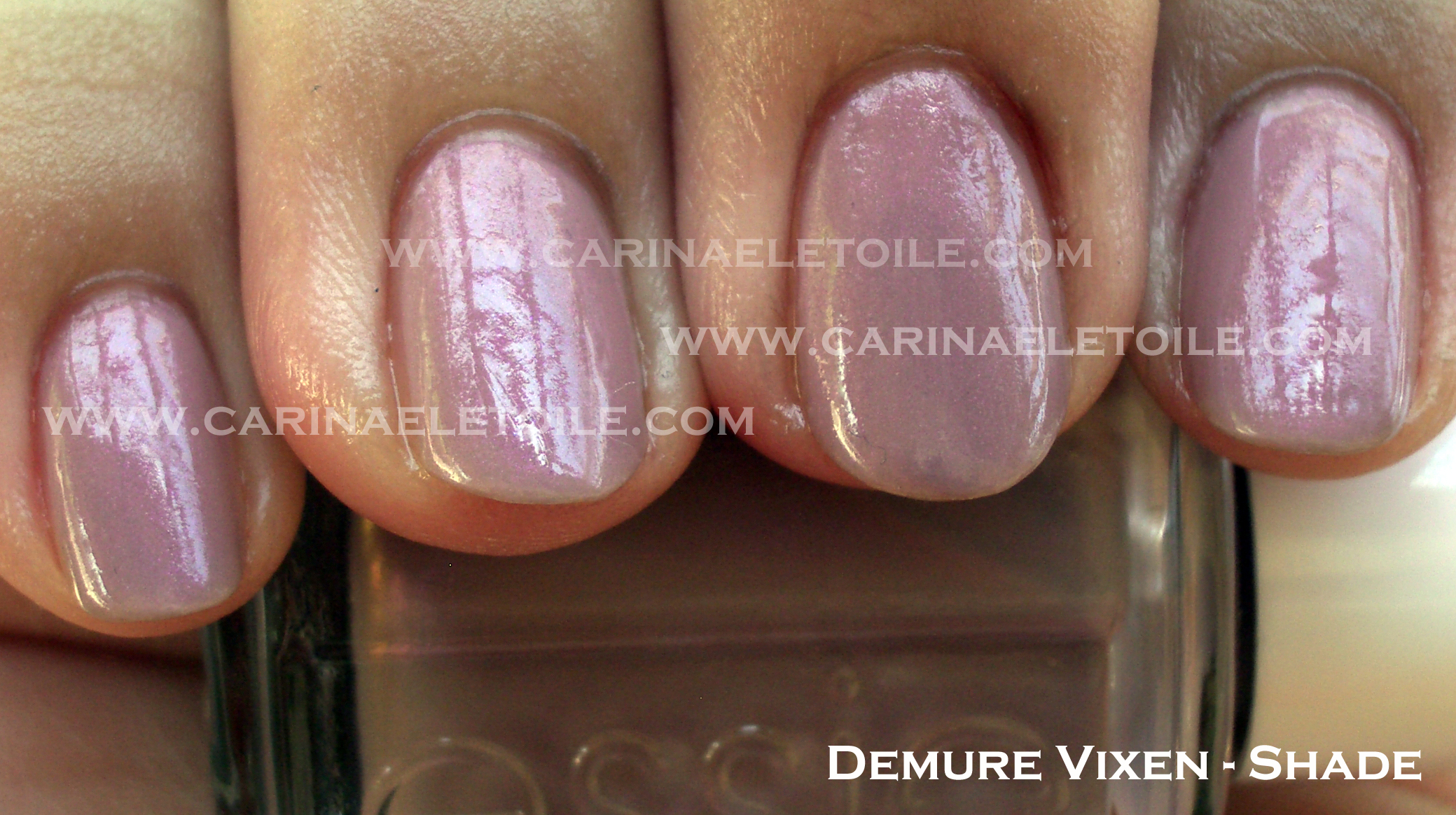
Friday, 16 July, 2010Demure Vixen is definitely demure, but in my opinion, no vixen. To me, vixen implies a steely sexy edge…this color doesn’t have it. This is one of those colors that I would call a lovely safe shade for work.
See below to understand what I mean.
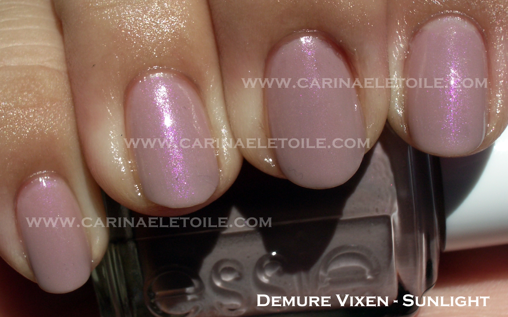
Don’t get me wrong…this is a lovely shade. I adore this shade – it’s the lighter sister of Sephora by OPI (aka $OPI)’s Call Your Mother with a violet shimmer through it. This color was almost a sheer. This was it after three coats. As always, Essie’s formula was like butta!
I’ve had this color for ages and was never really motivated to try it. I thought it looked beautiful in the bottle but was worried it wouldn’t translate well into real life. I hate it when a polish does that and it so often happens with shades like these once on me.
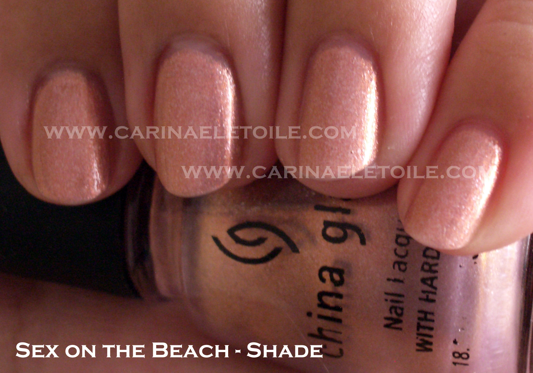
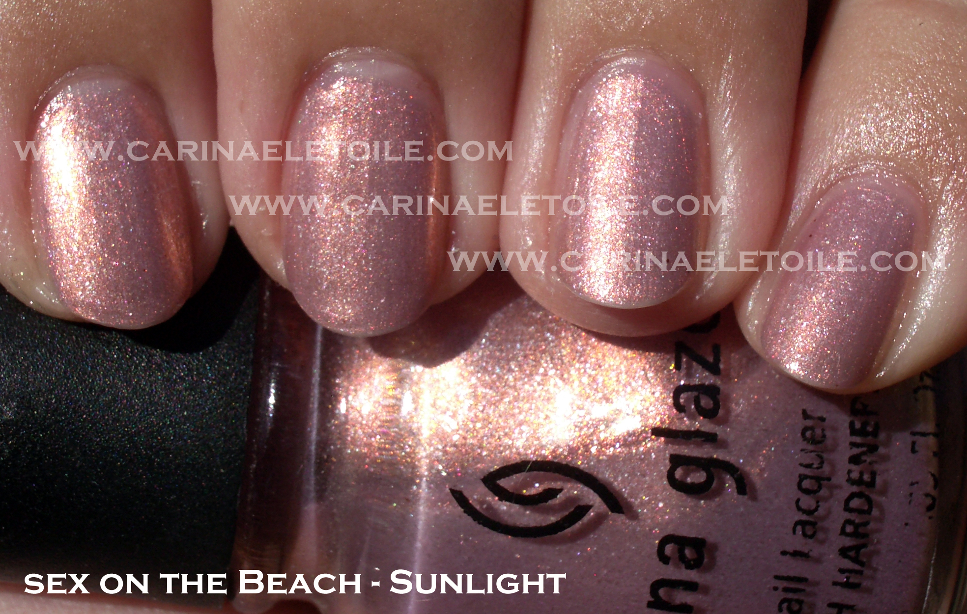
This wasn’t a huge disappointment, but it did transfer almost perfectly – it’s a peach shimmer with a lovely gold undertone. Unfortunately, the shade is a bit too warm for me. 🙁
It’s a gorgeous color nonetheless – see below.
It looks so ho-hum boring in the shade, doesn’t it?
Sunlight brought this baby to life, showing flashes of peach, pink and gold shimmer. It’s very pretty, n’est-ce pas? I know I don’t have a color similar or even remotely close to this, so even though it’s a bit on the warm side for my skin I’m going to keep this!
Spa Ritual Spring 2010 Collection – Believe Collection (Part II)
Wednesday, 5 May, 2010You can see the cuticle issues on my middle finger. This pink had a shimmer in it that was meant for someone either younger or older, but not me. I’m very fussy about my pink nail polish and this is definitely not one for me.
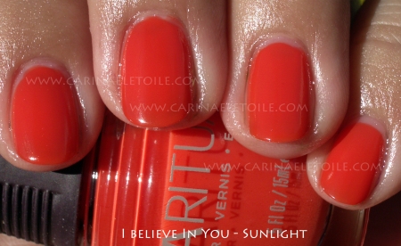
See? Cuticle pull again! This orange…is orange. I love orange nail polish, but this was a bit too sheer and almost a jelly like quality. This is 2 coats and it’s still slightly sheer. Not sure if you can see that.
A lovely creme that I absolutely loved in the bottle. Sadly, it looks like I’ve glued some pastel colored M &Ms onto my fingers. It looks surreal and very odd. I was hoping that it would look ok on me, but it really didn’t. I love, love, LOVE this color. I really wish this would look good on me. Oh well…plenty of polish for me to choose from so I’m not lamenting my lack of choices. 🙂


