I purchased this collection two months ago and completely forgot about it. 🙁 Well, it was hidden…so out of sight, out of mind. I knew I had purchased it, but didn’t know where it had gone to. The room I share with the cat is where I also have my polish collection. I honestly thought the cat had done something to it. Turns out it was erstwhile hubby, moving things around while looking for a some random cord to connect something to his computer, but that’s another issue completely. I will say that he needs to join Cord Collectors Anonymous.
Anyway, I now present the first half of SpaRitual’s Spring 2010 collection called Believe. It came with these cute little charms with words and sayings on them like, “Wish”, “Believe” and “I Can”. You’ll even see a tag in one of my swatches!
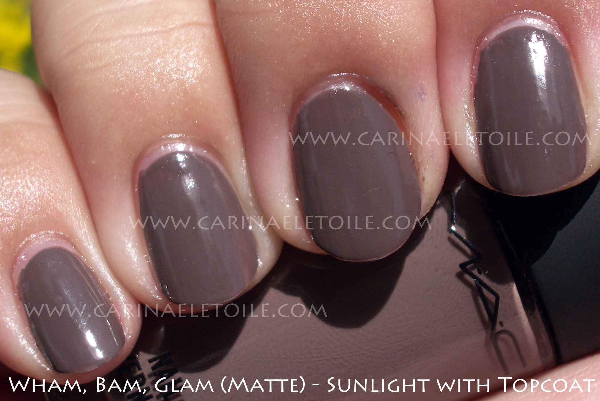
I loved SpaRitual’s formula – it was even and smooth with a minimal chance of me messing it up – which I did. Can you spot the flaws on the application, aside from my obvious cuticle pull mishaps? 🙂 Formula was so easy to work with and it dried so fast I was a bit stunned. The brush on Spread Your Wings was a bit jacked – more bristles than the other bottles and at a strange 15 degree angle. I thought it was supposed to be like that until I noticed some bristles less than a millimeter longer than the rest in the bottle.
I split this collection into 2 – Part I is the ZOMG MUST SHOW YOU and Part II is I MUST SHOW YOU THESE LATER! In other words, the first part wowed me while the second part made me look and go, “Oh. ok. Not so bad.”
Enough of my nattering – here are the pics.


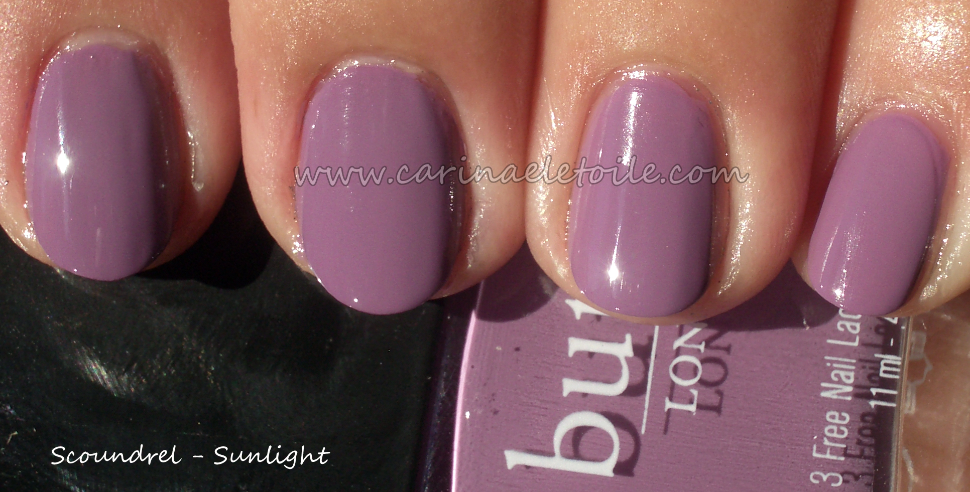
How gorgeous is this purple?! I love cremes and this purple creme makes my heart beat a little faster.


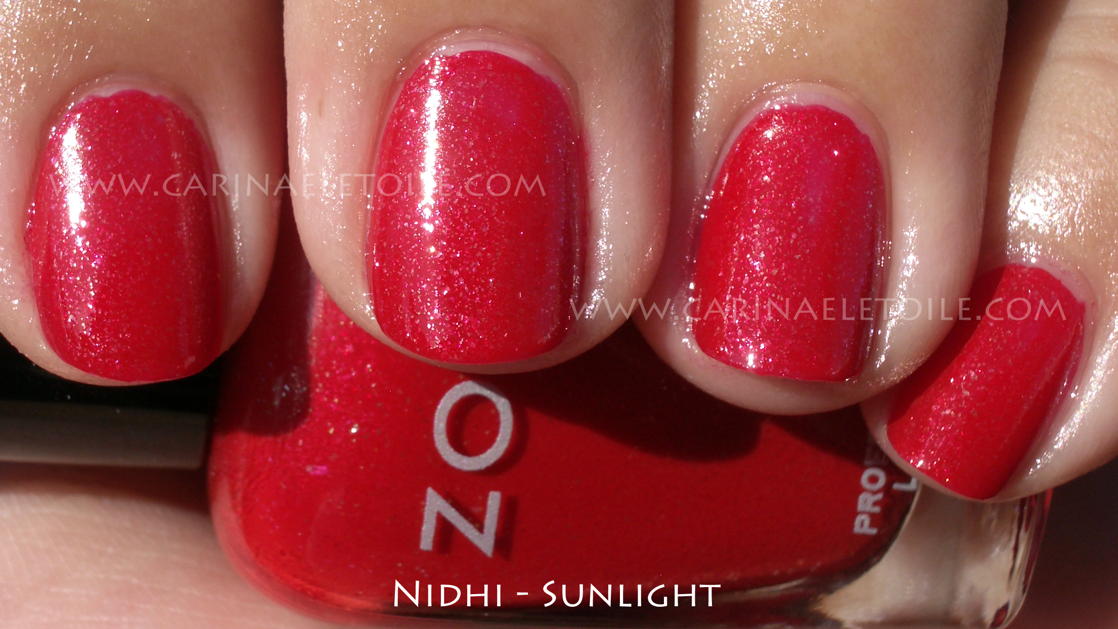
Despite the jacked up brush, this color really moved me. This is the shade of red that I love wearing. How can one NOT love wearing a color this luxurious?

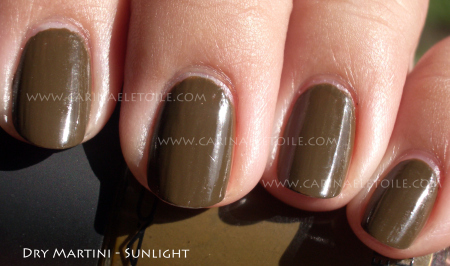
Hello, green lover…*purrs* How beautiful is this? I didn’t have to do anything to this picture – just cropped it. The green looked exactly perfect and when I ran it through PhotoShop, it barely did anything to it to balance it out. When I had this one, this green shot straight to the #1 spot for my greens. IMO, this is the go to green for me. I used to dislike green polish, but the ones that have come out in the past couple of years have really made me change my mind.

Perfection in the sun, too.

Was playing about and put NFU Oh’s #55 on top. The sunlight washed it out, but it was a lovely combination. The NFU is lighter and what you can’t really is the dimensional depth the glitter added. I had a shade shot that was slightly blurry but even in that you couldn’t see the difference. You can really see it in person.


")
")
")
")