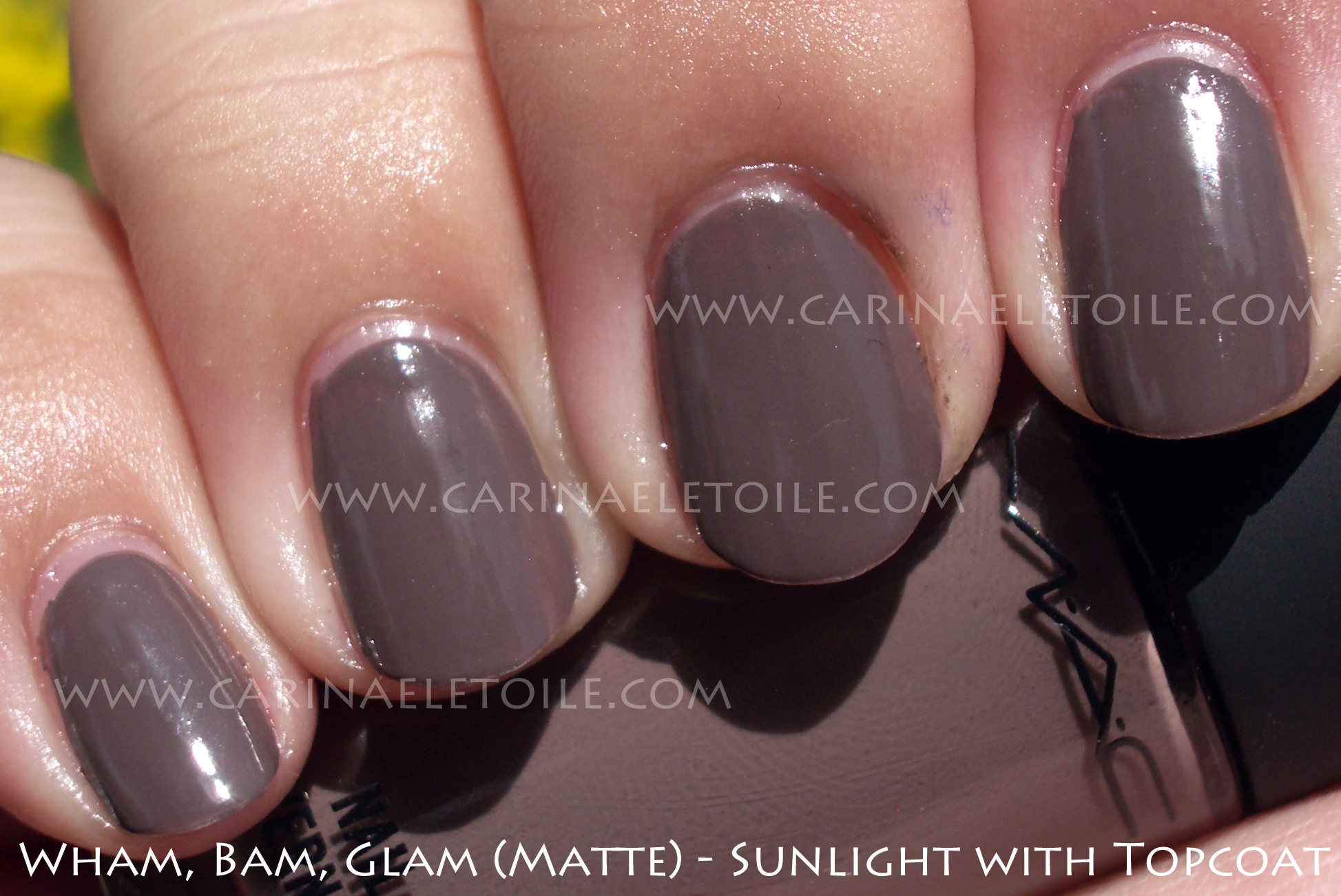
I couldn’t make up my mind, so I ended up just trying on Knight’s Armor, then deciding to swatch it. So it’s a sloppier than usual application for ALL these swatches. I just got a little too excited.
As for the Damone Roberts one, I had originally been wearing Knight’s Armor on my left hand and DR1968 on the other. Hah. I liked how DR1968 looked on my right hand, so I took off KA (as you might see some glitter in the DR1968 swatch) and now all my fingers are sporting DR1968…with one lone exception: my thumb. That has Nubar 2010 on top of it. I was all over the place today.

Thumbshot – Damone Roberts 1968 with Nubar 2010. Regular Shade and Sunlight shots below!


I was fully prepared to NOT like this color. I put it on…and I really liked it. I bought a few extra bottles because I plan on having a give away here soon, so stay tuned. Anyway, this formula was slightly thicker than the usual OPI but what I liked most is that it dried fast, which is unusual. This is 3 coats because I suck at applying nail polish.


I think my really bad photography skills came into play here. I feel like I made this polish look ugly. It’s not. It’s so gorgeous. I wanted to compare it to Orly’s Goth, but it wouldn’t be fair to either of the polishes. This glitter is all one size and the base for this is a bit more dark grey. Also, there is more glitter in this than Goth. Orly’s Goth is a black base with different sizes of the glitter. This was truly fabulous. Knight’s Armor is part of Nubar’s Fortress Collection.
The formula dried quickly and wasn’t as gritty due to the glitter. I have the Sparkles collection as well and that glitter collection is beautiful, but it’s so dense that when I applied a top coat, it never was a full glossy shine. You’d end up seeing and feeling the texture of the glitter underneath.
I’ll be swatching Nubar’s Fortress Collection soon, but in the meantime, I just had to get this pretty color out there and into my swatch blog.


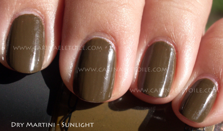
")
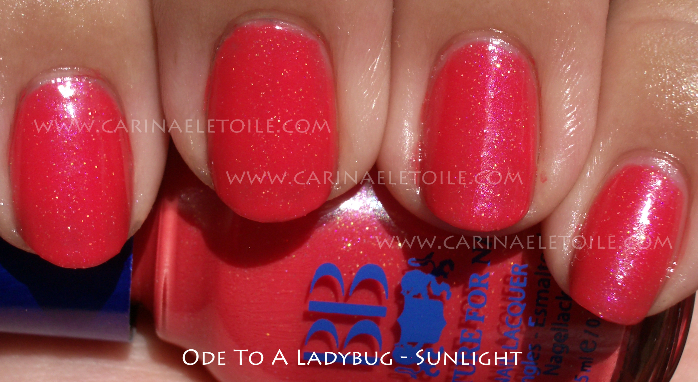
")
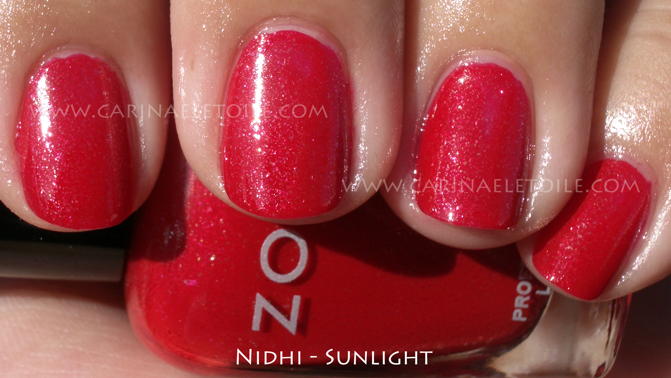
")
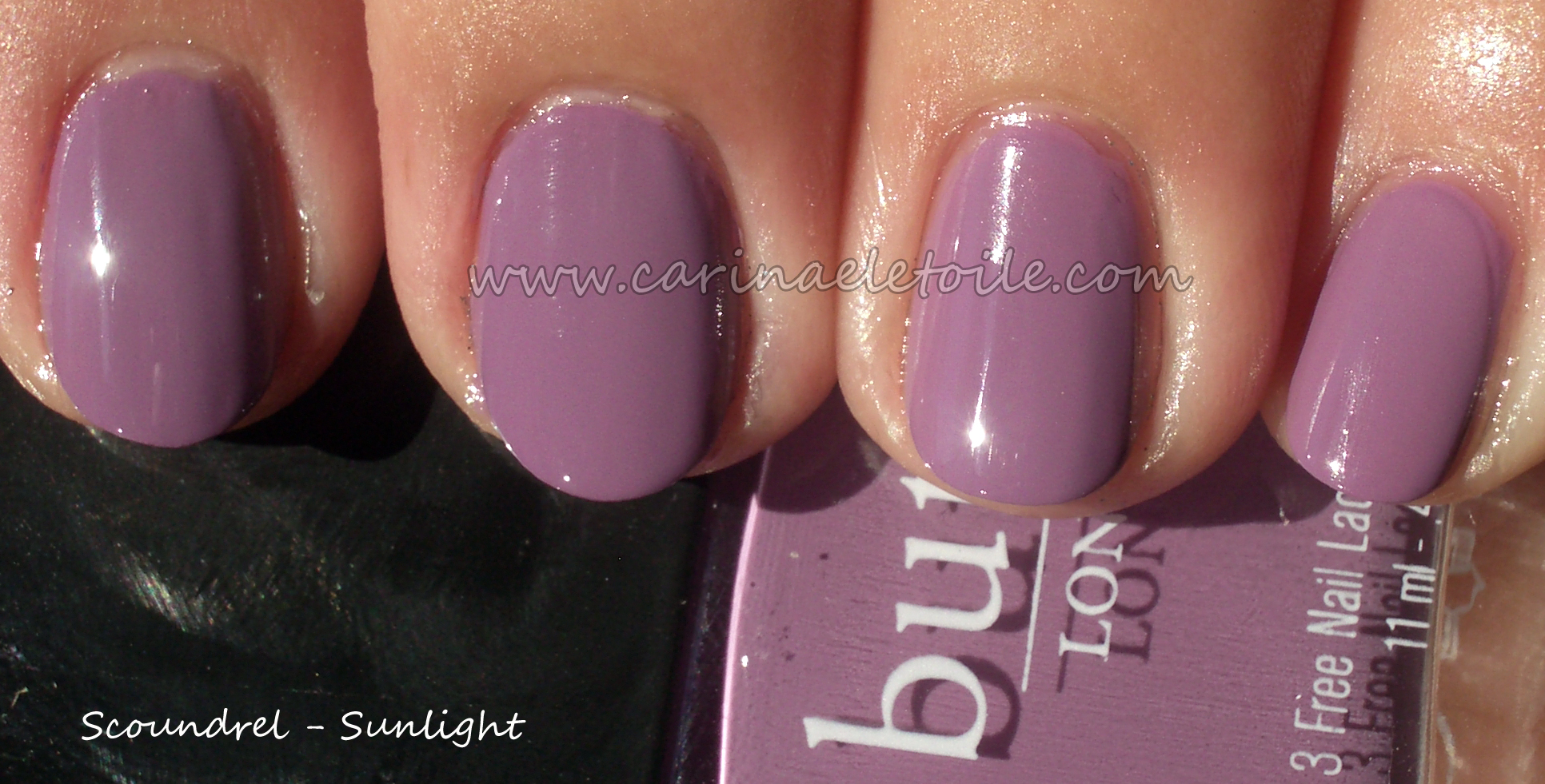
")