However, I ruined the mani.
See how I did it!

However, I ruined the mani.
See how I did it!
Anyway, the color up for show today is Jade Dragon. It is part of MAC’s Nail Trend F/W 2010 collection.
I loved, yet loathed, this color. Why?
This half is subtle but still gorgeous.
This post is image heavy…you have been warned!


Hello, Friday Red. What isn’t visible in the picture is the pink undertones. I’m looking at the bottle right now and the pinkness isn’t shown. I love the faint shimmer that makes if glow. Bravo, OPI!


Bronze-y orangey goodness…I can’t believe this actually looked good on me!


It looks so different in these two pictures, but I assure you they’re the same ones. Sunlight made it appear a more deeper gold. Absolutely gorgeous!


A hot magenta.


I honestly thought this color from OPI (The Show Must Go On!) would be a clone for MAC’s Bad Fairy. It’s not. Not even close. BF is more on the orange side, while TSMGO is more on the pink/magenta side. Both share the same orange glass flecks. I had to do 3 coats of BF while OPI’s formula was wonderfully opaque in 2 coats. Though vastly different, there are enough similarities to make them seem almost identical. Owning both would be wonderful, but owning either of the two is still good enough.


I’ve posted this comparison before, but to not include it would be silly because Tease-y Does It is part of the collection. You can read more about Tease-y Does It here.
The overall formula for MAC is thin and runny. That being said, it dried quickly.
I do wish MAC had put some Villains on the polish bottles. They did it for the other items in the line, so why not this one? Kind of bums me out. Overall the colors were cute, but as you can see, nothing that really wowed me. I’ve seen Mean & Green and Formidable! before thanks to Orly. I’m still going to hang on to these, though. 😀
This is an image heavy post…you have been warned! I tried to best capture the shimmers of the polishes.


 There really is no discernible difference between the two, is there? Even the size of the glitter, etc. M&G is a bit thinner than SC. 3 coats of each.


 MAC’s formula is thinner and runnier than Orly. You can see it. Other than that, no real discernible difference. This is 3 coats of each polish.
 Bottle shot for MAC


 This formula was very thin and required 3 coats. But even after 3 coats, you can still see my nail under it. 🙁
 Bottle shot
Anyway, this color was so promising in the bottle. But in the back of my mind, I kept hearing, “OPI did it better with Russian Navy…OPI did it better with Russian Navy…” And ya know what? OPI did it better with Russian Navy.
The one thing that MAC got right over OPI was the formula. It wasn’t a pain to deal with. If anything, it made me really sad because the formula was so wonderful while the color itself was kind of…meh and uninspiring.
From far away (and at night) the color looks like a dark creme. Even in fairly direct lighting, it still looks like a dark creme. Heck, even in my pictures it looks like a dark creme that had some glitter spilled into it purely by accident.
Please overlook the tip wear – it’s going on…day three (I believe) in the picture.
 *cough* very OPI Lincoln Park After Dark, don’t you think?


I like blues like this and the only thing I wish MAC had done was make this polish bolder. Maybe the glitter in it a bit more big and boomin’, ya know? This was opaque in two coats and it dried quickly. However, much as I did enjoy this color, it didn’t live up to the hype I had put in my head for it. Don’t get me wrong – I do like it. I just wish it had wowed me a bit more.
As always, keep clicking the pictures to enlarge until they can enlarge no more! The actual sizes are huge and these are just thumbnails.


Bottle shot!
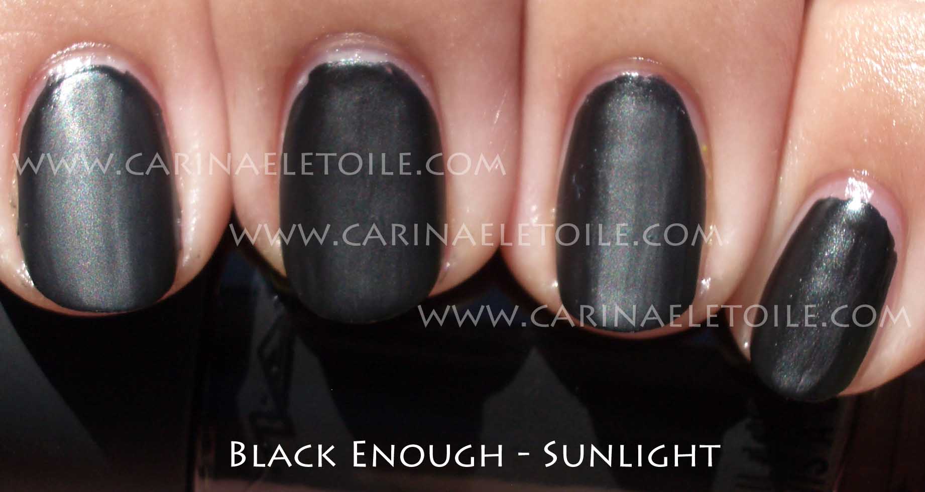
It’s been a while since I’ve worn black.
The formula dried quickly, despite the lack of a fast drying top coat. All coats were reasonably dry and fairly good to go in half an hour.


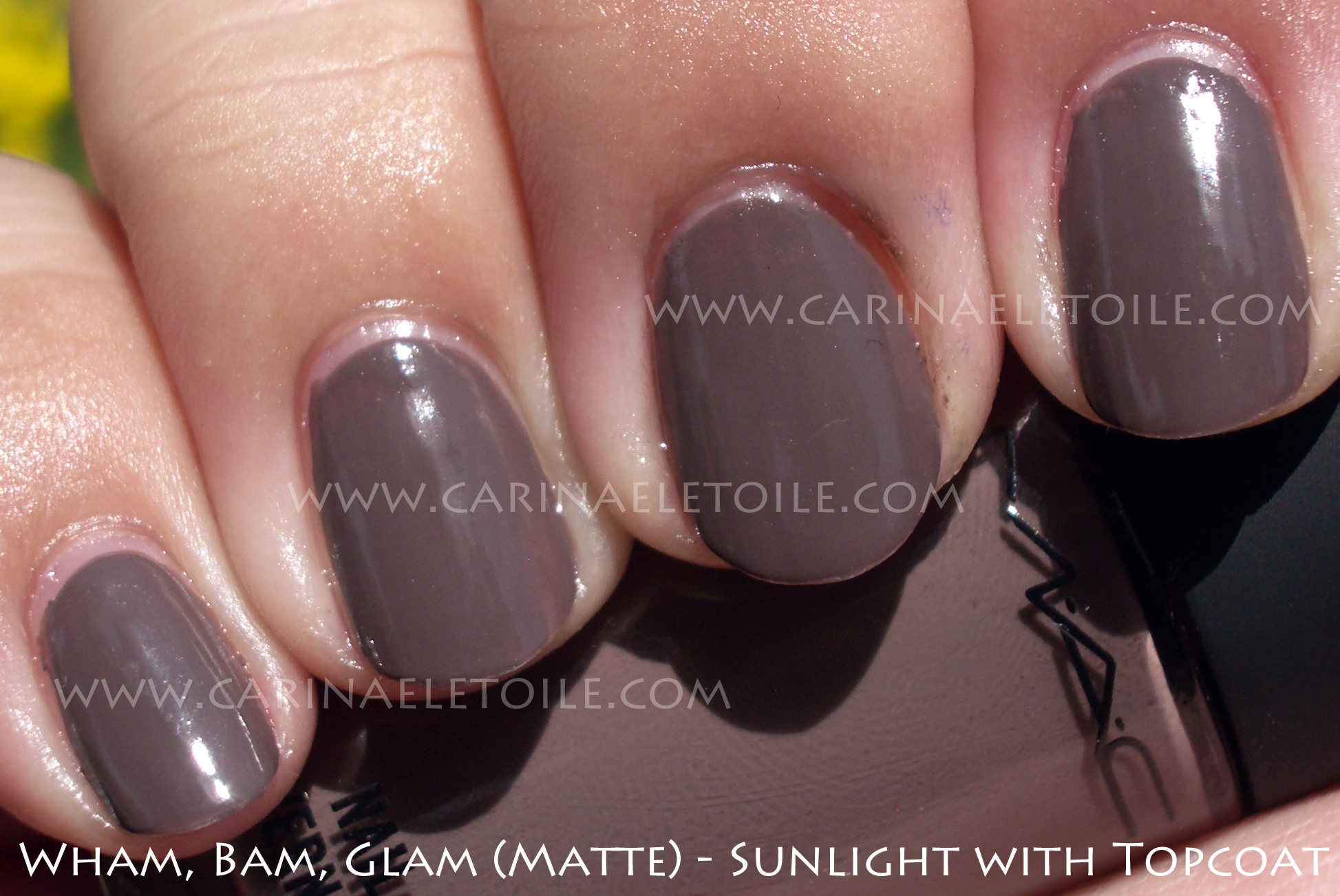
Application was like any other matte for me – moody and pissy. I can never get them to look nice and even, as you’ll see from application pics with the brush strokes so evident on the nail. This color rocked it matte, but when I put on a shiny top coat? Swoonworthy. Seriously. It’s love. I have this fondness for mushroomy/taupe-y colors.
This isn’t quite like the traditional mattes I’ve been seeing out there – it’s a bit like a Ginger & Liz when this dried…more like the finish of a candle than a flat, dull matte.
Small note: I really am not a left handed person and I need to stop trying to paint colors on my right hand. Please excuse the fountain pen ink on my hand – my pen exploded because I dropped it and I thought I had cleaned it off pretty well. Clearly I didn’t.
Lamer excuses out of the way, in comes the pictures.
")
")
See? It’s pretty matte…
")
But it’s even prettier with a top coat, don’t you think?

